
js ````
const let var
var 存在声明提升,值为undefined;可以重复声明,声明后被覆盖
let 不存在声明提升,所以会存在暂时性死区;在同一个作用域内不能重复声明
const 定义常量,所以一旦声明就需要立即初始化,在同一个作用域内不能重复声明
js数据类型
基本数据类型
- Number
- String
- Boolean
- Undefined
- null
- symbol
引用类型(object)
复杂数据类型统称为Object es6新添加有 Set Map
基本数据类型存储在栈中;引用类型的对象存储在堆中
当变量赋值,解析器首先要确认是引用类型还是基本类型
- 声明变量时不同的内存地址分配:
- 基本类型的值存放在栈中,在栈中存放的是对应的值
- 引用类型对应的值存储在堆中,在栈中存放的是指向堆内存的地址
- 不同的类型数据导致赋值变量时的不同:
- 简单类型赋值,是生成相同的值,两个数据对应不同的地址
- 复杂类型赋值,是将保存对象的内存地址赋值给另一个变量。也就是两个变量指向堆内存中同一个对象
!!! es6新增基本数据类型Symbol
因为对象属性的数据类型都是字符串,会导致属性名重复;symbol就是解决对象属性名重复,导致属性值被覆盖的问题
唯一性
1
2
3console.log(Symbol() === Symbol() )//false
//类似于NaN
console.log(NaN() === NaN() )//false不具备迭代器接口( !Symbo.iterator ) 不能用for in 或 for of 循环
1
2
3
4
5
6
7
var person = {
name: "张三",
age: 12,
[Symbol('level')]: 'A'
}
//需要用Reflect.ownKeys() 才能获取到所有的key
Reflect.ownKeys(person)Symbol.for() 与 Symbol.keyFor()
1
2
3
let s1 = Symbol.for('foo')
let s2 = Symbol.for('foo')
s1 == s2 //true 创建Symbol.for('foo')会全局寻找是否之前创建过Symbol.for('foo'),如果有则直接使用以创建的没有则创建
数组常用方法
- 增
- push() unshift() splice() concat()
1 | //push() 接收任意数量参数,并添加到末尾,返回数组最新长度 |
- 删
- pop() shift() splice() slice()
1 | //pop() 用于删除数组的最后一项,返回被删除项 |
- 改
- splice() 删一个加一个,相当于改
1 | // 下标 |
- 查
- indexOf() includes() find()
1 | // indexOf() 返回查找元素位置,找到返回index,找不到返回 -1 |
- 排序
- reverse() 反转 sort() 传入一个比较函数
1 | function compare(value1, value2) { |
转换方法
- join() 方法接收一个参数,即字符串分隔符,返回包含所有项的字符串
1
2let array = [12,23,34]
let arr = array.join("+") // "12+23+34"迭代方法
- some()[ES6] every()[ES6] forEach() filter() map()
1 | //some() 对数组每一项都运行传入的测试函数,如果至少有1个元素返回 true ,则这个方法返回 true |
ES6新增数组方法
- Array构造函数新增方法:扩展运算符 Array.from() Array.of()
1
2
3
4
5
6
7
8
9
10
11
12
13
14
15
16
17
18
19
20
21
22
23
24
25
26
27
28//扩展运算符
console.log(...[1, 2, 3]) // 1 2 3
console.log(1, ...[2, 3, 4], 5) // 1 2 3 4 5
[...'hello'] // [ "h", "e", "l", "l", "o" ]
[...document.querySelectorAll('div')] // [<div>, <div>, <div>] 伪数组转成真数组
/**
伪数组:伪数组没有Array.prototype,它只是一个对象;伪数组的索引,就是那些键值对的key,没有真正的顺序可言;长度是手动设置的
数组:数组有Array.prototype,他是对象的同时,也是数组;数组的索引和长度是内置属性
*/
//Array.from() 将对象value转为数组:类似数组的对象和可遍历(iterable)的对象(包括 ES6 新增的数据结构 Set 和 Map)
let arrayLike = {
'0': 'a',
'1': 'b',
'2': 'c',
length: 3
};
let arr2 = Array.from(arrayLike); // ['a', 'b', 'c']
//还可以接受第二个参数,用来对每个元素进行处理
Array.from([1, 2, 3], (x) => x * x)// [1, 4, 9]
//Array.of() // 创建数组
/**
没有参数的时候,返回一个空数组;
将一组值,转换为数组*/
Array.of() // []
Array.of(3) // [3]
Array.of(3, 11, 8) // [3,11,8]- 实例对象新增方法:copyWithin() find()、findIndex() fill() entries(),keys(),values() includes() flat(),flatMap()
1
2
3
4
5
6
7
8
9
10
11
12
13
14
15
16
17
18
19
20
21
22
23
24
25
26
27
28
29//fill() 填充一个数组
new Array(3).fill(7)// [7, 7, 7]
//还可以带上参数,填充到指定位置
['a', 'b', 'c'].fill(7, 1, 2)// ['a', 7, 'c']
//entries(),keys(),values()
/**
entries()是对键值对的遍历
keys()是对键名的遍历
values()是对值的遍历*/
for (let [index, item] of ['a', 'b'].entries()) {
console.log(index, item);
}
// 0 "a"
for (let index of ['a', 'b'].keys()) {
console.log(index);
}
// 0
// 1
for (let item of ['a', 'b'].values()) {
console.log(item);
}
// 'a'
// 'b'
//flat() 数组扁平化处理
[1, 2, [3, [4, 5]]].flat(2)// [1, 2, 3, 4, 5]
// flatMap() 在 map() 方法的基础上,对返回值进行了“扁平化”处理
[2, 3, 4].flatMap((x) => [x, x * 2]) //[2, 4, 3, 6, 4, 8]
字符串常用方法
- 增 concat
1 | //concat 用于将一个或多个字符串拼接成新字符串,不会改变原字符串 |
- 删 slice() substr() substring()
1 | let stringValue = "hello word" |
改
- trim() trimLeft() trimRight()
1
2
3
4
5
6
7
8
9
10let stringValue = " hello world "
//trim() 删除前后打头的所有空格符,返回新字符串
let trimStringValue = stringValue.trim()
console.log(trimStringValue) // "hello word"
//trimLeft() 删除前面打头所有空格,返回新字符串
let trimLeftStringValue = stringValue.trimLeft()
console.log(trimLeftStringValue) //“hello word ”
//trimRight() 删除后面打头所有空格,返回新字符串
let trimRightStringValue = stringValue.trimRight()
console.log(trimRightStringValue) //" hello word"- repeat()
1
2
3//repeat() 接收一个整数参数,表示要将字符串复制多少,然后返回拼接所有副本后的结果
let strintValue = "nana "
let copyResult = stringValue.repeat(2) //"nana nana "- padStart() podEnd()
1
2
3
4
5
6
7let stringValue = "foo"
//padStart() 复制字符串,如果小于指定长度,则在前面填充字符,直到长度满足,默认填充空格
console.log(stringValue.padStart(6)) // " foo"
console.log(stringValue.padStart(6,"a")) // "aaafoo"
//padEnd() 复制字符串,如果小于指定长度,则在后面填充字符,直到长度满足,默认填充空格
console.log(stringValue.padEnd(6)) // "foo "
console.log(stringValue.padEnd(6,"a")) // "fooaaa"- toLowerCase() toUpperCase()
1
2
3
4
5let stringValue = "hello word"
// toLowerCase() 将字符串转成小写
console.log(stringValue.toUpperCase()) //""hello word""
// toUpperCase() 将字符串转成大写
console.log(stringValue.toLowerCase()) //"HELLO WORD"查
- chatAt()
1
2
3//chatAt() 返回给定索引位置的字符
let stringValue = "hello word"
console.log(stringValue.charAt(2)) //"l"- indexOf()
1
2
3//indexOf() 从字符串开头去搜索传入的字符串,并返回索引位置(没有找到,则返回-1)
let stringValue = "hello word"
console.log(stringValue.indexOf("o")) //4- startsWith() includes()
1
2
3
4
5
6
7
8//从字符串中搜索传入字符串,并返回一个表示是否包含的返回布尔值
let stringValue = "hello word"
//startWith()
console.log(stringValue.startsWith(llo)) //true
console.log(stringValue.startsWith(oll)) //false
//includes()
console.log(stringValue.includes(oll)) //false
console.log(stringValue.includes(llo)) //true转换成数组
- splic() 跟 数组方法 join() 相反
1
2let stringValue = "12+13+14"
let arr = str.split("+") //[12, 23, 34]模板匹配
- match() search() replace()
1
2
3
4
5
6
7
8
9
10
11
12
13let text = "cat, bat, sat, fat"
//match() 接收一个参数,可以是正则表达式,也可以是RexExp对象,返回数组
let pattern = /.at/;
let matches = text.match(pattern)
console.log(matches[0]) // "cat" 只要遇到匹配的后续不会再进行匹配
//search() 接收一个参数,可以是一个正则表达式字符串,也可以是一个RegExp对象,找到则返回匹配索引,否则返回 -1
let pos = text.search(/at/)
console.log(pos) //1
//replace() 接收两个参数,第一个参数为匹配的内容,第二个参数为替换的元素(可用函数),返回替换后的字符串,只会更换第一个匹配的字符串
let result = text.replace("at", "omd")
console.log(result) //"comd, bat, sat, fat"字符串反转(应用)
- 利用扩展运算符变成数组(或字符串的split() 方法),对数组进行反转,在合并成字符串
1 | let str = "123456" |
利用循环
1
2
3
4
5var res = [];
for(i = str.length; i>=0; i--){
res.push(i+1)
};
let unstr = res.join("") //"654321";
对象
对象便利 (对象不具备迭代器数据结构,不能使用for of 遍历)
- 对象 for in 遍历
1 | let obj = { |
- 对象forEach遍历
1 | let obj = { |
- 对象values遍历
1 | let obj = { |
- 对象getOwnPropertyNames 遍历
1 | let obj = { |
- 使用Reflect.ownKeys(obj) 遍历
1 | let obj = { |
- 属性简写
1 | const obj = { |
- 属性名表达式
1 | //sysbol ES6 允许字面量定义对象时,将表达式放在括号内 |
- super关键字
1 | //this关键字总是指向函数所在的当前对象,ES6 又新增了另一个类似的关键字super,指向当前对象的原型对象 |
- 扩展运算符的应用
1 | let { x, y, ...z } = { x: 1, y: 2, a: 3, b: 4 }; |
- ES6对象新增的方法
1 | Object.is() //严格判断两个值是否相等,与 === 行为基本一致。 |
函数
ES6新增方法
- 默认参数
1 | function foo({x, y = 5} = {}) { |
- 函数的length属性
1 | // 1.length将返回没有指定默认值的参数个数 |
- name属性
1 | //返回该函数的函数名 |
ES6新增
Set
Set是es6新增的数据结构,类似于数组,但是成员的值都是唯一的,没有重复的值,我们一般称为集合
- 增 添加某个值,返回
Set结构本身
1 | const s = new Set(); |
- 删 删除某个值,返回一个布尔值,表示删除是否成功
1 | const s = new Set(); |
- 查 判断值是否存在
1 | const s = new Set(); |
- clear() 清除所有成员,没有返回值
1 | const s = new Set(); |
- 遍历
1 | let set = new Set(['red', 'green', 'blue']); |
Map
Map类型是键值对的有序列表,而键和值都可以是任意类型
- 增 设置键名
key对应的键值为value,然后返回整个 Map 结构;可采用链式写法
1 | const m = new Map() |
- 删 delete
方法删除某个键,返回true。如果删除失败,返回false
1 | const m = new Map(); |
- 改
key已经有值,则键值会被更新,否则就新生成该键
1 | const m = new Map() |
- 查
has方法返回一个布尔值,表示某个键是否在当前 Map 对象之中
1 | const m = new Map(); |
- get get
方法读取key对应的键值,如果找不到key,返回undefined
1 | const m = new Map(); |
- size属性
1 | const map = new Map(); |
- clear
clear方法清除所有成员,没有返回值
1 | let map = new Map(); |
- 遍历
1 | const map = new Map([['F', 'no'],['T', 'yes']]); |
ES6 之前, 如果对象属性是对象,则后面会覆盖前面的属性
1 | var obj1 = { |
WeakSet 和 WeakMap
WeakSet
WeakSet可以接受一个具有Iterable接口的对象作为参数没有遍历操作的
API没有
size属性WeakSet只能成员只能是引用类型,而不能是其他类型的值;WeakSet里面的引用只要在外部消失,它在WeakSet里面的引用就会自动消失
1 | let ws=new WeakSet(); |
WeakMap
WeakMap结构与Map结构类似,也是用于生成键值对的集合;在API中WeakMap与Map有两个区别:- 没有遍历操作的
API
- 没有遍历操作的
1
2
3
4
5
6
7
8
9
10
11
12// WeakMap 可以使用 set 方法添加成员
const wm1 = new WeakMap();
const key = {foo: 1};
wm1.set(key, 2);
wm1.get(key) // 2
// WeakMap 也可以接受一个数组,
// 作为构造函数的参数
const k1 = [1, 2, 3];
const k2 = [4, 5, 6];
const wm2 = new WeakMap([[k1, 'foo'], [k2, 'bar']]);
wm2.get(k2) // "bar"WeakMap只接受对象作为键名(null除外),不接受其他类型的值作为键名;WeakMap的键名所指向的对象,一旦不再需要,里面的键名对象和所对应的键值对会自动消失
1
2
3
4
5
6
7const map = new WeakMap();
map.set(1, 2)
// TypeError: 1 is not an object!
map.set(Symbol(), 2)
// TypeError: Invalid value used as weak map key
map.set(null, 2)
// TypeError: Invalid value used as weak map key
typeof 和 instanceof 判断类型对象
- typeof : 适用于判断基本类型、方法对象等。判断所有对象,都返回对象[Object, Object]
- instanceof : 适用于判断对象(Object)。判断对象比较详细
数组incloudes方法
可以简便实现同一个属性的多种判断
1 | //正常判断用法 |
对象解构赋值
1 | let person = { |
手写数组map函数和filter函数
map()
1
2
3
4
5
6
7
8
9
10
11
12
13var arr = [1,2,3]
//方法实现
Array.prototype._map = function(fn){
var newArr = []
for(var i=0; i<this.length;i++){
newArr.push(fn(this[i],i))
}
return newArr
}
//方法调用
arr._map((v)=>v+1)filter()
1 | var arr = [1,2,3] |
对象字面量代替switch
1 | //例子 |
map数据类型使用实例
1 | var obj1 = { |
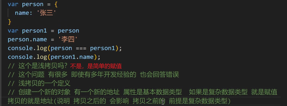
深拷贝和浅拷贝
浅拷贝

1
2
3
4
5
6
7
8
9
10
11
12
13
14
15function shallowClone(source) {
if (typeof source !== 'object' || source == null)
{
return source;
}
let target = Array.isArray(source) ? [] : {};
for (let key in source) {
//source.hasOwnProperty(key) 判断是否是source自身的属性,不拷贝原型链的属性
if (source.hasOwnProperty(key)) {
//shallowClone 实现对属性进行递归拷贝
target[key] = shallowClone(source[key]);
}
}
return target;
}深拷贝(复杂数据类型也会开辟新空间存储)
1
2
3
4
5
6
7
8
9
10
11
12
13
14
15
16
17
18
19
20
21
22
23
24
25// 利用json数据转换来达到深拷贝
let deePerson = JSON.parse(JSON.stringify(person))
//或者自己写递归循环实现深拷贝
function deepClone(obj, hash = new WeakMap()) {
if (obj == null) return obj; // 如果是null或者undefined我就不进行拷贝操作
//如果是时间函数Date() 、正则表达式 RegExp()也直接返回
if (obj instanceof Date) return new Date(obj);
if (obj instanceof RegExp) return new RegExp(obj);
// 可能是对象或者普通的值 如果是函数的话是不需要深拷贝
if (typeof obj !== "object") return obj;
// 是对象的话就要进行深拷贝
if (hash.get(obj)) return hash.get(obj);
let cloneObj = new obj.constructor();
// 找到的是所属类原型上的constructor,而原型上的 constructor指向的是当前类本身
hash.set(obj, cloneObj);
for (let key in obj) {
if (obj.hasOwnProperty(key)) {
// 实现一个递归拷贝
cloneObj[key] = deepClone(obj[key], hash);
}
}
return cloneObj;
}
拷贝弊端:不能拷贝函数 、正则表达式 RegExp()
文件切片上传和重传
要实现重传效果,你可以考虑以下几个步骤:
- 在前端实现切片上传时,记录每个切片的索引号和总数,并将这些信息发送到服务器端。
- 在服务器端接收到切片后,可以根据索引号和总数来判断是否有缺失的切片。
- 如果发现有缺失的切片,服务器端可以向前端发送一个请求,要求重新上传这些缺失的切片。
- 前端接收到服务器端的请求后,重新上传缺失的切片即可。
在实现重传时,你可以考虑以下几点:
- 在前端记录每个切片的上传状态,可以使用一个数组或对象来保存每个切片的状态信息。
- 当服务器端要求重传时,前端可以根据切片的状态信息,选择性地重新上传缺失的切片。
- 为了避免重复上传已经成功上传的切片,你可以在前端和服务器端都对已上传的切片进行标记或记录。
防抖节流(闭包的实际运用)
防抖函数
当持续出发事件,一定时间没有再触发该事件,事件函数将执行一次
如果设定时间之前又触发了一次,则重新延时(定时器);类似王者荣耀回城,再次点击回城重新计时
1
2
3
4
5
6
7
8
9
10
11
12
13function debounce(func, wait) {
let timeout;
//利用闭包来延长timer 的声明周期和作用域
return function () {
let context = this; // 保存this指向
let args = arguments; // 拿到event对象
clearTimeout(timeout) // 清除上一次的函数
timeout = setTimeout(function(){ // 创建新的事件,并重新计时
func.apply(context, args)
}, wait);
}
}节流函数
当持续触发一个事件的时候,保证一段事件内,只调用一次事件处理;类似王者荣耀技能,只有当CD结束时才能再次释放
1
2
3
4
5
6
7
8
9
10
11
12function throttled2(fn, delay = 500) {
let timer = null
//利用闭包来延长timer 的声明周期和作用域
return function (...args) {
if (!timer) {
timer = setTimeout(() => {
fn.apply(this, args)
timer = null
}, delay);
}
}
}
相同点:
- 都可以通过使用
setTimeout实现 - 目的都是,降低回调执行频率。节省资源
应用场景:
防抖:
- 搜索框搜索输入。只需用户最后一次输入完,再发送请求
- 手机号、邮箱验证输入检测
- 窗口大小
resize。只需窗口调整完成后,计算窗口大小。防止重复渲染。
节流:
- 滚动加载,加载更多或滚到底部监听
- 搜索框,搜索联想功能
图片懒加载
图片懒加载是一种网页优化技术,用于延迟加载页面中的图片,以减少页面加载时间和带宽消耗。在网页中,当用户滚动浏览页面时,只有当图片进入可视窗口时才加载图片,而不是一次性加载所有图片
思路:通过JavaScript监听滚动事件,当图片进入可视窗口时再动态加载图片。
- 原生js
1 | document.addEventListener('DOMContentLoaded', function() { |
- vue3 setup 组合式api 写法
1 | <template> |
上拉刷新,触底加载
- 原生js
1 | document.addEventListener('DOMContentLoaded', function() { |
- vue3 setup 组合式api 写法
1 | <template> |
原生js实现路由
背景: 再过去,路由切换只出现在后台,前端想要切换到某个页面,就需要向后端请求,随后完成路由切换。但随着spa单页面应用模型的发展,前端路由也逐渐火热,单页面顾名思义就是一个html页面,但当我们点击导航的时候url会改变,网页也会显示不同的内容。简而言之就是js监测url变化,从而改变内容
实现思路:实现前端路由是为了在单页面应用中实现页面切换而不刷新整个页面。原生JavaScript可以通过监听URL的变化来实现简单的路由功能
步骤:
- 使用
hash实现路由:在URL中使用#后面的部分来表示路由路径,当hash发生变化时,可以通过监听hashchange事件来捕获路由变化。 - 动态更新页面内容:根据不同的路由路径,动态更新页面内容,实现页面切换的效果
1 | //自执行函数 |
其他:
- 参数传递:可以在路由路径中传递参数,通过解析参数来动态展示页面内容。
- 路由拦截:可以在路由处理函数中增加拦截逻辑,实现路由权限控制或其他逻辑。
- 路由动画:可以在页面切换时添加动画效果,提升用户体验
- 使用history
通过history对象的popstate事件,我们可以在浏览历史记录发生变化时捕获路由的变化
我们通过window.addEventListener('popstate', function(event) { ... })来监听popstate事件,当浏览历史记录发生变化时,会触发该事件。在事件处理函数中,我们可以获取当前的URL,从而实现路由变化的监听和处理。
通过监听history对象的路由变化,我们可以实现更灵活的路由管理,同时可以结合pushState、replaceState等方法来改变路由并触发相应的事件。
1 | // 监听popstate事件 |
箭头函数
- 箭头函数this指向 - 指向外层函数上下文
- 箭头函数不能当做构造函数
- 箭头函数不可以当做迭代器
this指向(谁调用我我指向谁)
1 | function get(content){ |
1 | var person = { |
1 | var name = 222; |
改变this指向
箭头函数没有自己的this,this是外层代码块的this,this是在定义函数时绑定的。不能够使用做构造函数
1 | var name = 11 |
手写call、apply
作用:改变this指向
场景: js的继承(原型链继承;构造函数继承(使用call实现) )
call
可以用作
- 继承
- 判断复杂数据类型
伪数组转换成数组
手写call方法
1
2
3
4
5
6
7
8
9
10
11
12
13
14
15
16
17
18
19
20
21
22
23
24
25
26
27
28
29
30
31
32var person = {
getName: function(){
//以函数的形式调用对象方法则指向window(浏览器环境)|global(nodejs环境),以方法的形式调用时,this指向调用方法的对象
return this.name
}
}
var person1 = {
name: ”张三“
}
//因为call方法是对象直接调用,有点类似是类的静态变量,每个对象方法都能调用,实现方法是直接挂在到Function构造函数的原型上。
Function.prototype.myCall = function(context) {
//这里面的this是调用该myCall方法的对象方法function
//所以传入的参数第一个参数必须是function类型,不是function返回错误
if(typeof this !== 'function'){
throw new Error('error')
}
//如果参数为空则直接this指向window
context = context || window
//获取除第一个参数的其余参数
var args = [...arguments].slice(1)
//这里直接使用this,则直接指向getName,以函数的方式调用,所以getName的this指向window,获取到的name是全局变量。但是我们可以用context传入的参数来改变getName的this
//首先是确定context传入的参数对象有getName方法,直接赋予getName方法
context.fn = this
//最后返回传入对象参数context.fn,也就是context.getName
let result = contest.fn(...args)//对数组args解构
delete context.fn
return result
}
//实际实现方法就是将传入的对象赋予该对象调用的函数,然后再用传入进去的对象调用该函数,从而达到改变this指向
person.getName.myCall(person1, 1, 2)apply


手写apply(其实与call方法一致,只是传入参数方式不同)
1 | var person = { |
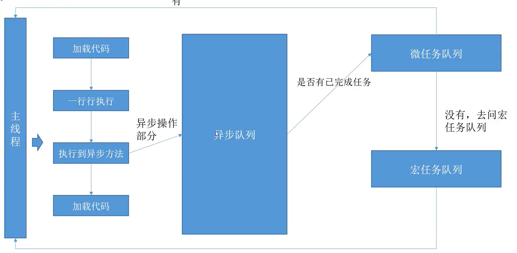
js事件循环机制;宏任务与微任务 事件队列
js语言特点
- 单线程
- 解释性语言(解释一行执行一行)
event-loop
事件循环机制 由三部分组成
调用栈、微任务队列、消息队列
- event-loop开始时,会从全局一行一行执行,遇到函数调用,会压入到栈中,被压入的函数称为帧,函数调用返回后从调用栈中弹出
- js中的异步操作比如fetch setTimeout setInterval 压入到调用栈中的时候里面的消息会进去到消息队列中去 ,消息队列会等到调用栈清空后再执行
- 像promise async await 的异步操作的时候会加入到微任务中去,调用栈中加入的微任务会立马执行
js执行顺序及异步实战技巧
吃透js执行顺序及异步实战管理技巧经验_哔哩哔哩_bilibili 10:23
- js的执行顺序
- 异步实战
- 先把异步promise化
- 梳理清楚逻辑上的操作顺序
- 组织为队列,按顺序执行
回调地狱优化
- 利用es11 的可选链式操作符
1 | var Animal = ({type, name, gender})=>{ |
- 利用提前退出和提前返回
1 | var Animal = ({type, name, gender})=>{ |
手写双向数据绑定(v-mode)
- 使用Obiect.defineProperty() 实现双向数据绑定 vue2
1 |
|
- 使用Proxy( ES6 的新特性) 和Reflect 实现双向数据绑定 vue3
1 | <!DOCTYPE html> |
Object.defineProperty与 Proxy区别
- 所有属性监听
- Object.defineProperty无法一次性监听对象所有属性,必须遍历或者递归来实现
- Proxy的实现就不需要遍历
- Proxy 的get方法用于拦截某个属性的读取操作,可以接收三个参数,依次为目标、属性名和Proxy实例本身,其中最后一个参数为可选参数
- set方法用来拦截某个属性的赋值操作,可以接受四个参数,依次为目标对象、属性名、属性值和Proxy实本身,其中最后一个为可选参数
- 新增属性监听
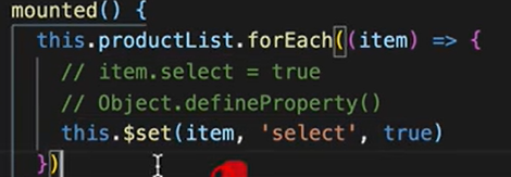
Object.defineProPerty无法监听新增属性,如果需要监听新增属性,需要手动再做一次监听,在Vue中想动态监听属性,一般用Vue.set(对象实例, “新增对象属性”)这种形式来添加
Proxy可以监听新增属性
- 数组操作
Object.defineProperty 无法响应数组操作
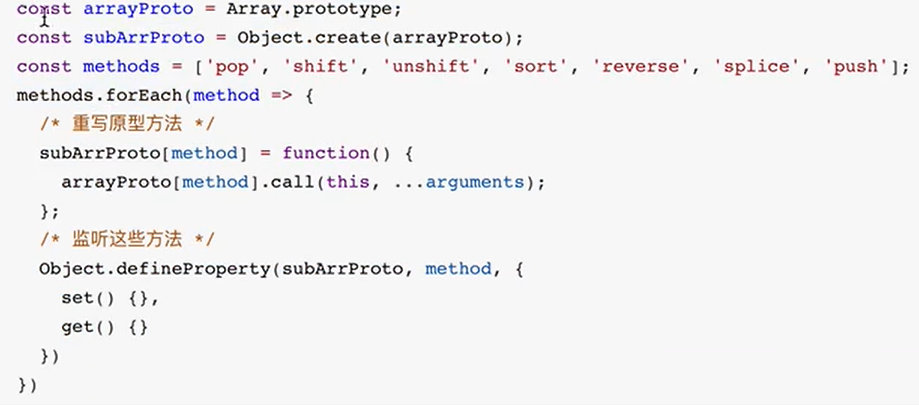
可以监听数组变化,但无法对新增数组变化进行监听,因此Mobk中为了监听数组变化,默认将数组长度设置为1000,监听0-999的属性变化
如果想要监听push、shift、pop、unshift等方法,该怎么做?Vue和Mobx中都是通过重写原型的方法实现的:在定义变量的时候,判断是否是数组,如果是数组,那么就修改它的proto,将其指向subArrProto,从而实现重写原型链。
vue源码:
场景:
- 利用Proxy set get 应用proxy表单验证
1 | //验证规则 |
- get 用来拦截私有属性的读取, 用_ 开头的属性是私有属性, 禁止私有属性读取
1 | const person ={ |
- 等等还有其他Proxy的方法使用 …….(get/ set/ apply/ construct/ has/ delete/ delete)
- !!! Proxy 可以提高开发效率和代码质量,但在使用过程中需要注意性能优化、避免循环引用导致栈溢出、合理使用拦截器和兼容性等方面的细节。
展开运算符
[…arr]
支持展开运算符是要有Symbol.iterator
arr[Symbol.iterator]
面试题:
1 | //我们能否以某种方式为下面的语句使用展开运算而不导致类型错误 ? |
- 对象转数组案例
- 使用 Object.keys() 方法获取对象的所有键,然后使用 map() 方法将每个键对应的值存入新数组中。
1 | const obj = { a: 1, b: 2, c: 3 }; |
- 使用 Object.values() 方法获取对象的所有值,直接将值存入新数组中。
1 | const obj = { a: 1, b: 2, c: 3 }; |
- 使用 Object.entries() 方法获取对象的键值对数组,然后对每个键值对进行处理。
1 | const obj = { a: 1, b: 2, c: 3 }; |
1 |
|
- 其他
- 继承:通过原型链,我们可以实现对象之间的继承关系,子对象可以继承父对象的属性和方法。可以尝试创建一个新的构造函数,让它继承自
Person构造函数,并添加新的属性或方法。 - 原型修改:可以尝试修改
Person构造函数的原型对象上的方法,然后看看实例对象是否能够访问到修改后的方法。 - 原型链终止:在原型链的顶端是
Object.prototype,它的原型是null。可以思考一下为什么原型链的顶端是Object.prototype,而不是其他对象。
- 继承:通过原型链,我们可以实现对象之间的继承关系,子对象可以继承父对象的属性和方法。可以尝试创建一个新的构造函数,让它继承自
继承
- 原型链继承
原型链继承是一种实现对象之间继承关系的方法,通过让一个对象的原型指向另一个对象,从而使得子对象可以继承父对象的属性和方法
步骤:
- 创建父对象:首先创建一个父对象,可以是一个普通对象或者一个构造函数。
- 创建子对象:然后创建一个子对象,通过将子对象的原型指向父对象来实现继承。
- 继承属性和方法:子对象通过原型链继承了父对象的属性和方法,可以访问和使用它们
1 | // 创建了一个父对象parent,其中包含一个sayHello方法。然后我们创建了一个子对象child,通过Object.create()方法将子对象的原型指向父对象 |
其他:
- 原型链继承的问题:原型链继承有一个问题,就是所有子对象共享父对象的属性和方法。这意味着如果一个子对象修改了继承的属性或方法,会影响到所有其他子对象。可以思考如何解决这个问题。
- 多层继承:可以尝试创建多层继承关系,即子对象的原型指向另一个子对象,从而实现多层继承。
- 构造函数和原型链结合:可以结合构造函数和原型链继承来实现更灵活的继承方式,即使用构造函数定义对象的特定属性,使用原型链继承共享的属性和方法
- 构造函数继承
构造函数继承是一种实现对象之间继承关系的方法,通过在子构造函数中调用父构造函数来实现属性的继承。这种继承方式也被称为经典继承或伪经典继承。
步骤:
- 定义父构造函数:首先定义一个父构造函数,该构造函数包含要被继承的属性和方法。
- 定义子构造函数:然后定义一个子构造函数,通过在子构造函数中调用父构造函数来继承父构造函数的属性。
- 继承属性:子对象通过构造函数继承父对象的属性,每个子对象都有自己的一份属性副本。
1 | // 定义了一个父构造函数Animal和一个子构造函数Dog。在子构造函数中,通过Animal.call(this, name)调用父构造函数来继承父对象的属性。这样子对象就可以拥有父对象的属性和方法。 |
其他:
- 原型链与构造函数继承结合:可以结合原型链和构造函数继承来实现更灵活的继承方式,即使用构造函数继承属性,使用原型链继承共享的方法。
- 继承多个构造函数:可以尝试在子构造函数中调用多个父构造函数来继承多个对象的属性。
- 继承方法:除了继承属性,还可以尝试在子构造函数中继承父对象的方法,而不仅仅是属性。
- 组合式继承
组合式继承(Combination Inheritance)是一种结合了构造函数继承和原型链继承的继承方式,可以解决构造函数继承和原型链继承各自的缺点,实现属性和方法的有效继承
步骤:
- 构造函数继承:通过在子构造函数中调用父构造函数来继承属性。
- 原型链继承:通过将子构造函数的原型指向一个父构造函数的实例来继承方法。
- 优点:组合式继承结合了构造函数继承和原型链继承的优点,避免了它们各自的缺点,实现了属性和方法的有效继承
1 | // 定义了一个父构造函数Animal和一个子构造函数Dog。在子构造函数中,通过Animal.call(this, name)调用父构造函数来继承父对象的属性,然后通过Dog.prototype = Object.create(Animal.prototype)来继承父对象的方法。这样子对象就可以拥有父对象的属性和方法。 |
- 优化组合式继承:可以进一步优化组合式继承,避免调用两次父构造函数,以提高性能。
- ES6类继承:可以尝试使用ES6中的类继承语法来实现继承,更加简洁和易读。
- 混合继承:可以结合多种继承方式,如构造函数继承、原型链继承、组合式继承等,来满足不同的继承需求。
- 寄生组合式继承
寄生组合式继承(Parasitic Combination Inheritance)是对组合式继承的一种优化,通过使用寄生式继承来减少调用父构造函数的次数,提高性能。
优缺点:
- 组合式继承的缺点:组合式继承会调用两次父构造函数,一次是在子构造函数中继承属性时,另一次是在设置子构造函数的原型时。这样会导致父构造函数被调用两次,影响性能。
- 寄生组合式继承的优化:寄生组合式继承通过使用一个空函数作为中介,来减少对父构造函数的不必要调用,提高性能。
1 | // 定义了一个寄生函数inheritPrototype,它通过创建父构造函数原型的副本,并将其赋值给子构造函数的原型,来实现寄生组合式继承。这样就避免了多次调用父构造函数,提高了性能。 |
其他:
- 继承多个父对象:可以尝试在寄生函数中实现继承多个父对象的属性和方法。
- 优化寄生式继承:可以进一步优化寄生式继承的实现方式,提高代码的可读性和性能。
- 使用工厂模式:可以结合工厂模式来改进继承的实现方式,实现更灵活的继承方式
前端性能优化
减少http请求
使用http2.0
使用ssr服务端渲染
SSR可以让首屏加载更快,带来更好的SEO前端基本上现在都是
SPA单页应用,单页应用的缺陷就是首屏加载很慢。合理使用cdn
将css放在文件头部,将js放在文件底部
使用精灵图/ 雪碧图, 减少请求次数
善用http缓存:强缓存&协商缓存
其他
- 首屏速度优化(SPA)——静态资源体积(tree-shaking、gzip)、异步引入、延迟加载
- 大量数据 渲染优化——一次渲染一部分;分页处理
- 用户体验优化——骨架屏、loading、页面状态缓存;搭配首屏加载
- 组件可扩展性和易用性能优化
- 错误处理 - 优化接口的出错处理,并发处理。让页面响应更快,体验更加
二者都是后端控制的东西,强缓存是响应头添加 'Cache-Control': 'max-age=xxx' 字段, max-age 是过期时间,强缓存后无法缓存输入 url 后的 get 请求,想要缓存这个请求需要靠协商缓存来实现,协商缓存的实现是在强缓存的基础上添加一个 'Last-Modified': stats.mtimeMs 或者 etag 字段,若检查到前端返回的 If-Modified-Since 时间一致,后端就返回 304 状态码给前端,浏览器就从缓存中读取静态资源
压缩文件
懒加载
懒加载的实现需要获取到可视区范围的高度,以及每张图片的高度,监听用户滚动的过程中图片是否进入范围内,进入时才赋值 src , src 只要有值就一定会发送 http 请求,此前存放 src 的属性可以任意取名,当然一般我们取名为 data- 前缀,比如下面这样
尽量使用css,字体来代表图片
使用webp格式的图片
webp 格式的图片是谷歌推出的,这种格式的图像压缩算法能力要优于传统的 jpg , png 等格式,在相同图片质量的情况下,空间大小会优化 30% 左右的样子
关于图片的性能优化就是小图用雪碧图,大图用 webp 格式
- webpack:tree-shaking | 打包文件名 + hash
tree-shaking 的作用就是帮我们把项目中无用的代码给找出来,比如我们调试用的 console.log ,其实 console.log 对浏览器的开销还是蛮大的
- 尽量减少回流重绘
输入url到页面渲染后半段:回流,重绘,优化
回流(重排)就是计算布局,重绘就是给页面上色
- 尽量不用 js 去直接修改 css
1 | // 案例一 |
- 合理使用事件委托
事件委托的机制是借助冒泡机制,把原本需要批量操作子组件的操作代理到一个父组件上
- if-else & switch
if-else 有个判断顺序的,一定是从上往下走逐个走到目标,每次都判断一下,浪费性能。而 switch 不然, switch 是直接命中目标,只有一次判断
if-else 会更加灵活,但是性能又没有 switch 来得好
动画效果: requestAnimationFrame避免页面卡顿
Web Worker 开启多线程
js默认情况下是单线程,但是v8引擎执行js的时候是可以多开辟线程,像页面上的图片有水印一般都是页面加载的时候实现,而非图片就有水印,像这种操作就是交给另一个线程来实现的(postMessge和onmessge )
- css选择器复杂性要低
浏览器读取css是从右往左读,尽量给每个标签打上类名,不要通过多层父容器
- 尽量使用弹性布局
flexbox性能会比较好
Vue
对vue的理解
- 是什么
是一个用于创建用户界面的开源JavaScript框架 , 也是一个创建单页应用的Web应用框架
- 核心特点
数据驱动(MVVM)
Model:模型层,负责处理业务逻辑以及和服务器端进行交互
View:视图层:负责将数据模型转化为UI展示出来,可以简单的理解为HTML页面
ViewModel:视图模型层,用来连接Model和View,是Model和View之间的通信桥梁
组件化
- 就是把图形、非图形的各种逻辑均抽象为一个统一的概念(组件)来实现开发的模式, 在
Vue中每一个.vue文件都可以视为一个组件 - 组件化优势:
- 降低整个系统的耦合度
- 调试方便
- 提高可维护性
- 就是把图形、非图形的各种逻辑均抽象为一个统一的概念(组件)来实现开发的模式, 在
指令系统
带有 v- 前缀的特殊属性作用, 当表达式的值改变时,响应式地作用于 DOM
1 | 常用的指令 |
v-model:
1 | <inpuy v-model="a" /> |
使用场景:
- 弹窗(直接v-moel绑定父组件的值,这样v-model就能轻松地控制显影)
- 业务里一些功能操作( 直接把操作结果绑定到父组件的data,不用父组件传值和监听)
- 跟传统开发的区别
- 传统开发是直接操作DOM节点,但操作DOM节点要消耗的资源比较大
vue基本不操作dom节点,而是通过修改变量值,来控制虚拟DOM的节点属性
- 和react区别
- 相同点
- 都有组件化思想
- 都支持服务器端渲染
- 都有Virtual DOM(虚拟dom)
- 数据驱动视图
- 都有支持native的方案:
Vue的weex、React的React native - 都有自己的构建工具:
Vue的vue-cli、React的Create React App
- 区别
- 数据流向的不同。
react从诞生开始就推崇单向数据流,而Vue是双向数据流 - 数据变化的实现原理不同。
react使用的是不可变数据,而Vue使用的是可变的数据 - 组件化通信的不同。
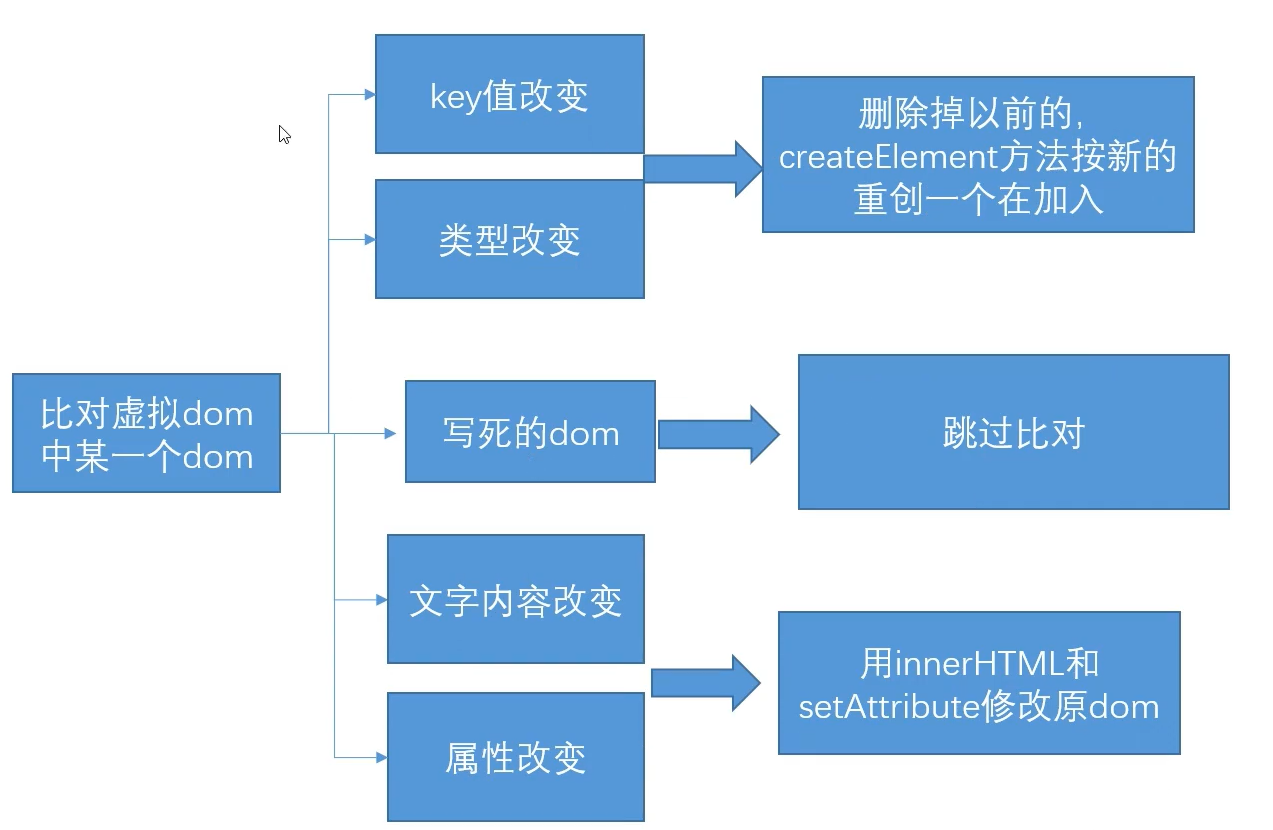
react中我们通过使用回调函数来进行通信的,而Vue中子组件向父组件传递消息有两种方式:事件和回调函数 - diff算法不同。
react主要使用diff队列保存需要更新哪些DOM,得到patch树,再统一操作批量更新DOM。Vue使用双向指针,边对比,边更新DOM
- 数据流向的不同。
利用v-model提升组件的方便性
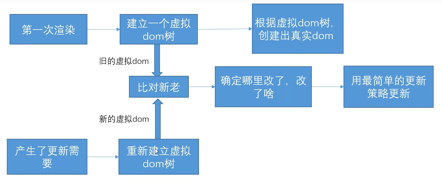
虚拟dom
vue是由 模版语法 -> render() -> VNode -> 真实dom
- render()函数是用来构建虚拟DOM的函数,它返回一个VNode节点
- vue的虚拟DOM(Virtual DOM)是一个轻量级的JavaScript对象,用来描述真实DOM树的结构。
- VNode(虚拟节点)是虚拟DOM中的一个节点,它包含了DOM元素的所有信息,比如标签名、属性、子节点等。
1
2
3
4
5
6
7
8
9
10
11
12
13
14
15
16
17
18
19
20
21
22// render 函数生成虚拟dom函数节点 vnode
// html 模版
<template>
<div id="app">
<h1>{{ title }}</h1>
<p>我是{{ name }}</p>
</div>
</template>
// 转化后的render函数
function render(){
var _vm = this
var _h = _vm.$createElement
var _c = _vm._self._c || _h
// 第一个参数时根节点, 第二个参数时该节点的属性 (可忽略), 第三个参数是该节点内容或者子节点
return _c("div", { attrs: { id: "app"}}, [
_c("h1",[_vm._v(_vm._s(_vm.title))]),
_c("p",[_vm._v("我是"+_vm._s(_vm.name))])
])
}
Vue 模板语法插值
v-once: 模板只渲染一次
v-html: 以html语法形式渲染,会将字符串内html标签转化为元素
v-text: 以纯文本形式输出
v-on: (缩写 @)
- v-on:click : 点击触发事件
v-bind:(缩写 :)
- v-bind:[属性名] : 直接在元素添加相应属性名 例如: v-bind:style=”width:100px,height:100px” v-bind:class=” ‘red’ “ :style=”{ padding: ‘0 ‘ + paddingValue }”
- 动态参数:(缩写 :[])
- v-bind:[sky]: 在定义属性参数sky时,sky会被替换(除class外)
- 动态参数:(缩写 :[])
- v-bind:[属性名] : 直接在元素添加相应属性名 例如: v-bind:style=”width:100px,height:100px” v-bind:class=” ‘red’ “ :style=”{ padding: ‘0 ‘ + paddingValue }”
计算属性
computed
组件
组件基础
插槽
插槽
具名插槽
- 利用
template加上属性v-slot:aaa 来为插槽添加具名,在调用时只需在<slot></slot>中添加属性name=aaa
1
2
3
4
5
6
7
8
9
10
11
12
13
14
15
16
17
18
19
20
21
22
23
24
25
26
27
28
29//插槽组件
<Table>
<!-- 只会显示aaa的插槽 -->
<slot name='aaa'></slot>
<slot name='bbb'></slot>
<slot></slot>
</Table>
//调用组件
<Table>
<h1>具名插槽</h1>
<!-- aaa的插槽命名如果冲突只会取第一个 -->
<template v-slot:aaa>
<p>
具名插槽aaa
</p>
</template>
<template v-slot:bbb>
<p>
具名插槽bbb
</p>
</template>
<!-- 如果起名了为default,则在调用插槽组件时必须要带命名,如果没有则不显示 -->
<template v-slot:default>
<p>
具名插槽default
</p>
</template>
</Table>- 插槽数据交互
1
2
3
4
5
6
7
8
9
10
11
12
13
14
15
16// 利用具名插槽的特性,调用的插槽<slot>会将属性带给这个具名插槽
//插槽组件
<Table>
<!-- 如果子组件含有参数myArr=[1, 2, 3, 4, 5],aaa的插槽提供自定义属性调用子组件数据 -->
<slot name='aaa' :dateSoup="myArr"></slot>
<slot name='bbb'></slot>
<slot></slot>
</Table>
//调用组件
<Table>
<h1>具名插槽</h1>
<!-- 父组件调用子组件参数 -->
<template v-slot:aaa="aaa" >
<p v-for="item in aaa.dateSoup">{{item}}</p>
</template>
</Table>- ES6 解构赋值和解构插槽prop
1
2
3
4
5
6
7
8
9
10
11
12
13
14
15
16// 利用解构赋值简化上述的取值
//插槽组件
<Table>
<!-- 如果子组件含有参数myArr=[1, 2, 3, 4, 5],aaa的插槽提供自定义属性调用子组件数据 -->
<slot name='aaa' :dateSoup="myArr"></slot>
<slot name='bbb'></slot>
<slot></slot>
</Table>
//调用组件
<Table>
<h1>具名插槽</h1>
<!-- 父组件调用子组件参数 -->
<template #aaa="{myArr:mA}" >
<p v-for="item in mA">{{item}}</p>
</template>
</Table>- 动态插槽
1
2v-slot:[header] = {item}
#[header] = {item}- 利用
动态组件
组件的其他写入方式
局部组件
vue3 ref跟reactive
一般对象和数组是使用ref或reactive是根据你的赋值方式决定的
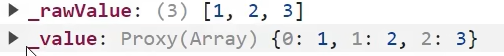
- ref
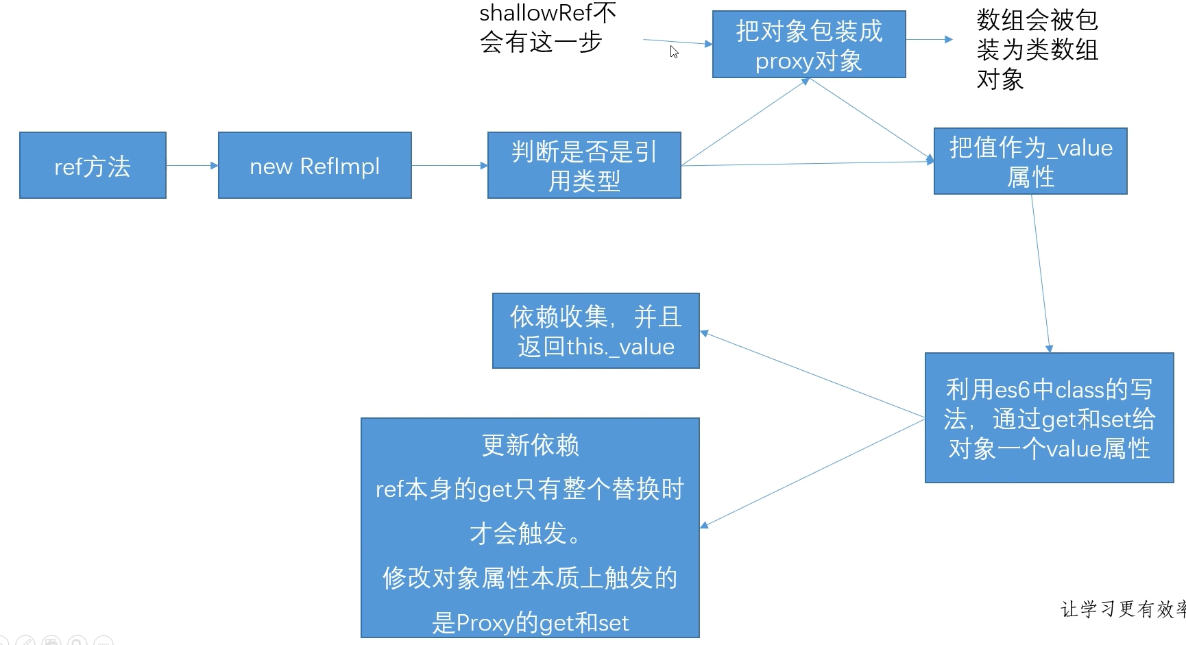
当给ref赋值数组 [1, 2, 3]时,value的值为 {0:1, 1:2, 2:3}; 经过proxy包装后数组会包装成类数组对象
ref 和 shallowRef
ref函数会对嵌套对象的所有属性进行递归地转换为响应式数据。这意味着当对象的属性值发生变化时,视图会自动更新。shallowRef函数只会对对象的第一层属性进行转换为响应式数据。这意味着当对象的属性值发生变化时,只有第一层属性会触发视图更新,而深层属性不会触发更新。
特性
- ref得到变量必须 ‘.value’ 赋值,你染等于把ref变成了普通数据,失去响应式
- ref的值如果是对象,里面的对象是响应式的,因为引用类型会包装成proxy在赋值。所以ref的值如果是对象,可以修改其中的属性而引发响应式
- 如果是浅ref(shallowRef)则对象不会包装成proxy
ref和toRef
- 使用ref修改的变量,具有响应式,通过.value修改值,但实际值是不会变的
- toRef修饰的变量,并不是一个响应式的数据。但实际值是被改变了;当该元素数据重新渲染时,就会显示修改后的数据
render函数和jsx
render函数
vue组件最终也会被编译成render函数,render函数可以动态创建标签,render函数会传入一个createElement参数,在函数中执行createElement() ,接受三个参数。分别为:该元素的html标签名或vue组件,对象( html属性),子元素或该元素文本内容
1 | // 通过render函数创建元素 |
1 | // 通过render函数渲染组件 |
vue 中使用jsx
jsx 模板中跟reate一致,调用参数使用{} ; jsx可以在组件内script中使用; 也可以新建jsx文件,引入vue的defineComponent来生成组件,并暴露出去;参数可以是一个函数,类似于setup();也可以传入一个对象,类似于script标签
1 | // Demo.jsx |
1 | //App.vue 引入 jsx |
自定义指令
在Vue 2中,您可以通过全局方法Vue.directive或在组件选项中的directives属性来创建自定义指令。您可以定义bind,inserted,update和componentUpdated等生命周期钩子函数来处理指令的行为。
1 | // Vue 2 中创建自定义指令 |
在Vue 3中,您可以使用app.directive方法来创建自定义指什。与Vue 2不同,Vue 3中的自定义指令不再具有钩子函数,而是使用mounted和beforeUnmount生命周期函数来处理指令的行为。
1 | // Vue 3 中创建自定义指令 |
el:表示指令绑定的元素。这是一个原生的DOM元素,在指令的钩子函数中可以通过el来操作元素的DOM属性、样式等。binding:是一个对象,包含了指令的信息。binding对象中包含了以下属性:name:指令的名称,不包括v-前缀。value:指令的绑定值,可以是一个变量、表达式或者对象。oldValue:指令之前的绑定值,在update和componentUpdated钩子函数中可用。expression:指令的表达式,通常是一个字符串。arg:指令的参数,如v-custom:arg中的arg。modifiers:一个包含修饰符的对象,如v-custom.modifier中的修饰符。
vnode:表示虚拟节点,是Vue中的一个概念,用来描述DOM节点的JavaScript对象。vnode是一个包含了节点信息的对象,包括节点的标签名、属性、子节点等。在指令的钩子函数中,可以通过vnode获取节点的信息。
vue 拖拽组件
SPA单页面理解,优缺点,如何实现,以及怎么做SEO
什么是SPA
- 是一种网络应用程序或网站的模型, 所有必要的代码都通过单个页面的加载而检索, 想 react、vue、angular都属于SPA
SPA和MPA的区别
单页面应用(SPA) 多页面应用(MPA) 组成 一个主页面和多个页面片段 多个主页面 刷新方式 局部刷新 整页刷新 url模式 哈希模式 历史模式 SEO搜索引擎优化 难实现,可使用SSR方式改善 容易实现 数据传递 容易 通过url、cookie、localStorage等传递 页面切换 速度快,用户体验良好 切换加载资源,速度慢,用户体验差 维护成本 相对容易 相对复杂 - 单页应用优缺点
1
2
3
4
5
6
7
8优点:
1. 具有桌面应用的即时性、网站的可移植性和可访问性
2. 用户体验好、快,内容的改变不需要重新加载整个页面
3. 良好的前后端分离,分工更明确
缺点:
1. 不利于搜索引擎的抓取
2. 首次渲染速度相对较慢SPA原理
- 监听地址栏中
hash或history浏览器历史变化 - 以当前hash为索引,加载对应资源
- 等待资源加载完毕,影藏之前界面,执行回调
- 显示当前界面
- 监听地址栏中
SPA如何做SEO(搜索引擎优化)
SSR服务端渲染
将组件或页面通过服务器生成html,再返回给浏览器
静态化
- 通过程序将动态页面抓取并保存为静态页面,这样的页面的实际存在于服务器的硬盘中
- 通过WEB服务器的
URL Rewrite的方式, 通过web服务器内部模块按一定规则将外部的URL请求转化为内部的文件地址
使用
Phantomjs针对爬虫处理原理是通过
Nginx配置,判断访问来源是否为爬虫,如果是则搜索引擎的爬虫请求会转发到一个node server,再通过PhantomJS来解析完整的HTML,返回给爬虫
v-show和v-if的区别和使用场景
- v**-show与v-if的共同点**
- 当表达式为
true的时候,都会占据页面的位置 - 当表达式都为
false时,都不会占据页面位置
- 当表达式为
- v-show与v-if的区别
- 控制手段不同
- v-show
隐藏则是为该元素添加css–display:none,是直接操作css,没有操作dom v-if显示隐藏是将dom元素整个添加或删除,会操作到dom
- v-show
- 编译过程不同
v-if切换有一个局部编译/卸载的过程,切换过程会销毁和重建内部的事件监听和子组件v-show只是简单的基于css切换,只是隐藏起来,不会出发生命周期
- 编译条件不同
v-if是真正的条件渲染,由false变为true的时候,触发组件的beforeCreate、create、beforeMount、mounted钩子,由true变为false的时候触发组件的beforeDestory、destoryed方法v-show由false变为true的时候不会触发组件的生命周期
- 性能消耗
v-if有更高的切换消耗v-show有更高的初始渲染消耗
- 控制手段不同
- v-show与v-if的使用场景
- 如果需要非常频繁地切换,则使用 v-show
- 如果在运行时条件很少改变,则使用 v-if
vue实例挂在过程
new Vue的时候调用会调用_init方法- 定义
$set、$get、$delete、$watch等方法 - 定义
$on、$off、$emit、$off等事件 - 定义
_update、$forceUpdate、$destroy生命周期
- 定义
- 调用
$mount进行页面的挂载 - 挂载的时候主要是通过
mountComponent方法 - 定义
updateComponent更新函数 - 执行
render生成虚拟DOM _update将虚拟DOM生成真实DOM结构,并且渲染到页面中
Vue main.js 中use() 的原理 ( 案例 组件库开发 [vite] )
use() 方法需传入一个对象,这个对象需要一个install 方法,他会去自动的执行这个对象的install方法
1 | // main.js |
1 | // myUi 组件库的入口文件 index.js |
组件库开发 (vue-vite)
- 步骤
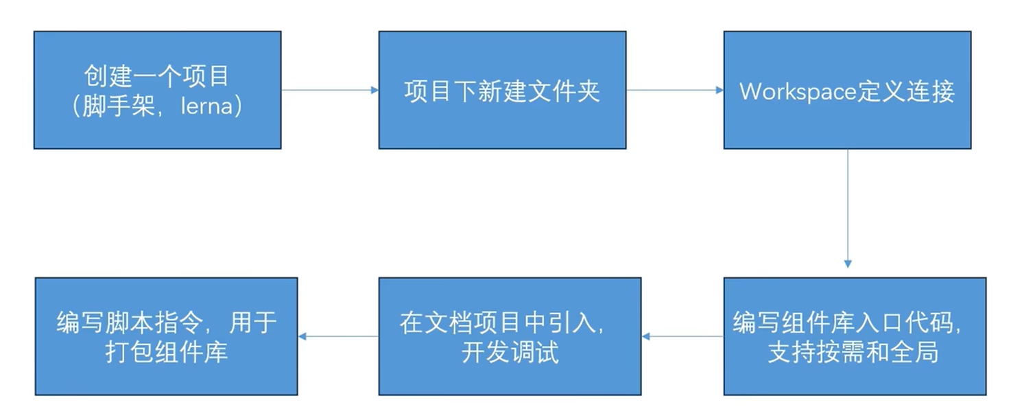
- workspaces定义连接( 需要16版本以上) : 在项目中package.json 中添加
1 | "workspaces":[ |
组件库文件初始化package.json 文件,需映射到model_value文件中
npm install 时会将组件库链接到model_value中,只需改原组件库文件即可
组件库打包
- 新建配置文件 lib.config.js 用来打包组件库
1
2
3
4
5
6
7
8
9
10
11
12
13
14
15
16// 因为组件库使用了vue文件类型
import { defineConfig} from 'vite'
import vue from '@vitejs/plugin-vue'
export default defineConfig({
build: {
lib:{
entry: "./package/myUi/index.js",
name: "myUi"
},
outDir: "lib"
},
plugins: [
vue(),
]
})- 在package.json 中添加打包语句
1
2
3"script": {
"build:myUi": "vite build --lib.config.js"
}打包后会有favicon.io myUipro.mjs myUipro.umd.js
myUipro.mjs 适配import引入
myUipro.umd.js 适配浏览器引入,使用script标签引入
vue生命周期;created和mounted这两个生命周期中请求数据有什么区别
介绍
在
Vue中实例从创建到销毁的过程就是生命周期,Vue生命周期钩子会自动绑定this上下文到实例中生命周期有哪些
Vue生命周期总共可以分为8个阶段:创建前后, 载入前后,更新前后,销毁前销毁后
生命周期 描述 beforeCreate 组件实例被创建之初 created 组件实例已经完全创建 beforeMount 组件挂载之前 mounted 组件挂载到实例上去之后 beforeUpdate 组件数据发生变化,更新之前 updated 组件数据更新之后 beforeDestroy vue3更名为beforeunmount 组件实例销毁之前 destroyed vue3更名为unmount 组件实例销毁之后 activated vue3新增 keep-alive 缓存的组件激活时 deactivated vue3新增 keep-alive 缓存的组件停用时调用 errorCaptured vue3新增 捕获一个来自子孙组件的错误时被调用 - 具体分析
1
2
3
4
5
6
7
8
9
10
11
12
13
14
15
16
17
18
19
20
21
22
23
24
25
26
27
28
29
30
31
32
33
34
35
36
37
38beforeCreate -> created
初始化vue实例,进行数据观测
created
1. 完成数据观测,属性与方法的运算,watch、event事件回调的配置
2. 可调用methods中的方法,访问和修改data数据触发响应式渲染dom,可通过computed和watch完成数据计算
3. 此时vm.$el 并没有被创建
created -> beforeMount
1. 判断是否存在el选项,若不存在则停止编译,直到调用vm.$mount(el)才会继续编译
2. 优先级:render > template > outerHTML
3. vm.el获取到的是挂载DOM的
beforeMount
1. 在此阶段可获取到vm.el
2. 此阶段vm.el虽已完成DOM初始化,但并未挂载在el选项上
beforeMount -> mounted
此阶段vm.el完成挂载,vm.$el生成的DOM替换了el选项所对应的DOM
mounted
vm.el已完成DOM的挂载与渲染,此刻打印vm.$el,发现之前的挂载点及内容已被替换成新的DOM
beforeUpdate
1. 更新的数据必须是被渲染在模板上的(el、template、render之一)
2. 此时view层还未更新
3. 若在beforeUpdate中再次修改数据,不会再次触发更新方法
updated
1. 完成view层的更新
3. 若在updated中再次修改数据,会再次触发更新方法(beforeUpdate、updated)
beforeDestroy
实例被销毁前调用,此时实例属性与方法仍可访问
destroyed
1. 完全销毁一个实例。可清理它与其它实例的连接,解绑它的全部指令及事件监听器
2. 并不能清除DOM,仅仅销毁实例- 使用场景分析
生命周期 描述 beforeCreate 执行时组件实例还未创建,通常用于插件开发中执行一些初始化任务 created 组件初始化完毕,各种数据可以使用,常用于异步数据获取 beforeMount 未执行渲染、更新,dom未创建 mounted 初始化结束,dom已创建,可用于获取访问数据和dom元素 beforeUpdate 更新前,可用于获取更新前各种状态 updated 更新后,所有状态已是最新 beforeDestroy 销毁前,可用于一些定时器或订阅的取消 destroyed 组件已销毁,作用同上 数据请求在created和mouted的区别
created是在组件实例一旦创建完成的时候立刻调用,这时候页面dom节点并未生成;mounted是在页面dom节点渲染完毕之后就立刻执行的;mounted中的请求有可能导致页面闪动; 因为页面dom结构已经生成,所以放在created中更合适!!! 为什么不在beforeCreate中发送请求
- 在
beforeCreate钩子函数中,实例还没有被初始化,发送请求可能会出现数据依赖没有准备好的情况,在created钩子函数中,实例已经初始化完成,方便发送请求并处理数据。
- 在
父组件引入子组件生命周期过程
vue2
父:beforeCreate - 父:created - 父:beforeMount - 子:beforeCreate - 子:created - 子:beforeMount - 子:mounted - 父:mounted
在mounted生命周期之前怎么获取DOM
通过js的事件循环机制,代码会先执行同步的。最后执行异步。只需要在异步方法中获取( 例如 nextTick() )
v-if 和v- for(vue2)
优先级
v-if与v-for都是vue模板系统中的指令; 在vue模板编译的时候,会将指令系统转化成可执行的render函数; 在进行if判断的时候,v-for是比v-if先进行判断;v-for优先级比v-if高注意事项
v-if和v-for同时用在同一个元素上使用
SPA首屏加载慢
减少首屏渲染时间的方法有很多,总的来讲可以分成两大部分 :资源加载优化 和 页面渲染优化
*
加载慢的原因
- 网络延时问题
- 资源文件体积是否过大
- 资源是否重复发送请求去加载了
- 加载脚本的时候,渲染内容堵塞了
解决方案
资源加载优化
减少资源大小
- 代码压缩
- Gzip
- 图片压缩
- 代码拆分
减少http请求次数
- http强缓存
- Service Worker
- 本地缓存( localStorage 等)
- 合并请求( nginx-http-concat 模块、 雪碧图等)
提高http请求响应速度
- CDN
- http弱缓存
- DNS Prefetch
- http2
优化资源加载时机
- 按需加载
- 懒加载
- 预加载( preload 等)
优化资源、 内容加载方式
- 客户端内H5页面可以考虑离线包方式
- 内容直出
页面渲染优化
- 优化html代码
- js外链底部
- css外链顶部
- 减少DOM数量
- 优化js、css代码
- 使用webworker
- 长任务分片执行
- 减少重拍、重绘
- 降低css选择器复杂性
- 优化动画效果
- 使用 requestAnimationFrame
- 使用 transform和 opacity 属性实现动画
- 合理使用 will-change 或 translate 来提升某些元素到新元素的合成
为什么vue2 组件的data属性是一个函数而不是对象,vue2实例可以是函数和对象,Vue3已更改为函数
组件传值
1、父传子
主要用到props属性传递,父组件通过自定义属性给子组件传值,子组件用props接收
1 | // 子组件 |
1 | // 父组件 |
2.子传父
1 | // 子组件 |
1 | // 父组件 |
3.兄弟之间通信
- 一种方法是父组件允当两个子组件之间的中间件
- 全局事件总线—EventBus(可以用于兄弟、爷孙、任意组件通信)
4.父组件充当中间件
假设有A、B、C页面,其中A、B为兄弟组件、C为父组件
1 | // 组件A |
1 | // B组件 |
1 | // A和B的父组件 |
5.全局事件总线—EventBus
1 | // 安装 |
1 | // 父组件 |
1 | // 子组件 |
6.爷孙之间通信
- provide/inject
- EventBus
eventBus上述有讲过这里就不讲了,讲一下provide/inject
爷孙组件无论任何一个组件内的值发生改变,两个组件的值都会进行响应式的数据更新。
1 | // 父组件 |
1 | // 子组件 |
7、任意组件、全局
- provide/inject
- EventBus
- Vuex
- Pinia
vue2与vue3的区别
-
vue2使用的是object.defindperty()
后期添加的属性是获取不到的
vue3使用的是 new Proxy()
后期添加的属性也能获取到
不需要循环属性进行监听
- $set 在vue3中去除了,因为Proxy不需要
- v-if 和v-for 优先级不同
- 生命周期钩子函数不同
- 定义变量和方法不同
- 指令插槽使用不同
- api类型
- 父子传参不同
- ref $children
- vue2使用选择式api;vue3可以使用选择式api,也可以使用组合式api或setup语法糖的形式
使用setup组织代码
vue3 hooks 相当于把一些功能从vue文件中提取出来,封装并抛出,在vue文件中直接导入使用
setup 如何获取this
1 | //创建的js,将其放入到vue全局中 |
1 | //main.js |
1 | //vue组件中使用 |
Vue3常用api
- createApp()
创建一个实例应用;等于Vue2的 ‘ new Vue() ’;
使用场景:写插件或分装全局组件会使用
- provide / inject
依赖注入;其实就是传值;
使用场景: 某父组件传值到后代组件,层次过多传递麻烦,可以使用
缺点: 不好维护及不好查询数据来源
- directive
自定义指令
场景:后台管理系统中按钮权限控制(一个用户拥有某些权限,但只能查看和修改,不能删除)
mixin
全局混入;局部
场景:可以添加生命周期,在小程序的分享功能会用到
缺点: 不好维护和查询数据来源
app.config.globalProperties
获取vue这个全局对象的属性和方法
自己封装插件的时候需要把方法添加到对象中
- nextTick
等待下一次DOM更新刷新的工具方法;nextTick返回一个Pormise,回调函数是放在Promise中,所以是异步执行
场景:dom更新,vue是数据驱动dom,所以数据赋值就要在nextTick进行
computed
计算属性;有缓存
reactuve、ref
用来定义数据和vue2 的data类型
- watch
监听(vue3不需要深度监听)
- markRaw()
不被new Proxy代理,说白了就是静态数据
- defineProps()
父组件传递的值,子组件使用setup的形式,需要用defineProps接收
- defineEmits()
当前组件使用setup形式,自定义事件需要使用defineEmits
- slot
分为匿名、具名、作用域
后台管理系统、左侧是固定菜单、右侧是不固定内容,右侧就是slot
介绍下vue3常用的响应式数据类型
- ref、reactive、toRef、toRefs
1 | //ref 普通数据类型响应式 |
teleport 组件使用场景
类似于传送,将其他元素子元素,传送到其他元素内
场景: 置顶弹窗,将其居中对齐,但并非全屏居中。只要加了
Nuxt解决SSR
- 首先,安装Nuxt.js:
1 | npm install nuxt |
- 创建一个Nuxt.js项目:
1 | npx create-nuxt-app my-nuxt-app |
- 在
nuxt.config.js文件中配置服务器端渲染:
1 | export default { |
- 创建一个页面组件(例如
pages/index.vue):
1 | <template> |
- 运行项目:
1 | npm run dev |
以上代码案例简单展示了如何使用Nuxt.js实现服务器端渲染。当访问应用时,Nuxt.js会在服务端渲染页面内容,并将渲染好的页面发送给客户端。这样可以提高页面加载速度和SEO表现。
vue实例: 重复小组件处理( 弹窗封装)
render函数 jsx 插槽组件
vue更新机制和项目优化
常见渲染问题和优化方案
场景:每次修改倒计时对应的变量,就会引起vue整个组件的跟新机制;如果页面特别庞大,倒计时会频繁的导致diff算法去对比dom,会产生很多内存和新能的消耗
解决:
- 把倒计时区域提取为组件,数据通过props传递给组件,这样更新和对比都只会出发组件本身,而组件的代码非常小,就一个倒计时。所以性能较优;注意传递的时候不要传递ref
- 绕开vue体系,使用原生dom操作,设置innerHTML的方式(简单设置文字内容可以考虑)
vue的更新机制原理
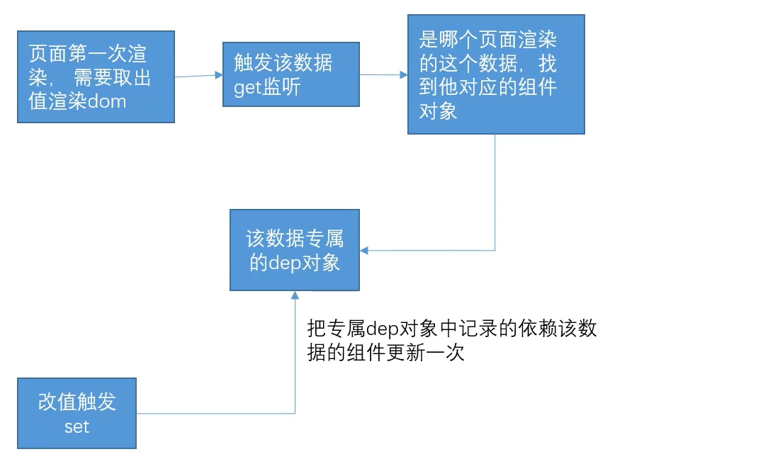
知识点一: vue更新是以组件为最小单位统计的
vue的响应式原理是get和set,set部分在修改数据的时候触发更新,而get会有一个依赖收集的过程
知识点二:更新过程和diff对比策略
总结:
- 如果有一些特别频繁的区域,可以把区域从页面中提取出来作为一个组件。尤其页面比较庞大的时候
- 尽量复用之前的dom,避免相似的结构用v-if 切换
类比react
- react优化需要认为操作,因为react更新并不能获取到修改的dom,反而导致整个页面更新
vue2 和 vue3 的区别
- 在使用上
- 用组合式api代替了选项式api,方便逻辑更加聚合,但是没有this
- 生命周期没有creat; setup等同于create,卸载改成unmount
- vue3中v-if 优先级高于v-for
- 根实例的创建从new App变成了createApp方法
- 一些全局注册,比如mixin,注册全局组件,use改成了用app实例调用,而不是vue类调用
- 新增传送门teleport组件
- template模板可以不包在一个div里
- 原理上
- 响应式原理改成了用proxy,解决了数组无法通过下标修改,无法监听到对象属性的新增和删除问题。也提升了响应效率
- vue3并不是完全抛弃了defineProperty,通过reactive定义的响应式数据使用proxy包装出来,而ref还是用的defineProperty去给一个空对象,定义了一个value属性来做的响应式
- 组合式api的写发下,源码改成了函数式编程,方便按需引入,因为tree-shaking功能必须配合按需引入写法。所以vue3更好地配合tree-sharking能让打包体积更小
- 性能优化,增加了静态节点标记。会标记静态节点,不对静态节点进行对比。从而增加效率
- 进阶
- vue3不推荐使用mixin进行复用逻辑提取,而是推荐写成hook
- v-model应用于组件时,监听的事件和传递的值改变
- 更好的配合ts
全家桶-vueRoute
1 | import {createRouter, createWebHashHistory, createWebHistory} from "vue-route" |
- vue2路由传参
1 | // 路由配置 |
- vue3路由传参
1 | import { useRoute, useRouter } from 'vue-router'; |
- 路由定义别名alias 和 name属性
1 | const routes = [ |
- routerView 和 routerLink 标签
1 | <template> |
嵌套路由( 子路由 )和共享组件
1
2
3
4
5
6
7
8
9
10
11
12
13
14
15
16
17
18
19
20
21
22
23
24const routes = [
{
path: "/",
// 别名
alias: ['/home','/index'], // 在浏览器中 /home 也可以跳转这个路由
name: 'userList',
component: ()=> import("../views/index.vue"), //父组件需要routerView 来渲染子路由页面
// 子路由
children: [
{
path: "", // 不填为默认子路由,
component: ()=>import("@/views/vip/default.vue")
},
{
path: "order", // 不填为默认子路由,
component: ()=>import("@/views/vip/order.vue")
},
{
path: "info", // 不填为默认子路由,
component: ()=>import("@/views/vip/info.vue")
},
]
},
]全局路由守卫
1 | router.beforeEach(to,from,next)=>{ |
全家桶-Vuex
vuex概述+ 工作流程
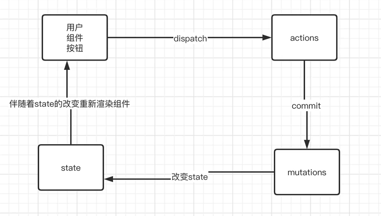
uex 是一个专门为 Vue.js 应用程序开发的状态管理模式库,用于管理应用程序中所有组件的状态。
用户通过
dispatch触发 actions ,actions 通过commit将数据提交到 mutations ,通过mutations改变state中的参数,从而伴随state数据的改变重新渲染页面action 支持的是异步操作( 与后端调用接口异步); mutations 支持是同步操作
!!! 用户可以直接操作mutations修改数据
基本使用
- 安装vuex
1
npm install vuex --save
- 创建store对象
1
2
3
4
5
6
7
8
9
10
11
12
13
14
15
16
17
18
19
20
21
22
23
24
25// store.js
import Vuex from 'vuex'
// 创建一个 Vuex store 实例
// import { createStore } from 'vuex'
// vue3 使用const store = new createStore({}) 创建
const store = new Vuex.Store({
state: {
// 定义一些状态
count: 1
},
mutations: {
// 定义一些更改状态的方法
increment (state) {
// 变更状态
state.count++
}
},
actions: {
// 定义一些异步操作
},
getters: {
// 定义一些派生状态
}
});
export default store;- vuex 挂载到vue 实例
1
2
3
4
5
6
7
8
9
10
11
12
13
14
15
16
17
18
19
20
21
22
23
24
25// vue2 main.js
// 引入 Vuex 和 Vue
import Vue from 'vue'
import Vuex from 'vuex'
import App from './App.vue'
import { store } from './store'
Vue.config.productionTi
// 使用 Vuex 插件
Vue.use(Vuex)
// 创建一个 Vue 实例
new Vue({
store, // 将 Vuex store 挂载到 Vue 实例中,在组件中可以使用this.$store调用store
// 其他配置项
render: h=>h(App)
}).$mount('#app')
//++++++++++++++++
// vue3 main.js
// 引入 Vuex 和 createApp
import { createApp } from 'vue'
import { provide } from '@vueuse/core'
import { store } from './store' // 导入你的 Vuex store
import router from './router/index.js'核心属性
state
State就是提供公共数据的
1
2
3
4
5
6
7
8
9// store.js
import Vuex from 'vuex'
// 创建一个 Vuex store 实例
const store = new Vuex.Store({
state: {
// 定义一些状态
count: 1
},
)}所有共享的数据都要统一放到Store的State中进行存储
1
2
3
4
5
6
7
8
9
10
11
12
13
14
15
16
17
18
19
20
21
22
23
24
25
26
27
28
29
30
<script>
//Vue2用法
import {mapState} from 'vuex'
import {mapGetters} from 'vuex'
app = new Vue({
date(): {
return {}
},
// 将store全局数据,映射为当前组件的计算属性
computed: {
count () {
return this.$store.state.count
},
//vue2 除了用this.$store 调用store 还可以使用按需导入的方法,使用辅助函数mapState()
...mapState(['count']),
}
})
// vue3
import { useStore } from 'vuex'
export default {
setup () {
const store = useStore() // store.count调用
}
}
</script>Getters
从 store 中的获取state 中状态
1
2
3
4
5
6
7
8
9
10
11
12// store.js
const store = Vuex.Store({
state: {
count: 0
},
getters: {
//Getter 接受 state 作为其第一个参数
showNumber (state) {
return `返回的count数据为:${state.count}`
},
}
})1
2
3
4
5
6
7
8
9
10
11
12
13
14
15
16
17
18
19
20
21
22
23
24
25
26
27
28
29
30
31
32
33
34
35
36
37
38<template>
<!-- 第一种方法可以直接调用插值表达式 -->
<div>
{{$store.getter.showNum}}
</div>
<div>
{{showNum}}
</div>
</template>
<script>
// vue2
// 导入辅助函数 mapGetters
import {mapMutations} from 'vuex'
app = new Vue({
date(): {
return {}
},
computed: {
// 方法二 直接将方法挂载到实例上,后续通过this.add()调用
...mapGetters(['showNum'])
}
})
</script>
// vue3
<template>
<!-- 第一种方法可以直接调用插值表达式 -->
<div>
{{store.getters.showNum}}
</div>
</template>
<script>
import {useStore} from 'vuex'
const store = useStore()
</script>mutations
mutation 非常类似于事件,更改 Vuex 的 store 中的状态的唯一方法是提交 mutation,每个 mutation 都有一个字符串的事件类型 (type)和一个回调函数 (handler)
- 只能通过mutation变更Store数据,不可以直接操作Store中的数据
- 通过这种方式虽然操作起来稍微繁琐一些,但是可以集中所有数据的变化,方便后期
1
2
3
4
5
6
7
8
9
10
11
12// ./store.js
const store = Vuex.Store({
state: {
count: 1
},
mutations: {
add (state) {
// 变更状态
state.count++
}
}
})1
2
3
4
5
6
7
8
9
10
11
12
13
14
15
16
17
18
19
20
21
22
23
24
25
26
27
28
29
30
31
32
33
<script>
// vue2
import {mapState} from 'vuex'
// 按需导入辅助函数 mapMutations
import {mapMutations} from 'vuex'
app = new Vue({
date(): {
return {}
},
methods: {
// 方法二 直接将方法挂载到实例上,后续通过this.add()调用
// 通过刚才导入的mapMutations函数,将需要的mutations函数,映射为当前组件的methods方法
...mapMutations(['add']),
btnHandle(num){
this.add(num)
}
// 方法一 this.$store.commit('add') 调用
hendel(){
//触发mutations
this.$store.commit('add')
},
}
})
//vue3
import {useStore} from 'vuex'
const store = useStore()
// 触发mutations的add()
const handle = ()=>{
store.commit('add')
}
</script>Mutations 传参 ( 提交载荷)
向
store.commit传入额外的参数,即 mutation 的载荷(payload)1
2
3
4
5
6
7
8
9
10
11
12// ./store.js
const store = Vuex.Store({
state: {
count: 1
},
mutations: {
add (state, numberStep) {
// 变更状态
state.count += numberStep
}
}
})1
2
3
4
5
6
7
8
9
10
11
12
13
14
15
16
17
18
19
20
21
22
23
24
25
26<script>
// vue2
import {mapState} from 'vuex'
app = new Vue({
date(): {
return {}
},
methods: {
...mapMutations(['add']),
btnHandle(num){
this.add('add',num)
},
hendel(){
// 触发mutations
this.$store.commit('add',3)
},
}
})
//vue3
import {useStore} from 'vuex'
const store = useStore()
// 触发mutations的add()
const handle = ()=>{
store.commit('add',3)
}
</script>Actions
Actions 类似于 mutations,不同在于:
- Actions 提交的是 mutations,而不是直接变更状态。
- Actions 可以包含任意异步操作。
1
2
3
4
5
6
7
8
9
10
11
12
13
14
15
16
17
18
19
20// ./store.js
const store = Vuex.Store({
state: {
count: 1
},
mutations: {
add (state, numStep) {
// 变更状态
state.count++
}
},
// 触发actions 异步任务时携带参数
actions: {
addAsync(context, numStep) {
setTimeout(()={
context.commit('add', numStep)
},1000)
}
}
})1
2
3
4
5
6
7
8
9
10
11
12
13
14
15
16
17
18
19
20
21
22
23
24
25
26
27
28
29
30
31
32
33
34
35
36<script>
// vue2
import {mapState} from 'vuex'
// 导入辅助函数 mapActions
import {mapActions} from 'vuex'
app = new Vue({
date(): {
return {}
},
methods: {
//第二种, 直接将方法挂载到实例上,this.addAsync(num)调用
...mapActions(['addAsync'])
btnHandle(num){
this.addAsync(num)
}
handle(num){
// 第一种方式,通过this.$store调用dispatch函数触发action
this.$store.dispatch('addAsync', num)
}
}
})
</script>
<script>
// vue3
import {useStore} from 'vuex'
const store = useStore()
hendle = (num)=>{
store.dispatch('addAsync', num)
}
</script>Module
Vuex 允许我们将 store 分割成模块(module)。每个模块拥有自己的 state、mutation、action、getter、甚至是嵌套子模块——从上至下进行同样方式的分割
1
2
3
4
5
6
7
8
9
10
11
12
13
14
15
16
17
18
19
20
21
22const moduleA = {
state: () => ({ ... }),
mutations: { ... },
actions: { ... },
getters: { ... }
}
const moduleB = {
state: () => ({ ... }),
mutations: { ... },
actions: { ... }
}
const store = createStore({
modules: {
a: moduleA,
b: moduleB
}
})
store.state.a // -> moduleA 的状态
store.state.b // -> moduleB 的状态
Vuex刷新页面数据丢失,怎么做数据持久化
- 使用pinia, 相比较vuex,更轻便,使用也更方便
- 存储在localStorage
Pinia
pinia优缺点
pinia 是轻量级状态管理工具,大小只有1KB.
pinia 刷新数据不会丢失
pinia 模块化设计,方便拆分。
pinia 没有 mutations,直接在 actions 中操作 state
pinia 支持多个 store。
pinia 基本使用
- 安装
1
2
3npm install pinia
yarn add pinia
如果使用vue2, 还需要安装组合式api包 @vue/composition-api- 引入
1
2
3
4
5
6
7
8
9
10
11
12
13
14
15
16
17
18
19
20
21
22// vue2 main.js
import Vue from 'vue'
import Vuex from 'vuex'
import App from './App.vue'
import {createPinia, piniaVuePlugin} from 'pinia'
Vue.use(PiniaVuePlugin)
const pinia = createPinia()
new Vue({
render: h=>h(App)
pinia
}).$mount('#app')
// vue3 main.js
// 引入 Vuex 和 createApp
import { createApp } from 'vue'
import App from 'App.vue'
import { provide } from '@vueuse/core'
import {createPinia} from 'pinia'
import router from './router/index.js'
App.createApp().use(router).use(createPinia()).mount('#app')- 创建pinia 实例
1
2
3
4
5
6
7
8
9
10
11
12
13
14
15// ./store.js
import {defineStore} from 'pinia'
// 第一个参数是容器id,唯一
export const Store = defineStore('main', {
// state 必须是箭头函数
// 函数可以在服务端渲染避免交叉请求导致数据污染
// 箭头函数是为了更好的ts类型推导
state:()=>{
return {
count: 0
}
},
getters: {},
actions: {}
})- 使用pinia 实例
1
2
3
4
5
6
7
8
9
10
11
12
13
14// app.vue
<template>
<div>
{{store.count}}
</div>
</template>
<script>
import {storeToRefs} from 'pinia'
import { Store } from './store.js'
// 方法一
const store = Store()
// 方法二 解构 ,不使用storeToRefs得到的数据不是响应式
const {count} = storeToRefs(store)
</script>状态更新
- actions
1
2
3
4
5
6
7
8
9
10
11
12
13
14
15// ./store.js
import {defineStore} from 'pinia'
export const Store = defineStore('main', {
state:()=>{
return {
count: 0
}
},
getters: {},
actions: {
changeCount(){
this.count++
}
}
})1
2
3
4
5
6
7
8
9
10
11
12
13// app.vue
<template>
<div>
{{store.count}}
</div>
</template>
<script>
import {storeToRefs} from 'pinia'
import { Store } from './store.js'
const store = Store()
// 触发action直接修改state
store.changeCount()
</script>- getters
1
2
3
4
5
6
7
8
9
10
11
12
13
14
15
16
17
18
19
20// ./store.js
import {defineStore} from 'pinia'
export const Store = defineStore('main', {
state:()=>{
return {
count: 0
}
},
// 有缓存功能,只会调用一次
getters: {
getCount(){
return `count: ${this.count}`
}
},
actions: {
changeCount(){
state.count++
}
}
})1
2
3
4
5
6
7
8
9
10
11
12<template>
<div>
{{store.getCount}}
</div>
</template>
<script>
import {storeToRefs} from 'pinia'
import { Store } from './store.js'
const store = Store()
// 触发action直接修改state
const countReturn = store.getCount()
</script>
Nuxt3框架 ( 服务端渲染)
基础知识
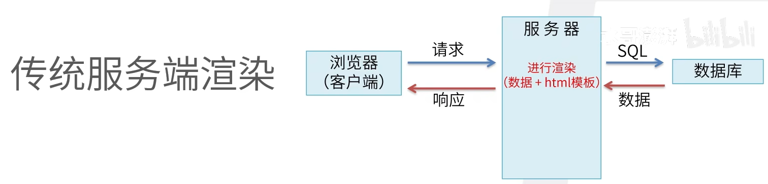
什么是SSR
服务器渲染,指的是在服务器上完成网页渲染并将其他送给客户端的过程
为什么需要SSR
SSR发送给客户端的是包含了完整内容的网页,这样用户可以先看到网页内容,而不需要等待( 网页加载>执行)js>加载数据>渲染网页), 从而提升用户体验;另一方面,因为网页内容已经包含了具体内容,对SEO也更加友好
SSR 优点 , 加载速度快,页面切换时不会全部重新加载
SSR 一般构成
- 服务器段应用程序
- 路由
- 模板引擎
- 数据获取
- 状态管理
- 客户端交互
Nuxt3 的SSR组件
<suspense>与异步组件useAsyncData和useLazyAsycDatauseFetch和useLazyFetch- 用
process.client和<client-only>来处理仅限浏览器内部使用的功能 - 用
process.server来处理仅限服务器使用的功能
Nuxt3 的渲染规则与缓存处理
3中不同的渲染模式:
- SSR:默认,即在服务器端渲染之后再发给客户端
- ISR:部署后,渲染之后即保留缓存至下次渲染
- SWR:保留缓存,并在指定时间后校验缓存
- prerender:部署时生成静态页面
鉴别用户身份
传统SPA,所有请求都是后请求吗,这些请求,可以认为完全由开发者控制。
Nuxt,因为SSR的存在,请求会被分成两类,页面渲染类和数据交互类。在网络环境里,存在大量缓存节点。如果将用户相关数据渲染成html,缓存到CDN里,会造成数据安全隐患。所以Nuxt在SSR机器内部发起请求时,不会携带cookie。用户主动发起请求,才会携带cookie
框架安装
安装命令
1
npx create-nuxt-app <项目名> || yarn create-nuxt-app <项目名>
选了SSR渲染模式,运行时会执行两个server,因为是SSR在服务器返回渲染好的html
基本路由 (Nuxt 框架的路由可以根据文件自动生成)
- 项目根目录
1 | // app.vue |
- 路由组件
1 | // 创建 /pages/about.vue - 对应路由地址为 /about - 需要重启 |
- 创建带目录的路由组件
1 | // 创建 /pages/users/createEdit.vue - 对应地址为 /user/createEdit |
- 默认路由组件
1 | // 创建 /pages/index.vue - 对应地址为 / |
- 路由导航跟传参
1 | // 路由跳转 使用原生a标签会导致刷新 |
1 | // 路由传参 |
- 自定义路由
1 | // /app/router.options.ts |
使用组件
当在components下创建的vue会被当做全局组件,可以直接调用,其他用法与vue类似
如果在components下创建xxx.vue ; 则直接使用
如果在components下创建 user/userList.vue ; 则直接使用
布局处理
- 可以使用
- 可以去掉app.vue , 创建 /layouts/default.vue 路由内容使用
- 如果要想使用app.vue ,又要layout生效。可以再app.vue中使用
1 | // app.vue |
SEO配置
- 在html中加入mate标签信息 (这个方式不允许使用响应式数据)
1 | // nuxt.config.ts |
- 另一种方法时在app.vue 标签中使用useHead() 参数是一个对象, 也就是上面nuxt.config.ts 中的app.head的属性内容 (可以使用响应式数据)
1 | // app.vue |
- 第三种方法可以在 中使用 ,首字母需要大写,可以使用响应式数据
1 | // app.vue |
静态资源缓存
public/ 目录相当于服务器的根目录 路径:/
assets/ css 图片等 路径:~/assets/
1 | // nuxt.config.ts |
配置与访问
- nuxt.config.ts
1 | // nuxt.config.ts |
1 | // .env 设置了 会覆盖 nuxt的runtimeConfig的变量 |
1 | <template> |
- app.config.ts 与nuxt.config.ts 类似
获取数据
axios (与vue类似,可以封账使用)
内置函数 useFetch() 返回一个promise
1
2
3
4
5
6
7
8
9
10
11
12
13
14
15
16
17
18
19<script setup>
const {data:users, pending, refresh, error } = awiat useFetch('/post',{
method: 'GET',
baseURL: "/api/user",
}).then(res => {
console.log(res)
})
/**
返回值
data: 请求结果
pending: 一个布尔值,指示是否任在获取数据
refresh:可用于刷新处理程序函数返回的数据函数
error:如果数据获取失败,则返回错误对象
*/
/**
refresh() 调用会自动取消之前请求,继续发送新请求
*/
</script>1
2
3
4
5
6
7
8
9
10
11<script>
// 使用useAsyncData()
useAsyncData('获取用户列表', ()=>$fetch('/post', {
method: 'GET',
baseURL: "/api/user",
})).then(res => {
console.log(res)
})
</script>userFetch() useAsyncData() 和 useLazyFetch() useLazyAsyncData() 区别
加了lazy的在请求发送时,首先更新页面,数据为空,获取到数据后再显示数据 (只有在网速慢时能体验到)
没有加lazy的请求方法, 会等待数据加载完后,再整体更新页面
请求拦截器 和 响应拦截器
onRequest() onResponse()
1
2
3
4
5
6
7
8
9<script setup>
const { data } = await useLazyFetch('/post',{
method: 'GET',
params: { id:3 },
baseURL: "/api/user",
onRequest({request, options}){console.log("请求拦截器")},
onResponse({request, options, response}){console.log("响应拦截器")}
})
</script>

cookie 和 token 处理
SSR服务器端渲染没法拿到浏览器端的cookie存储,所以需要获取请求中的cookie,然后带到下一个请求的请求头中
1 | <script setup> |
服务端接口
接口编写
1
2
3
4
5
6
7// 创建文件 server/api/hello.js 响应接口路径: /api/hello
export default defineEventHandler((event) => {
return {
code: 10001,
msg: 'hello work'
}
})1
2
3
4
5
6
7// 创建文件 server/routes/hello.js 响应接口路径:/hello
export default defineEventHandler((event) => {
return {
code: 10001,
msg: 'hello work'
}
})路由参数设计
1
2
3
4
5
6// 创建文件 server/api/hello/[name].ts 响应接口路径:/api/hello/userName
export default defineEventHandler((event) => {
// 获取参数
const userName = event.context.params.name
return userName
})1
2
3
4
5
6// 创建文件 server/api/user.ts 响应接口路劲: /api/user?name=123&age=321
export default defineEventHandler((event) => {
// 获取参数
const query = getQuery(event)
return query
})路由请求方式设定
通过 .get .post .put .delete
1
2// GET 创建文件 server/api/user.get.ts GET 方式接口请求
// POST 创建文件 server/api/user.post.ts POST 方式接口请求处理带有body的post请求
1
2
3
4
5// 创建文件 server/api/user.post.ts 响应接口: /api/user 请求数据在请求体
export default defineEventHandler(async (event)=>{
const body = await readBody(event)
return body
})[…].ts 路由文件
1 | // 创建文件 server/[...].ts 相应接口:当访问不存在接口时,就会响应该接口 |
获取运行时的配置 和 cookie
1
2
3
4
5export default defineEventHandler((event)=>{
const config = userRuntimeConfig()
const cookies = parseCookies(event)
return { config, cookie }
})另一种写法
1
2
3
4import {createRouter} from 'h3'
const router = createRouter()
router.get('/', ()=> 'hello word')
export default router设置数据库存储
1
2
3
4
5
6
7
8
9
10
11
12
13
14
15export default defineNuxtConfig({
nitro: {
storage: {
'redis':{
driver: 'redis',
port: 6379,
host:"127.0.0.1",
username: "root",
password: "root",
db: 0,
tls: {}
}
}
}
})1
2
3
4
5
6
7
8
9
10
11
12
13
14// post请求保存到redis数据库
// 创建 server/api/test.post.ts
export default defineEventHandler(async(event)=>{
const body = await readBody(event)
await userStorage().setItem('redis:test', body)
return 'Data is set'
})
// 创建 server/api/test.get.ts
// get 请求并保存数据到redis
export default defineEventHandler((async(event)=>{
const data = await useStorage().getItem('redis:test')
return data
}))
状态管理
构建-部署
使用PM2
PM2可以用于生产环境的Nodejs的进程管理,并且它内置一个负载均衡
它不仅可以保证服务不会中断一直在线,并且提供0秒reload功能
安装: npm i pm2 -g
创建并编辑:ecosystem.config.js
1 | // 在 打包后的 .out 文件夹下创建 ecosystem.config.js |
- 开启pm2管理 pm2 start
- 查看开启项目 pm2 ls
- 停止项目 pm2 stop
- 重新启动 pm2 restart
- 删除项目 pm2 delete
路由渲染策略
1 | export default defineNuxtConfig({ |
生命周期
服务端生命周期
nuxtServerInit(store, context) {}
store: vuex上下文
context:nuxt上下文
middlware(store, route, redirect, params, query, req, res){} 导航守卫验证
validate( {params,query} )
Vue3 —> Nuxt3 (SPA->SSR)
Pug 模版引擎
TS项目经验 (G:\代码库\前端\web大前端练习库\Typescript)
用来做什么
ts最大意义就是,避免你写错,漏写,能基本上屏蔽你的低级错误
- 编写一些共用方法和全局配置对象,用于提醒使用者别传错或者参数值
- 编写组件的时候用于提示使用者有没有写错props
- 一些第三方库如果是ts编写,可以检测到你有没有调用错方法,写错配置
常见问题
- 现阶段类型不匹配,ts报错 // 断言
- 调用ts编写的第三方库时,需要定义某个东西为第三方库类型 // 如果第三方定义了类型,可以可以从第三方库中传入类型 ; 一般是在pageage.json ,type参数中
- 一些常见的dom类报错 //断言
CSS
盒子模型的理解
浏览器的渲染引擎会根据CSS 基础框盒模型,将所有元素表示为一个个矩形的盒子,盒子由四个部分组成:content、padding、border、margin
CSS 中的 box-sizing 属性定义了引擎应该如何计算一个元素的总宽度和总高度
1 | box-sizing: content-box|border-box|inherit: |
- content-box 默认值,元素的 width/height 不包含padding,border,与标准盒子模型表现一致
- border-box 元素的 width/height 包含 padding,border,与怪异盒子模型表现一致
- inherit 指定 box-sizing 属性的值,应该从父元素继承
css选择器有哪些?优先级?哪些属性可以继承?
一、常用:
id选择器(#box),选择id为box的元素
类选择器(.one),选择类名为one的所有元素
标签选择器(div),选择标签为div的所有元素
后代选择器(#box div),选择id为box元素内部所有的div元素
子选择器(.one>one_1),选择父元素为.one的所有.one_1的元素
相邻同胞选择器(.one+.two),选择紧接在.one之后的所有.two元素
群组选择器(div,p),选择div、p的所有元素
伪类选择器
1
2
3
4
5
6:link :选择未被访问的链接
:visited:选取已被访问的链接
:active:选择活动链接
:hover :鼠标指针浮动在上面的元素
:focus :选择具有焦点的
:first-child:父元素的首个子元素伪元素选择器
1
2
3
4:first-letter :用于选取指定选择器的首字母
:first-line :选取指定选择器的首行
:before : 选择器在被选元素的内容前面插入内容
:after : 选择器在被选元素的内容后面插入内容属性选择器
1
2
3
4[attribute] 选择带有attribute属性的元素
[attribute=value] 选择所有使用attribute=value的元素
[attribute~=value] 选择attribute属性包含value的元素
[attribute|=value]:选择attribute属性以value开头的元素
CSS3中新增的选择器有如下:
层次选择器(p~ul),选择前面有p元素的每个ul元素
伪类选择器
1
2
3
4
5
6
7
8
9
10
11
12
13:first-of-type 表示一组同级元素中其类型的第一个元素
:last-of-type 表示一组同级元素中其类型的最后一个元素
:only-of-type 表示没有同类型兄弟元素的元素
:only-child 表示没有任何兄弟的元素
:nth-child(n) 根据元素在一组同级中的位置匹配元素
:nth-last-of-type(n) 匹配给定类型的元素,基于它们在一组兄弟元素中的位置,从末尾开始计数
:last-child 表示一组兄弟元素中的最后一个元素
:root 设置HTML文档
:empty 指定空的元素
:enabled 选择可用元素
:disabled 选择被禁用元素
:checked 选择选中的元素
:not(selector) 选择与 <selector> 不匹配的所有元素属性选择器
1
2
3[attribute*=value]:选择attribute属性值包含value的所有元素
[attribute^=value]:选择attribute属性开头为value的所有元素
[attribute$=value]:选择attribute属性结尾为value的所有元素
二、优先级
内联 > ID选择器 > 类选择器 > 标签选择器
经过上面的优先级计算规则,我们知道内联样式的优先级最高,如果外部样式需要覆盖内联样式,就需要使用!important
三、继承属性
字体系列属性
1
2
3
4
5
6font:组合字体
font-family:规定元素的字体系列
font-weight:设置字体的粗细
font-size:设置字体的尺寸
font-style:定义字体的风格
font-variant:偏大或偏小的字体
文本系列属性
1
2
3
4
5
6
7
8text-indent:文本缩进
text-align:文本水平对刘
line-height:行高
word-spacing:增加或减少单词间的空白
letter-spacing:增加或减少字符间的空白
text-transform:控制文本大小写
direction:规定文本的书写方向
color:文本颜色
元素可见性
1
visibility
表格布局属性
1
2
3
4
5caption-side:定位表格标题位置
border-collapse:合并表格边框
border-spacing:设置相邻单元格的边框间的距离
empty-cells:单元格的边框的出现与消失
table-layout:表格的宽度由什么决定列表属性
1
2
3list-style-type:文字前面的小点点样式
list-style-position:小点点位置
list-style:以上的属性可通过这属性集合引用
1
quotes:设置嵌套引用的引号类型
光标属性
1
cursor:箭头可以变成需要的形状
继承中比较特殊的几点:
- a 标签的字体颜色不能被继承
- h1-h6标签字体的大下也是不能被继承的
四、无继承的属性
- display
- 文本属性:vertical-align、text-decoration
- 盒子模型的属性:宽度、高度、内外边距、边框等
- 背景属性:背景图片、颜色、位置等
- 定位属性:浮动、清除浮动、定位position等
- 生成内容属性:content、counter-reset、counter-increment
- 轮廓样式属性:outline-style、outline-width、outline-color、outline
- 页面样式属性:size、page-break-before、page-break-after
说说em/px/rem/vh/vw区别
一、介绍
传统的项目开发中,我们只会用到px、%、em这几个单位,它可以适用于大部分的项目开发,且拥有比较良好的兼容性
从CSS3开始,浏览器对计量单位的支持又提升到了另外一个境界,新增了rem、vh、vw、vm等一些新的计量单位
二、单位
| CSS单位 | |
|---|---|
| 相对长度单位 | em、ex、ch、rem、vw、vh、vmin、vmax、% |
| 绝对长度单位 | cm、mm、in、px、pt、pc |
px
px为绝对单位,在于px的大小和元素的其他属性无关em
em是相对长度单位。相对于当前对象内文本的字体尺寸。如当前对行内文本的字体尺寸未被人为设置,则相对于浏览器的默认字体尺寸(
1em = 16px)- em 的值并不是固定的
- em 会继承父级元素的字体大小
- em 是相对长度单位。相对于当前对象内文本的字体尺寸。如当前对行内文本的字体尺寸未被人为设置,则相对于浏览器的默认字体尺寸
- 任意浏览器的默认字体高都是 16px
rem
rem,相对单位,相对的只是HTML根元素font-size的值
特点:
- rem单位可谓集相对大小和绝对大小的优点于一身
- 和em不同的是rem总是相对于根元素,而不像em一样使用级联的方式来计算尺寸
- vh、vw
vw ,就是根据窗口的宽度,分成100等份,100vw就表示满宽,50vw就表示一半宽。(vw 始终是针对窗口的宽),同理,vh则为窗口的高度
- 对于普通定位元素就是我们理解的父元素
- 对于position: absolute;的元素是相对于已定位的父元素
- 对于position: fixed;的元素是相对于 ViewPort(可视窗口)
三、总结
px:绝对单位,页面按精确像素展示
em:相对单位,基准点为父节点字体的大小,如果自身定义了font-size按自身来计算,整个页面内1em不是一个固定的值
rem:相对单位,可理解为root em, 相对根节点html的字体大小来计算
vh、vw:主要用于页面视口大小布局,在页面布局上更加方便简单
css中,有哪些方式可以隐藏页面元素?区别?
通过css实现隐藏元素方法有如下:
display:none
特点:元素不可见,不占据空间,无法响应点击事件
visibility:hidden
特点:元素不可见,占据页面空间,无法响应点击事件
opacity:0
不会引发重排,一般情况下也会引发重绘
特点:改变元素透明度,元素不可见,占据页面空间,可以响应点击事件
设置height、width模型属性为0
如果元素内有子元素或内容,还应该设置其
overflow:hidden来隐藏其子元素特点:元素不可见,不占据页面空间,无法响应点击事件
position:absolute
将元素移出可视区域
特点:元素不可见,不影响页面布局
clip-path
通过裁剪的形式
特点:元素不可见,占据页面空间,无法响应点击事件
区别
| display: none | visibility: hidden | opacity: 0 | |
|---|---|---|---|
| 页面中 | 不存在 | 存在 | 存在 |
| 重排 | 会 | 不会 | 不会 |
| 重绘 | 会 | 会 | 不一定 |
| 自身绑定事件 | 不触发 | 不触发 | 可触发 |
| transition | 不支持 | 支持 | 支持 |
| 子元素可复原 | 不能 | 能 | 不能 |
| 被遮挡的元素可触发事件 | 能 | 能 | 不能 |
谈谈你对BFC的理解
一、是什么
BFC目的是形成一个相对于外界完全独立的空间,让内部的子元素不会影响到外部的元素
二、触发条件
触发BFC的条件包含不限于:
- 根元素,即HTML元素
- 浮动元素:float值为left、right
- overflow值不为 visible,为 auto、scroll、hidden
- display的值为inline-block、inltable-cell、table-caption、table、inline-table、flex、inline-flex、grid、inline-grid
- position的值为absolute或fixed
三、应用场景
- 防止margin重叠(塌陷)
1 | <style> |
两个p元素之间的距离为100px,发生了margin重叠(塌陷),以最大的为准,如果第一个P的margin为80的话,两个P之间的距离还是100,以最大的为准。
前面讲到,同一个BFC的俩个相邻的盒子的margin会发生重叠
可以在p外面包裹一层容器,并触发这个容器生成一个BFC,那么两个p就不属于同一个BFC,则不会出现margin重叠
1 | <style> |
- 清除内部浮动
1 | <style> |
而BFC在计算高度时,浮动元素也会参与,所以我们可以触发.par元素生成BFC,则内部浮动元素计算高度时候也会计算
- 自适应多栏布局
这里举个两栏的布局
1 | <style> |
前面讲到,每个元素的左外边距与包含块的左边界相接触
因此,虽然.aslide为浮动元素,但是main的左边依然会与包含块的左边相接触
而BFC的区域不会与浮动盒子重叠
所以我们可以通过触发main生成BFC,以此适应两栏布局
1 | .main { |
这时候,新的BFC不会与浮动的.aside元素重叠。因此会根据包含块的宽度,和.aside的宽度,自动变窄
元素水平垂直居中的方法有哪些?如果元素不定宽高呢?
- 居中元素(子元素)的宽高已知
- 居中元素宽高未知
一、实现方式
实现元素水平垂直居中的方式:
利用定位+margin:auto
1
2
3
4
5
6
7
8
9
10
11
12
13
14
15
16
17
18
19
20
21
22<style>
.father{
width:500px;
height:300px;
border:1px solid #0a3b98;
position: relative;
}
.son{
width:100px;
height:40px;
background: #f0a238;
position: absolute;
top:0;
left:0;
right:0;
bottom:0;
margin:auto;
}
</style>
<div class="father">
<div class="son"></div>
</div>利用定位+margin:负值
1
2
3
4
5
6
7
8
9
10
11
12
13
14
15
16
17
18
19
20
21<style>
.father {
position: relative;
width: 200px;
height: 200px;
background: skyblue;
}
.son {
position: absolute;
top: 50%;
left: 50%;
margin-left:-50px;
margin-top:-50px;
width: 100px;
height: 100px;
background: red;
}
</style>
<div class="father">
<div class="son"></div>
</div>利用定位+transform
1
2
3
4
5
6
7
8
9
10
11
12
13
14
15
16
17
18
19
20<style>
.father {
position: relative;
width: 200px;
height: 200px;
background: skyblue;
}
.son {
position: absolute;
top: 50%;
left: 50%;
transform: translate(-50%,-50%);
width: 100px;
height: 100px;
background: red;
}
</style>
<div class="father">
<div class="son"></div>
</div>table布局
1
2
3
4
5
6
7
8
9
10
11
12
13
14
15
16
17
18
19<style>
.father {
display: table-cell;
width: 200px;
height: 200px;
background: skyblue;
vertical-align: middle;
text-align: center;
}
.son {
display: inline-block;
width: 100px;
height: 100px;
background: red;
}
</style>
<div class="father">
<div class="son"></div>
</div>flex布局
1
2
3
4
5
6
7
8
9
10
11
12
13
14
15
16
17
18<style>
.father {
display: flex;
justify-content: center;
align-items: center;
width: 200px;
height: 200px;
background: skyblue;
}
.son {
width: 100px;
height: 100px;
background: red;
}
</style>
<div class="father">
<div class="son"></div>
</div>grid网格布局
1
2
3
4
5
6
7
8
9
10
11
12
13
14
15
16
17
18
19<style>
.father {
display: grid;
align-items:center;
justify-content: center;
width: 200px;
height: 200px;
background: skyblue;
}
.son {
width: 10px;
height: 10px;
border: 1px solid red
}
</style>
<div class="father">
<div class="son"></div>
</div>
如何实现两栏布局,右侧自适应?三栏布局中间自适应呢?
- 两栏布局
- 实现思路也非常的简单:
- 使用 float 左浮左边栏
- 右边模块使用 margin-left 撑出内容块做内容展示
- 为父级元素添加BFC,防止下方元素飞到上方内容
- 实现思路也非常的简单:
1 | <style> |
使用flex弹性布局
注意的是,flex容器的一个默认属性值:align-items: stretch;
这个属性导致了列等高的效果。 为了让两个盒子高度自动,需要设置: align-items: flex-start
1 | <style> |
- 三栏布局
- 实现三栏布局中间自适应的布局方式有:
- 两边使用 float,中间使用 margin
- 两边使用 absolute,中间使用 margin
- 两边使用 float 和负 margin
- display: table 实现
- flex实现
- grid网格布局
- 实现三栏布局中间自适应的布局方式有:
两边使用 float,中间使用 margin
原理如下:
- 两边固定宽度,中间宽度自适应。
- 利用中间元素的margin值控制两边的间距
- 宽度小于左右部分宽度之和时,右侧部分会被挤下去
这种实现方式存在缺陷:
- 主体内容是最后加载的。
- 右边在主体内容之前,如果是响应式设计,不能简单的换行展示
1 | <style> |
说说flexbox(弹性盒布局模型),以及适用场景?
一、是什么
Flexible Box 简称 flex,意为”弹性布局”,可以简便、完整、响应式地实现各种页面布局
采用Flex布局的元素,称为flex容器container
它的所有子元素自动成为容器成员,称为flex项目item
二、属性
flex-direction
决定主轴的方向(即项目的排列方向)
1
2
3
4
5
6
7
8
9.container {
flex-direction: row | row-reverse | column | column-reverse;
}
/*
row(默认值):主轴为水平方向,起点在左端
row-reverse:主轴为水平方向,起点在右端
column:主轴为垂直方向,起点在上沿。
column-reverse:主轴为垂直方向,起点在下沿
*/flex-wrap
弹性元素永远沿主轴排列,那么如果主轴排不下,通过
flex-wrap决定容器内项目是否可换行1
2
3
4
5
6
7
8
9.container {
flex-wrap: nowrap | wrap | wrap-reverse;
}
/*
nowrap(默认值):不换行
wrap:换行,第一行在下方
wrap-reverse:换行,第一行在上方
默认情况是不换行,但这里也不会任由元素直接溢出容器,会涉及到元素的弹性伸缩
*/flex-flow
是
flex-direction属性和flex-wrap属性的简写形式,默认值为row nowrap1
2
3.box {
flex-flow: <flex-direction> || <flex-wrap>;
}justify-content
定义了项目在主轴上的对齐方式
1
2
3
4
5
6
7
8
9
10.box {
justify-content: flex-start | flex-end | center | space-between | space-around;
}
/*
flex-start(默认值):左对齐
flex-end:右对齐
center:居中
space-between:两端对齐,项目之间的间隔都相等
space-around:两个项目两侧间隔相等
*/align-items
定义项目在交叉轴上如何对齐
1
2
3
4
5
6
7
8
9
10.box {
align-items: flex-start | flex-end | center | baseline | stretch;
}
/*
flex-start:交叉轴的起点对齐
flex-end:交叉轴的终点对齐
center:交叉轴的中点对齐
baseline: 项目的第一行文字的基线对齐
stretch(默认值):如果项目未设置高度或设为auto,将占满整个容器的高度
*/align-content
定义了多根轴线的对齐方式。如果项目只有一根轴线,该属性不起作用
1
2
3
4
5
6
7
8
9
10
11.box {
align-content: flex-start | flex-end | center | space-between | space-around | stretch;
}
/*
flex-start:与交叉轴的起点对齐
flex-end:与交叉轴的终点对齐
center:与交叉轴的中点对齐
space-between:与交叉轴两端对齐,轴线之间的间隔平均分布
space-around:每根轴线两侧的间隔都相等。所以,轴线之间的间隔比轴线与边框的间隔大一倍
stretch(默认值):轴线占满整个交叉轴
*/容器成员属性如下:
order定义项目的排列顺序。数值越小,排列越靠前,默认为0
1
2
3.item {
order: <integer>;
}flex-grow上面讲到当容器设为
flex-wrap: nowrap;不换行的时候,容器宽度有不够分的情况,弹性元素会根据flex-grow来决定定义项目的放大比例(容器宽度>元素总宽度时如何伸展)
默认为
0,即如果存在剩余空间,也不放大1
2
3.item {
flex-grow: <number>;
}flex-shrink定义了项目的缩小比例(容器宽度<元素总宽度时如何收缩),默认为1,即如果空间不足,该项目将缩小
如果所有项目的
flex-shrink属性都为1,当空间不足时,都将等比例缩小如果一个项目的
flex-shrink属性为0,其他项目都为1,则空间不足时,前者不缩小1
2
3.item {
flex-shrink: <number>; /* default 1 */
}flex-basis浏览器根据这个属性,计算主轴是否有多余空间,默认值为
auto,即项目的本来大小,如设置了width则元素尺寸由width/height决定(主轴方向),没有设置则由内容决定当设置为0的是,会根据内容撑开
它可以设为跟
width或height属性一样的值(比如350px),则项目将占据固定空间1
2
3.item {
flex-basis: <length> | auto; /* default auto */
}flexflex属性是flex-grow,flex-shrink和flex-basis的简写,默认值为0 1 auto,也是比较难懂的一个复合属性1
2
3.item {
flex: none | [ <'flex-grow'> <'flex-shrink'>? || <'flex-basis'> ]
}align-self允许单个项目有与其他项目不一样的对齐方式,可覆盖
align-items属性默认值为
auto,表示继承父元素的align-items属性,如果没有父元素,则等同于stretch1
2
3.item {
align-self: auto | flex-start | flex-end | center | baseline | stretch;
}
圣杯布局
左右两侧固定,中间由窗口适应
两种实现方式
- 浮动实现
1 | <body id="container"> |
- flex实现
1 | <body id="container"> |
介绍一下felx网格布局
介绍一下grid网格布局
tailwindCSS(CSS框架)
安装
1
npm install tailwindcss
使用
bootstrap5 (UI 框架)
快速上手
- 包的管理工具安装
1
npm i bootstrap@5.3.0-alpha1
- html 等方式; 直接下载本地,导入
1
2
3
4
5
6
7
8<!-- 新 Bootstrap5 核心 CSS 文件 -->
<link rel="stylesheet" href="https://cdn.staticfile.net/twitter-bootstrap/5.1.1/css/bootstrap.min.css">
<!-- popper.min.js 用于弹窗、提示、下拉菜单 -->
<script src="https://cdn.staticfile.net/popper.js/2.9.3/umd/popper.min.js"></script>
<!-- 最新的 Bootstrap5 核心 JavaScript 文件 -->
<script src="https://cdn.staticfile.net/twitter-bootstrap/5.1.1/js/bootstrap.min.js"></script>断点
当视口达到某个节点,就会做响应的调整
断点 标识 尺寸 X-Small None <576px Small sm >=576px Medium md >=768px Large lg >=992px Extra large xl >=1200px Extra extra large xxl >=1400px 容器
.container用于固定宽度并支持响应式布局的容器(会随根据视口宽度到达断点发生变化;一个阶段内的断点改变视口宽度会改变内边距).container-fluid用于 100% 宽度,占据全部视口的容器 (不会受断点影响)
网格系统
1
2
3
4
5
6
7
8
9
10
11// 默认占满, 所以小于sm时不受控制
<div class="row">
<div class="col-8">
.col-8
<div class="row">
<div class="col-6">.col-6</div>
<div class="col-6">.col-6</div>
</div>
</div>
<div class="col-4">.col-4</div>
</div><576px >=576px >=768px >=992px >=1200px >=1400px 类前缀 .col- .col-sm- .col-md- .col-lg- .col-xl- .col-xxl- 列数量和 12 12 12 12 12 12 间隙宽度 1.5rem 1.5rem 1.5rem 1.5rem 1.5rem 1.5rem 文字排版
可以使用
class="h1"来代替标题类 .display 标题可以输出更大更粗的字体样式
1
2
3
4<h1 class="display-1">Display 1</h1>
<h1 class="display-2">Display 2</h1>
<h1 class="display-3">Display 3</h1>
<h1 class="display-4">Display 4</h1>副标题 元素用于字号更小的颜色更浅的文本
1
2
3
4
5
6<h1>h1 标题 <small>副标题</small></h1>
<h2>h2 标题 <small>副标题</small></h2>
<h3>h3 标题 <small>副标题</small></h3>
<h4>h4 标题 <small>副标题</small></h4>
<h5>h5 标题 <small>副标题</small></h5>
<h6>h6 标题 <small>副标题</small></h6>高亮显示 高亮文本
1
<p>使用 mark 元素来 <mark>高亮</mark> 文本。</p>
下滑虚线
1
<p>The <abbr title="World Health Organization">WHO</abbr> was founded in 1948.</p>
引用文本 .blockquote
1
2
3
4<blockquote class="blockquote">
<p>For 50 years, WWF has been protecting the future of nature. The world's leading conservation organization, WWF works in 100 countries and is supported by 1.2 million members in the United States and close to 5 million globally.</p>
<footer class="blockquote-footer">From WWF's website</footer>
</blockquote>左对齐 .text-start
居中 .text-center
右对齐 .text-end
设定文本对齐,段落中超出屏幕部分文字自动换行 .text-justufy
段落中超出屏幕部分不换行 .text-nowrap
将所有列表
- 项放置同一行 .list-inline
颜色

1 | <div class="container"> |
表格 .class
1
2
3
4
5
6
7
8
9
10
11
12
13
14
15
16
17
18
19
20
21
22
23
24
25
26
27
28
29
30
31
32
33
34
35
36
37
38
39
40
41
42<table class="table">
<thead>
<tr>
<th>Firstname</th>
<th>Lastname</th>
<th>Email</th>
</tr>
</thead>
<tbody>
<tr class="table-primary">
<td>Primary</td>
<td>Joe</td>
<td>joe@example.com</td>
</tr>
<tr class="table-success">
<td>Success</td>
<td>Doe</td>
<td>john@example.com</td>
</tr>
<tr class="table-danger">
<td>Danger</td>
<td>Moe</td>
<td>mary@example.com</td>
</tr>
<tr class="table-info">
<td>Info</td>
<td>Dooley</td>
<td>july@example.com</td>
</tr>
<tr class="table-warning">
<td>Warning</td>
<td>Refs</td>
<td>bo@example.com</td>
</tr>
<tr class="table-active">
<td>Active</td>
<td>Activeson</td>
<td>act@example.com</td>
</tr>
</tbody>
</table>图像
- 圆角图片 .rounded
- 椭圆图片 .rounded-circle
- 缩略图 .img-thumbnail
- 图片对齐方式 使用 .float-start 类来设置图片左对齐,使用 .float-end 类设置图片右对齐
- 图片居中 使用 .mx-auto (margin:auto) 和 .d-block (display:block) 类来设置图片居中对齐
- 响应式图片 .img-fluid 类设置了 max-width: 100%; 、 height: auto;
信息提示框
.alert 类, 后面加上 .alert-success, .alert-info, .alert-warning, .alert-danger, .alert-primary, .alert-secondary, .alert-light 或 .alert-dark 类来实现
按钮
- 实例
1
2
3
4
5
6
7
8
9
10
11
12
13<button type="button" class="btn">基本按钮</button>
<button type="button" class="btn btn-primary">主要按钮</button>
<button type="button" class="btn btn-secondary">次要按钮</button>
<button type="button" class="btn btn-success">成功</button>
<button type="button" class="btn btn-info">信息</button>
<button type="button" class="btn btn-warning">警告</button>
<button type="button" class="btn btn-danger">危险</button>
<button type="button" class="btn btn-dark">黑色</button>
<button type="button" class="btn btn-light">浅色</button>
<button type="button" class="btn btn-link">链接</button>
<!-- 也可以使用在input 和a 标签 -->
<a href="#" class="btn btn-info" role="button">链接按钮</a>
<input type="button" class="btn btn-info" value="输入框按钮">- 设置镂空效果
1
2
3
4
5
6
7
8<button type="button" class="btn btn-outline-primary">主要按钮</button>
<button type="button" class="btn btn-outline-secondary">次要按钮</button>
<button type="button" class="btn btn-outline-success">成功</button>
<button type="button" class="btn btn-outline-info">信息</button>
<button type="button" class="btn btn-outline-warning">警告</button>
<button type="button" class="btn btn-outline-danger">危险</button>
<button type="button" class="btn btn-outline-dark">黑色</button>
<button type="button" class="btn btn-outline-light text-dark">浅色</button>- 大小设置
1
2
3<button type="button" class="btn btn-primary btn-lg">大号按钮</button>
<button type="button" class="btn btn-primary">默认按钮</button>
<button type="button" class="btn btn-primary btn-sm">小号按钮</button>- 块级按钮—— 占一整行
1
2
3
4
5
6
7
8
9<div class="d-grid">
<button type="button" class="btn btn-primary btn-block">按钮 1</button>
</div>
<!-- 有多个块级可以使用 .gap-* 设置间距 最高为5-->
<div class="d-grid .gap-3">
<button type="button" class="btn btn-primary btn-block">按钮 1</button>
<button type="button" class="btn btn-primary btn-block">按钮 1</button>
<button type="button" class="btn btn-primary btn-block">按钮 1</button>
</div>- 激活和禁用
1
2
3<button type="button" class="btn btn-primary active">点击后的按钮</button>
<button type="button" class="btn btn-primary" disabled>禁止点击的按钮</button>
<a href="#" class="btn btn-primary disabled">禁止点击的链接</a>- 按钮 loading 效果
1
2
3
4
5
6
7
8
9
10
11
12
13
14<button class="btn btn-primary">
<span class="spinner-border spinner-border-sm"></span>
Loading..
</button>
<button class="btn btn-primary" disabled>
<span class="spinner-border spinner-border-sm"></span>
Loading..
</button>
<button class="btn btn-primary" disabled>
<span class="spinner-grow spinner-grow-sm"></span>
Loading..
</button>按钮组
- 实例
1
2
3
4
5<div class="btn-group">
<button type="button" class="btn btn-primary">Apple</button>
<button type="button" class="btn btn-primary">Samsung</button>
<button type="button" class="btn btn-primary">Sony</button>
</div>- .btn-group-lg|sm 类来设置按钮组的大小
1
2
3
4
5<div class="btn-group btn-group-lg">
<button type="button" class="btn btn-primary">Apple</button>
<button type="button" class="btn btn-primary">Samsung</button>
<button type="button" class="btn btn-primary">Sony</button>
</div>- 默认横向分布,**.btn-group-vertical** 类改编成垂直分布
1
2
3
4
5<div class="btn-group-vertical">
<button type="button" class="btn btn-primary">Apple</button>
<button type="button" class="btn btn-primary">Samsung</button>
<button type="button" class="btn btn-primary">Sony</button>
</div>- 横向内嵌下拉菜单 .dropdown-menu
1
2
3
4
5
6
7
8
9
10
11
12
13<div class="btn-group">
<button type="button" class="btn btn-primary">Apple</button>
<button type="button" class="btn btn-primary">Samsung</button>
<div class="btn-group">
<button type="button" class="btn btn-primary dropdown-toggle" data-bs-toggle="dropdown">
Sony
</button>
<div class="dropdown-menu">
<a class="dropdown-item" href="#">Tablet</a>
<a class="dropdown-item" href="#">Smartphone</a>
</div>
</div>
</div>- 垂直按钮组及下拉菜单 .dropdown-menu
1
2
3
4
5
6
7
8
9
10
11<div class="btn-group-vertical">
<button type="button" class="btn btn-primary">Apple</button>
<button type="button" class="btn btn-primary">Samsung</button>
<div class="btn-group">
<button type="button" class="btn btn-primary dropdown-toggle" data-bs-toggle="dropdown">Sony</button>
<ul class="dropdown-menu">
<li><a class="dropdown-item" href="#">Tablet</a></li>
<li><a class="dropdown-item" href="#">Smartphone</a></li>
</ul>
</div>
</div>- 带间距的按钮组
1
2
3
4
5
6
7
8
9
10
11
12
13
14
15<!-- 利用 btn-group 默认间隔 -->
<div class="container mt-3">
<h2>多个按钮组并排</h2>
<div class="btn-group mr-3">
<button type="button" class="btn btn-primary">Apple</button>
<button type="button" class="btn btn-primary">Samsung</button>
<button type="button" class="btn btn-primary">Sony</button>
</div>
<div class="btn-group">
<button type="button" class="btn btn-primary">BMW</button>
<button type="button" class="btn btn-primary">Mercedes</button>
<button type="button" class="btn btn-primary">Volvo</button>
</div>
</div>tag 标签
- 实例
1
2
3
4
5
6
7
8<span class="badge bg-primary">主要</span>
<span class="badge bg-secondary">次要</span>
<span class="badge bg-success">成功</span>
<span class="badge bg-danger">危险</span>
<span class="badge bg-warning">警告</span>
<span class="badge bg-info">信息</span>
<span class="badge bg-light">浅色</span>
<span class="badge bg-dark">深色</span>- 椭圆效果 .rounded-pill
1
2<span class="badge rounded-pill bg-default">默认</span>
<span class="badge rounded-pill bg-primary">主要</span>- 可以插入元素内部使用
1
2
3<button type="button" class="btn btn-primary">
Messages <span class="badge bg-danger">4</span>
</button>进度条
- 实例
1
2
3<div class="progress">
<div class="progress-bar bg-success" style="width:40%"></div>
</div>.progress-bar-striped类来设置条纹进度条
1
2
3<div class="progress">
<div class="progress-bar progress-bar-striped" style="width:40%"></div>
</div>.progress-bar-animated类可以为进度条条纹添加动画效果
1
2
3<div class="progress">
<div class="progress-bar progress-bar-striped progress-bar-animated" style="width: 40%"></div>
</div>loading
- 转圈 loading .spinner-border .text-muted 为颜色
1
2
3
4
5
6
7
8
9<div class="spinner-border text-muted"></div>
<div class="spinner-border text-primary"></div>
<div class="spinner-border text-success"></div>
<div class="spinner-border text-info"></div>
<div class="spinner-border text-warning"></div>
<div class="spinner-border text-danger"></div>
<div class="spinner-border text-secondary"></div>
<div class="spinner-border text-dark"></div>
<div class="spinner-border text-light"></div>- 闪烁 loading spinner-grow
1
2<div class="spinner-grow text-muted"></div>
<div class="spinner-grow text-primary"></div>- 设置大小 .spinner-border-sm .spinner-grow-sm
1
2<div class="spinner-border spinner-border-sm"></div>
<div class="spinner-grow spinner-grow-sm"></div>- 按钮loading ( 上面有)
页码
- 实例 .active 当前页高亮显示
1
2
3
4
5
6
7<ul class="pagination">
<li class="page-item"><a class="page-link" href="#">Previous</a></li>
<li class="page-item"><a class="page-link" href="#">1</a></li>
<li class="page-item active"><a class="page-link" href="#">2</a></li>
<li class="page-item"><a class="page-link" href="#">3</a></li>
<li class="page-item"><a class="page-link" href="#">Next</a></li>
</ul>- .disabled 设置分页链接不可点击
1
2
3<ul class="pagination">
<li class="page-item disabled"><a class="page-link" href="#">1</a></li>
</ul>- 大小设置 .pagination-lg .pagination-sm
1
2
3
4
5
6<!-- 大 -->
<ul class="pagination pagination-lg"></ul>
<!-- 默认 -->
<ul class="pagination"></ul>
<!-- 小 -->
<ul class="pagination pagination-sm"></ul>- 对齐方式 .justify-content-center .ustify-content-end
1
2
3
4
5
6<!-- 默认靠左 -->
<ul class="pagination"></ul>
<!-- 居中 -->
<ul class="pagination justify-content-center"></ul>
<!-- 靠右-->
<ul class="pagination justify-content-end"></ul>面包屑
- 实例 .breadcrumb
1
2
3
4
5
6
7
8
9
10<div class="container mt-3">
<h2>面包屑导航</h2>
<p>.breadcrumb 和 .breadcrumb-item 类用于设置面包屑导航:</p>
<ul class="breadcrumb">
<li class="breadcrumb-item"><a href="#">Photos</a></li>
<li class="breadcrumb-item"><a href="#">Summer 2017</a></li>
<li class="breadcrumb-item"><a href="#">Italy</a></li>
<li class="breadcrumb-item active">Rome</li>
</ul>
</div>列表组
- 实例 .list-group
1
2
3
4
5
6
7
8
9
10<ul class="list-group">
<li class="list-group-item list-group-item-success">成功列表项</li>
<li class="list-group-item list-group-item-secondary">次要列表项</li>
<li class="list-group-item list-group-item-info">信息列表项</li>
<li class="list-group-item list-group-item-warning">警告列表项</li>
<li class="list-group-item list-group-item-danger">危险列表项</li>
<li class="list-group-item list-group-item-primary">主要列表项</li>
<li class="list-group-item list-group-item-dark">深灰色列表项</li>
<li class="list-group-item list-group-item-light">浅色列表项</li>
</ul>- 水平列表组 .list-group-horizontal
1
2
3
4
5
6<ul class="list-group list-group-horizontal">
<li class="list-group-item">第一项</li>
<li class="list-group-item">第二项</li>
<li class="list-group-item">第三项</li>
<li class="list-group-item">第四项</li>
</ul>- 移除列表边框 .list-group-flush
1
2
3
4
5
6<ul class="list-group list-group-flush">
<li class="list-group-item">第一项</li>
<li class="list-group-item">第二项</li>
<li class="list-group-item">第三项</li>
<li class="list-group-item">第四项</li>
</ul>- 高亮显示选中列表 .active
1
2
3
4
5<ul class="list-group">
<li class="list-group-item active">激活列表项</li>
<li class="list-group-item">第二项</li>
<li class="list-group-item">第三项</li>
</ul>- 禁用的列表项 .disabled
1
2
3
4
5<ul class="list-group">
<li class="list-group-item disabled">禁用项</li>
<li class="list-group-item">第二项</li>
<li class="list-group-item">第三项</li>
</ul>下拉菜单
- 实例
1
2
3
4
5
6
7
8
9
10<div class="dropdown">
<button type="button" class="btn btn-primary dropdown-toggle" data-bs-toggle="dropdown">
下拉菜单按钮
</button>
<div class="dropdown-menu">
<a class="dropdown-item" href="#">链接 1</a>
<a class="dropdown-item" href="#">链接 2</a>
<a class="dropdown-item" href="#">链接 3</a>
</div>
</div>- 添加分割线 .dropdown-divider
1
<li><hr class="dropdown-divider"></li>
- 标题
1
<li><h5 class="dropdown-header">标题 1</h5></li>
- 常规 高亮选中 禁用
1
2
3
4
5<ul class="dropdown-menu">
<li><a class="dropdown-item" href="#">常规项</a></li>
<li><a class="dropdown-item active" href="#">激活项</a></li>
<li><a class="dropdown-item disabled" href="#">禁用项</a></li>
</ul>- 定位
1
2
3
4
5
6
7
8
9
10
11
12
13
14
15
16
17
18
19
20
21
22<!-- 靠左 -->
<div class="dropdown dropend">
<button type="button" class="btn btn-primary dropdown-toggle" data-bs-toggle="dropdown">
右边显示菜单
</button>
<ul class="dropdown-menu">
<li><a class="dropdown-item" href="#">常规项</a></li>
<li><a class="dropdown-item active" href="#">激活项</a></li>
<li><a class="dropdown-item disabled" href="#">禁用项</a></li>
</ul>
</div>
<!-- 靠右 -->
<div class="dropdown dropstart">
<button type="button" class="btn btn-primary dropdown-toggle" data-bs-toggle="dropdown">
右边显示菜单
</button>
<ul class="dropdown-menu">
<li><a class="dropdown-item" href="#">常规项</a></li>
<li><a class="dropdown-item active" href="#">激活项</a></li>
<li><a class="dropdown-item disabled" href="#">禁用项</a></li>
</ul>
</div>- 弹出菜单方向
1
2
3
4
5
6
7<!-- 右下-->
<div class="dropdown dropdown-menu-end"></div>
<!-- 向上 -->
<div class="dropup"></div>
<!-- 向左 -->
<div class="dropstart"></div>收缩数据元素
- 实例
1
2
3
4<button type="button" class="btn btn-primary" data-bs-toggle="collapse" data-bs-target="#demo">折叠</button>
<div id="demo" class="collapse">
这里是一些测试的内容。。。这里是一些测试的内容。。。这里是一些测试的内容。。。这里是一些测试的内容。。。这里是一些测试的内容。。。
</div>- 手风琴
1
2
3
4
5
6
7
8
9
10
11
12
13
14
15
16
17
18
19
20
21
22
23
24
25
26
27
28
29
30
31
32
33
34
35
36
37
38
39
40
41
42
43<div class="container mt-3">
<h2>手风琴实例</h2>
<p><strong>注意:</strong> 使用 <strong>data-parent</strong> 属性来确保所有的折叠元素在指定的父元素下,这样就能实现在一个折叠选项显示时其他选项就隐藏。</p>
<div id="accordion">
<div class="card">
<div class="card-header">
<a class="btn" data-bs-toggle="collapse" href="#collapseOne">
选项一
</a>
</div>
<div id="collapseOne" class="collapse show" data-bs-parent="#accordion">
<div class="card-body">
#1 内容
</div>
</div>
</div>
<div class="card">
<div class="card-header">
<a class="collapsed btn" data-bs-toggle="collapse" href="#collapseTwo">
选项二
</a>
</div>
<div id="collapseTwo" class="collapse" data-bs-parent="#accordion">
<div class="card-body">
#2 内容
</div>
</div>
</div>
<div class="card">
<div class="card-header">
<a class="collapsed btn" data-bs-toggle="collapse" href="#collapseThree">
选项三
</a>
</div>
<div id="collapseThree" class="collapse" data-bs-parent="#accordion">
<div class="card-body">
#3 内容
</div>
</div>
</div>
</div>
</div>导航栏
- 高亮+下拉菜单+禁用
1
2
3
4
5
6
7
8
9
10
11
12
13
14
15
16
17
18
19<ul class="nav nav-pills">
<li class="nav-item">
<a class="nav-link active" href="#">Active</a>
</li>
<li class="nav-item dropdown">
<a class="nav-link dropdown-toggle" data-bs-toggle="dropdown" href="#">Dropdown</a>
<ul class="dropdown-menu">
<li><a class="dropdown-item" href="#">Link 1</a></li>
<li><a class="dropdown-item" href="#">Link 2</a></li>
<li><a class="dropdown-item" href="#">Link 3</a></li>
</ul>
</li>
<li class="nav-item">
<a class="nav-link" href="#">Link</a>
</li>
<li class="nav-item">
<a class="nav-link disabled" href="#">Disabled</a>
</li>
</ul>- 选项卡
1
2
3
4
5
6
7
8
9
10
11
12
13
14
15
16
17
18
19
20
21
22
23
24
25
26
27
28
29
30
31
32
33<div class="container mt-3">
<h2>选项卡切换</h2>
<br>
<!-- Nav tabs -->
<!-- nav-pills胶囊选项卡 .nav-tabs普通选项卡-->
<ul class="nav nav-tabs" role="tablist">
<li class="nav-item">
<a class="nav-link active" data-bs-toggle="tab" href="#home">Home</a>
</li>
<li class="nav-item">
<a class="nav-link" data-bs-toggle="tab" href="#menu1">Menu 1</a>
</li>
<li class="nav-item">
<a class="nav-link" data-bs-toggle="tab" href="#menu2">Menu 2</a>
</li>
</ul>
<!-- Tab panes -->
<div class="tab-content">
<div id="home" class="container tab-pane active"><br>
<h3>HOME</h3>
<p>Lorem ipsum dolor sit amet, consectetur adipisicing elit, sed do eiusmod tempor incididunt ut labore et dolore magna aliqua.</p>
</div>
<div id="menu1" class="container tab-pane fade"><br>
<h3>Menu 1</h3>
<p>Ut enim ad minim veniam, quis nostrud exercitation ullamco laboris nisi ut aliquip ex ea commodo consequat.</p>
</div>
<div id="menu2" class="container tab-pane fade"><br>
<h3>Menu 2</h3>
<p>Sed ut perspiciatis unde omnis iste natus error sit voluptatem accusantium doloremque laudantium, totam rem aperiam.</p>
</div>
</div>
</div>轮播
- 实例
1
2
3
4
5
6
7
8
9
10
11
12
13
14
15
16
17
18
19
20
21
22
23
24
25
26
27
28
29
30
31<!-- 轮播 -->
<div id="demo" class="carousel slide" data-bs-ride="carousel">
<!-- 指示符 -->
<div class="carousel-indicators">
<button type="button" data-bs-target="#demo" data-bs-slide-to="0" class="active"></button>
<button type="button" data-bs-target="#demo" data-bs-slide-to="1"></button>
<button type="button" data-bs-target="#demo" data-bs-slide-to="2"></button>
</div>
<!-- 轮播图片 -->
<div class="carousel-inner">
<div class="carousel-item active">
<img src="https://static.jyshare.com/images/mix/img_fjords_wide.jpg" class="d-block" style="width:100%">
</div>
<div class="carousel-item">
<img src="https://static.jyshare.com/images/mix/img_nature_wide.jpg" class="d-block" style="width:100%">
</div>
<div class="carousel-item">
<img src="https://static.jyshare.com/images/mix/img_mountains_wide.jpg" class="d-block" style="width:100%">
</div>
</div>
<!-- 左右切换按钮 -->
<button class="carousel-control-prev" type="button" data-bs-target="#demo" data-bs-slide="prev">
<span class="carousel-control-prev-icon"></span>
</button>
<button class="carousel-control-next" type="button" data-bs-target="#demo" data-bs-slide="next">
<span class="carousel-control-next-icon"></span>
</button>
</div>遮罩
- 实例
1
2
3
4
5
6
7
8
9
10
11
12
13
14
15
16
17
18
19
20
21
22
23
24
25
26<!-- 模态框 -->
<!-- 可添加动画 .fade -->
<div class="modal" id="myModal">
<!-- 尺寸 小:.modal-sm 大:.modal-lg 超大:.modal-xl 全屏:.modal-fullscreen 居中:modal-dialog-centered 添加内部滚动条(默认外部):modal-dialog-scrollable-->
<div class="modal-dialog">
<div class="modal-content">
<!-- 模态框头部 -->
<div class="modal-header">
<h4 class="modal-title">模态框标题</h4>
<button type="button" class="btn-close" data-bs-dismiss="modal"></button>
</div>
<!-- 模态框内容 -->
<div class="modal-body">
模态框内容..
</div>
<!-- 模态框底部 -->
<div class="modal-footer">
<button type="button" class="btn btn-danger" data-bs-dismiss="modal">关闭</button>
</div>
</div>
</div>
</div>点击弹框
- 实例
- data-bs-trigger=”focus” 点击外部元素关闭弹窗
- data-bs-trigger 鼠标移出关闭弹窗
1
2
3
4<a href="#" title="标题" data-bs-toggle="popover" data-bs-trigger="focus" data-bs-placement="top" data-bs-content="我是内容部分">点我</a>
<a href="#" title="标题" data-bs-toggle="popover" data-bs-trigger="focus" data-bs-placement="bottom" data-bs-content="我是内容部分">点我</a>
<a href="#" title="标题" data-bs-toggle="popover" data-bs-trigger="focus" data-bs-placement="left" data-bs-content="我是内容部分">点我</a>
<a href="#" title="标题" data-bs-toggle="popover" data-bs-trigger="focus" data-bs-placement="right" data-bs-content="我是内容部分">点我</a>- 实例
点击弹窗
- 使用 . show 来设置显影
1
2
3
4
5
6
7
8
9
10<div class="toast show">
<div class="toast-header">
弹窗标题
<!-- 弹窗默认是关闭的,可以使用 .show 来设置显示,关闭弹窗可以在 <button>元素上添加 data-bs-dismiss="toast" -->
<button type="button" class="btn-close" data-bs-dismiss="toast"></button>
</div>
<div class="toast-body">
这是一个Bootstrap 5弹窗示例。
</div>
</div>
Element (UI框架)
layout 布局
row 和 col
通过 row 和 col 组件,并通过 col 组件的 span 属性我们就可以自由地组合布局
1
2
3
4
5
6
7
8
9
10
11
12
13
14<template>
<el-row>
<el-col :span="24"></el-col>
</el-row>
<el-row>
<el-col :span="12"></el-col>
<el-col :span="12"></el-col>
</el-row>
<el-row>
<el-col :span="8"></el-col>
<el-col :span="8"></el-col>
<el-col :span="8"></el-col>
</el-row>
</template>基于断点的隐藏类
Element Plus 额外提供了一系列类名
1
import 'element-plus/lib/theme-chalk/display.css'
包含的类名及其含义为:
- hidden-xs-only - 当视口在 xs 尺寸时隐藏
- hidden-sm-only - 当视口在 sm 尺寸时隐藏
- hidden-sm-and-down - 当视口在 sm 及以下尺寸时隐藏
- hidden-sm-and-up - 当视口在 sm 及以上尺寸时隐藏
- hidden-md-only - 当视口在 md 尺寸时隐藏
- hidden-md-and-down - 当视口在 md 及以下尺寸时隐藏
- hidden-md-and-up - 当视口在 md 及以上尺寸时隐藏
- hidden-lg-only - 当视口在 lg 尺寸时隐藏
- hidden-lg-and-down - 当视口在 lg 及以下尺寸时隐藏
- hidden-lg-and-up - 当视口在 lg 及以上尺寸时隐藏
- hidden-xl-only - 当视口在 xl 尺寸时隐藏
参数
- el-row
参数 说明 类型 可选值 默认值 gutter 栅格间隔 number — 0 justify flex 布局下的水平排列方式 string start/end/center/space-around/space-between start align flex 布局下的垂直排列方式 string top/middle/bottom top tag 自定义元素标签 string * div - el-col
参数 说明 类型 可选值 默认值 span 栅格占据的列数 number — 24 offset 栅格左侧的间隔格数 number — 0 push 栅格向右移动格数 number — 0 pull 栅格向左移动格数 number — 0 xs <768px响应式栅格数或者栅格属性对象number/object (例如: {span: 4, offset: 4}) — — sm ≥768px响应式栅格数或者栅格属性对象number/object (例如: {span: 4, offset: 4}) — — md ≥992px响应式栅格数或者栅格属性对象number/object (例如: {span: 4, offset: 4}) — — lg ≥1200px响应式栅格数或者栅格属性对象number/object (例如: {span: 4, offset: 4}) — — xl ≥1920px响应式栅格数或者栅格属性对象number/object (例如: {span: 4, offset: 4}) — — tag 自定义元素标签 string * div
布局容器
- 圣杯布局
1
2
3
4
5
6
7
8
9
10
11<template>
<el-container>
<el-aside width="200px">Aside</el-aside>
<el-container>
<el-header>Header</el-header>
<el-main>Main</el-main>
<el-footer>Footer</el-footer>
</el-container>
</el-container>
</div>
</template>参数
- el-containner
参数 说明 类型 可选值 默认值 direction 子元素的排列方向 string horizontal / vertical 子元素中有 el-header或el-footer时为 vertical,否则为 horizontal- el-header
参数 说明 类型 可选值 默认值 height 顶栏高度 string — 60px - el-aside
参数 说明 类型 可选值 默认值 width 侧边栏宽度 string — 300px - el-footer
参数 说明 类型 可选值 默认值 height 底栏高度 string — 60px
颜色
- Success #67C23A
- Waring #E6A23C
- Danger #F56C6C
- Info #909399
图标 ( 当前图标只适用于vue3)
安装
1
yarn add @element-plus/icons
1
npm install @element-plus/icons
基本用法
1
2
3
4
5
6
7
8
9
10
11
12!-- 用 el-icon 为 SVG 提供属性 -->
<el-icon :size="size" :color="color">
<edit />
</el-icon>
<!-- 或者单独使用,不从祖先节点继承任何属性 -->
<edit />
<script lang="ts" setup>
import { Edit } from '@element-plus/icons'
</script>
按钮
- 实例
1
2
3
4
5
6
7
8
9
10
11
12
13
14
15
16
17
18
19
20
21
22
23
24<template>
<el-row>
<el-button>默认按钮</el-button>
<el-button type="primary">主要按钮</el-button>
<el-button type="success">成功按钮</el-button>
<el-button type="info">信息按钮</el-button>
<el-button type="warning">警告按钮</el-button>
<el-button type="danger">危险按钮</el-button>
</el-row>
<template>
<!-- 按钮组 -->
<template>
<el-button-group>
<el-button type="primary" icon="el-icon-arrow-left">上一页</el-button>
<el-button type="primary">下一页<i class="el-icon-arrow-right el-icon--right"></i
></el-button>
</el-button-group>
<el-button-group>
<el-button type="primary" icon="el-icon-edit"></el-button>
<el-button type="primary" icon="el-icon-share"></el-button>
<el-button type="primary" icon="el-icon-delete"></el-button>
</el-button-group>
</template>参数
- el-button
参数 说明 类型 可选值 默认值 size 尺寸 string medium / small / mini — type 类型 string primary / success / warning / danger / info / text — plain 是否朴素按钮 boolean — false round 是否圆角按钮 boolean — false circle 是否圆形按钮 boolean — false loading 是否加载中状态 boolean — false disabled 是否禁用状态 boolean — false icon 图标类名 string — — autofocus 是否默认聚焦 boolean — false native-type 原生 type 属性 string button / submit / reset button el-button-group
参数 说明 类型 可选值 默认值 size 用于控制该按钮组内按钮的尺寸 string medium / small / mini — el-button-group Slots( 提供插槽方式)
Name Description default 自定义按钮组内容 1
2
3
4
5
6
7
8
9
10
11<template>
<div class="el-button-group">
<!-- 使用插槽的方式传入按钮内容 -->
<slot></slot>
</div>
</template>
<script>
export default {
name: 'ElButtonGroup'
};
</script>
文字链接
实例
1
2
3
4
5
6
7
8
9
10<template>
<div>
<el-link href="https://element.eleme.io" rel="external nofollow" target="_blank" target="_blank">默认链接</el-link>
<el-link type="primary">主要链接</el-link>
<el-link type="success">成功链接</el-link>
<el-link type="warning">警告链接</el-link>
<el-link type="danger">危险链接</el-link>
<el-link type="info">信息链接</el-link>
</div>
</template>参数
参数 说明 类型 可选值 默认值 type 类型 string primary / success / warning / danger / info default underline 是否下划线 boolean — true disabled 是否禁用状态 boolean — false href 原生 href 属性 string — - icon 图标类名 string — -
间距
- 实例
1
2
3
4
5
6
7
8
9
10
11
12
13
14
15
16
17
18
19
20
21
22
23
24
25
26
27
28
29
30
31<template>
<div>
<div style="margin-bottom: 15px">
direction:
<el-radio v-model="direction" label="horizontal">horizontal</el-radio>
<el-radio v-model="direction" label="vertical">vertical</el-radio>
</div>
<div style="margin-bottom: 15px">
fillRatio:<el-slider v-model="fillRatio"></el-slider>
</div>
<el-space
fill
wrap
:fillRatio="fillRatio"
:direction="direction"
style=" width: 100%"
>
<el-card class="box-card" v-for="i in 5" :key="i">
<template #header>
<div class="card-header">
<span>Card name</span>
<el-button class="button" type="text">Operation button</el-button>
</div>
</template>
<div v-for="o in 4" :key="o" class="text item">
{{ 'List item ' + o }}
</div>
</el-card>
</el-space>
</div>
</template>参数
- el-space
参数 说明 类型 可选值 默认值 alignment 对齐的方式 string align-items ‘center’ class 类名 string / Array<Object | String> / Object - - direction 排列的方向 string vertical/horizontal horizontal prefixCls 给 space-items 的类名前缀 string el-space - style 额外样式 string / Array<Object | String> / Object - - spacer 间隔符 string / number / VNode - - size 间隔大小 string / number / [number, number] - ‘small’ wrap 设置是否自动折行 boolean true / false false fill 子元素是否填充父容器 boolean true / false false fillRatio 填充父容器的比例 number - 100
滚动条
- 实例
1
2
3
4
5<template>
<el-scrollbar height="400px">
<p class="item" v-for="item in 20">{{ item }}</p>
</el-scrollbar>
</template>参数
- el-scrollbar
参数 说明 类型 可选值 默认值 height 滚动条高度 string / number — — max-height 滚动条最大高度 string / number — — native 是否使用原生滚动条样式 boolean — false wrap-style 包裹容器的自定义样式 string — — wrap-class 包裹容器的自定义类名 string — — view-style 视图的自定义样式 string — — view-class 视图的自定义类名 string — — noresize 不响应容器尺寸变化,如果容器尺寸不会发生变化,最好设置它可以优化性能 boolean — false tag 视图的元素标签 string — div always 滚动条总是显示 boolean — false min-size 滚动条最小尺寸 number — 20 - el-scrollbar 事件
事件名称 说明 回调参数 scroll 滚动时触发的事件 滚动距离 { scrollLeft, scrollTop } - el-scrollbar 方法
方法名 说明 参数 setScrollTop 设置滚动条到顶部的距离 (scrollTop: number) setScrollLeft 设置滚动条到左边的距离 (scrollLeft: number) update 手动更新滚动条状态 —
全局配置
1
2
3
4
5
6
7
8
9
10
11
12
13
14
15
16
17
18
19
20
21
22
23<template>
<el-config-provider :locale="locale">
<app />
</el-config-provider>
</template>
<script>
import { defineComponent } from 'vue'
import { ElConfigProvider } from 'element-plus'
import zhCn from 'element-plus/lib/locale/lang/zh-cn'
export default defineComponent({
components: {
ElConfigProvider,
},
setup() {
return {
locale: zhCn,
}
},
})
</script>单选框
- 实例
1
2
3
4
5
6
7
8
9
10
11
12
13
14
15
16
17
18
19
20
21
22
23
24
25
26
27
28
29
30
31
32
33
34
35
36
37
38
39
40
41
42
43
44
45
46
47
48
49
50
51
52
53
54
55
56
57
58
59
60
61
62
63
64
65
66
67
68
69
70
71
72
73
74
75
76
77
78<template>
<div>
<el-radio v-model="radio1" label="1">备选项1</el-radio>
<el-radio v-model="radio1" label="2">备选项2</el-radio>
</div>
<div>
<el-radio v-model="radio2" label="1" size="medium">备选项1</el-radio>
<el-radio v-model="radio2" label="2" size="medium">备选项2</el-radio>
</div>
<div>
<el-radio v-model="radio3" label="1" size="small">备选项1</el-radio>
<el-radio v-model="radio3" label="2" size="small">备选项2</el-radio>
</div>
<div>
<el-radio v-model="radio4" label="1" size="mini">备选项1</el-radio>
<el-radio v-model="radio4" label="2" size="mini">备选项2</el-radio>
</div>
</template>
<script>
export default {
data() {
return {
radio1: '1',
radio2: '1',
radio3: '1',
radio4: '1',
}
},
}
</script>
<!-- 按钮组 -->
<template>
<div>
<el-radio-group v-model="radio1">
<el-radio-button label="上海"></el-radio-button>
<el-radio-button label="北京"></el-radio-button>
<el-radio-button label="广州"></el-radio-button>
<el-radio-button label="深圳"></el-radio-button>
</el-radio-group>
</div>
<div style="margin-top: 20px">
<el-radio-group v-model="radio2" size="medium">
<el-radio-button label="上海"></el-radio-button>
<el-radio-button label="北京"></el-radio-button>
<el-radio-button label="广州"></el-radio-button>
<el-radio-button label="深圳"></el-radio-button>
</el-radio-group>
</div>
<div style="margin-top: 20px">
<el-radio-group v-model="radio3" size="small">
<el-radio-button label="上海"></el-radio-button>
<el-radio-button label="北京" disabled></el-radio-button>
<el-radio-button label="广州"></el-radio-button>
<el-radio-button label="深圳"></el-radio-button>
</el-radio-group>
</div>
<div style="margin-top: 20px">
<el-radio-group v-model="radio4" disabled size="mini">
<el-radio-button label="上海"></el-radio-button>
<el-radio-button label="北京"></el-radio-button>
<el-radio-button label="广州"></el-radio-button>
<el-radio-button label="深圳"></el-radio-button>
</el-radio-group>
</div>
</template>
<script>
export default {
data() {
return {
radio1: '上海',
radio2: '上海',
radio3: '上海',
radio4: '上海',
}
},
}
</script>参数
- el-radio
参数 说明 类型 可选值 默认值 model-value / v-model 绑定值 string / number / boolean — — label Radio 的 value string / number / boolean — — disabled 是否禁用 boolean — false border 是否显示边框 boolean — false size Radio 的尺寸 string medium / small / mini — name 原生 name 属性 string — — - el-radio 事件
事件名称 说明 回调参数 change 绑定值变化时触发的事件 选中的 Radio label 值 - el-radio-group
参数 说明 类型 可选值 默认值 model-value / v-model 绑定值 string / number / boolean — — size 单选框组尺寸 string medium / small / mini — disabled 是否禁用 boolean — false text-color 按钮形式的 Radio 激活时的文本颜色 string — #ffffff fill 按钮形式的 Radio 激活时的填充色和边框色 string — #409EFF - el-radio-button
参数 说明 类型 可选值 默认值 label Radio 的 value string / number — — disabled 是否禁用 boolean — false name 原生 name 属性 string — — - el-radio-group 事件
事件名称 说明 回调参数 change 绑定值变化时触发的事件 选中的 Radio label 值
多选框
- 实例
1
2
3
4
5
6
7
8
9
10
11
12
13
14
15
16
17
18
19
20
21
22
23
24
25
26
27
28
29
30
31
32
33
34
35
36
37
38
39
40
41
42
43
44
45
46
47
48
49
50
51
52
53
54
55
56<template>
<div>
<el-checkbox v-model="checked1" label="备选项1"></el-checkbox>
<el-checkbox v-model="checked2" label="备选项2"></el-checkbox>
</div>
<div>
<el-checkbox v-model="checked3" label="备选项1" size="medium"></el-checkbox>
<el-checkbox v-model="checked4" label="备选项2" size="medium"></el-checkbox>
</div>
<div>
<el-checkbox v-model="checked5" label="备选项1" size="small"></el-checkbox>
<el-checkbox v-model="checked6" label="备选项2" size="small"></el-checkbox>
</div>
<div>
<el-checkbox v-model="checked7" label="备选项1" size="mini"></el-checkbox>
<el-checkbox v-model="checked8" label="备选项2" size="mini"></el-checkbox>
</div>
</template>
<script>
export default {
data() {
return {
checked1: true,
checked2: false,
checked3: false,
checked4: false,
checked5: false,
checked6: false,
checked7: false,
checked8: false,
}
},
}
</script>
<!-- 多选框组 -->
<template>
<el-checkbox-group v-model="checkList">
<el-checkbox label="复选框 A"></el-checkbox>
<el-checkbox label="复选框 B"></el-checkbox>
<el-checkbox label="复选框 C"></el-checkbox>
<el-checkbox label="禁用" disabled></el-checkbox>
<el-checkbox label="选中且禁用" disabled></el-checkbox>
</el-checkbox-group>
</template>
<script>
export default {
data() {
return {
checkList: ['选中且禁用', '复选框 A'],
}
},
}
</script>参数
- el-checkbox
参数 说明 类型 可选值 默认值 model-value / v-model 绑定值 string / number / boolean — — label 选中状态的值(只有在 checkbox-group或者绑定对象类型为array时有效)string / number / boolean / object — — true-label 选中时的值 string / number — — false-label 没有选中时的值 string / number — — disabled 是否禁用 boolean — false border 是否显示边框 boolean — false size Checkbox 的尺寸 string medium / small / mini — name 原生 name 属性 string — — checked 当前是否勾选 boolean — false indeterminate 设置 indeterminate 状态,只负责样式控制 boolean — false - el-checkbox 事件
事件名称 说明 回调参数 change 当绑定值变化时触发的事件 更新后的值 - el-checkbox-group
参数 说明 类型 可选值 默认值 model-value / v-model 绑定值 array — — size 多选框组尺寸 string medium / small / mini — disabled 是否禁用 boolean — false min 可被勾选的 checkbox 的最小数量 number — — max 可被勾选的 checkbox 的最大数量 number — — text-color 按钮形式的 Checkbox 激活时的文本颜色 string — #ffffff fill 按钮形式的 Checkbox 激活时的填充色和边框色 string — #409EFF - el-checkbox-group 事件
事件名称 说明 回调参数 change 当绑定值变化时触发的事件 更新后的值 - el-checkbox-button
Checkbox-button Attributes
参数 说明 类型 可选值 默认值 label 选中状态的值(只有在 checkbox-group或者绑定对象类型为array时有效)string / number / boolean / object — — true-label 选中时的值 string / number — — false-label 没有选中时的值 string / number — — disabled 是否禁用 boolean — false name 原生 name 属性 string — — checked 当前是否勾选 boolean — false
输入框
- 实例
1
2
3
4
5
6
7
8
9
10
11
12
13
14
15
16
17
18
19
20
21
22
23
24
25
26
27
28
29
30
31
32
33
34<template>
<el-input v-model="input" placeholder="请输入内容"></el-input>
</template>
<script>
import { defineComponent, ref } from 'vue'
export default defineComponent({
setup() {
return {
input: ref(''),
}
},
})
</script>
<!-- el-autocomplete 是一个可带输入建议的输入框组件-->
<template>
<el-row class="demo-autocomplete" >
<el-col :span="12">
<div class="sub-title">激活即列出输入建议</div>
<!-- fetch-suggestions 是一个返回输入建议的方法属性,如 querySearch -->
<el-autocomplete
class="inline-input"
v-model="state1"
:fetch-suggestions="querySearch"
placeholder="请输入内容"
@select="handleSelect"
></el-autocomplete>
</el-col>
</el-row>
</template>
const querySearch ...参数
- el-input
参数 说明 类型 可选值 默认值 type 类型 string text,textarea 和其他 原生 input 的 type 值 text model-value / v-model 绑定值 string / number — — maxlength 最大输入长度 string / number — — minlength 原生属性,最小输入长度 number — — show-word-limit 是否显示输入字数统计,只在 type = "text"或type = "textarea"时有效boolean — false placeholder 输入框占位文本 string — — clearable 是否可清空 boolean — false show-password 是否显示切换密码图标 boolean — false disabled 禁用 boolean — false size 输入框尺寸,只在 type!="textarea"时有效string medium / small / mini — prefix-icon 输入框头部图标 string — — suffix-icon 输入框尾部图标 string — — rows 输入框行数,只对 type="textarea"有效number — 2 autosize 自适应内容高度,只对 type="textarea"有效,可传入对象,如,{ minRows: 2, maxRows: 6 }boolean / object — false autocomplete 原生属性,自动补全 string — off name 原生属性 string — — readonly 原生属性,是否只读 boolean — false max 原生属性,设置最大值 — — — min 原生属性,设置最小值 — — — step 原生属性,设置输入字段的合法数字间隔 — — — resize 控制是否能被用户缩放 string none, both, horizontal, vertical — autofocus 原生属性,自动获取焦点 boolean true, false false form 原生属性 string — — label 输入框关联的 label 文字 string — — tabindex 输入框的 tabindex string / number - - validate-event 输入时是否触发表单的校验 boolean - true input-style input 元素或 textarea 元素的 style object - {} - el-input 插槽
name 说明 prefix 输入框头部内容,只对 type="text"有效suffix 输入框尾部内容,只对 type="text"有效prepend 输入框前置内容,只对 type="text"有效append 输入框后置内容,只对 type="text"有效- el-input 事件
事件名称 说明 回调参数 blur 在 Input 失去焦点时触发 (event: Event) focus 在 Input 获得焦点时触发 (event: Event) change 仅在输入框失去焦点或用户按下回车时触发 (value: string | number) input 在 Input 值改变时触发 (value: string | number) clear 在点击由 clearable属性生成的清空按钮时触发— - el-input 方法
方法名 说明 参数 focus 使 input 获取焦点 — blur 使 input 失去焦点 — select 选中 input 中的文字 — - el-autocomplete
参数 说明 类型 可选值 默认值 placeholder 输入框占位文本 string — — disabled 禁用 boolean — false value-key 输入建议对象中用于显示的键名 string — value model-value / v-model 必填值,输入绑定值 string — — debounce 获取输入建议的去抖延时 number — 300 placement 菜单弹出位置 string top / top-start / top-end / bottom / bottom-start / bottom-end bottom-start fetch-suggestions 返回输入建议的方法,仅当你的输入建议数据 resolve 时,通过调用 callback(data:[]) 来返回它 Function(queryString, callback) — — popper-class Autocomplete 下拉列表的类名 string — — trigger-on-focus 是否在输入框 focus 时显示建议列表 boolean — true name 原生属性 string — — select-when-unmatched 在输入没有任何匹配建议的情况下,按下回车是否触发 select事件boolean — false label 输入框关联的 label 文字 string — — prefix-icon 输入框头部图标 string — — suffix-icon 输入框尾部图标 string — — hide-loading 是否隐藏远程加载时的加载图标 boolean — false popper-append-to-body 是否将下拉列表插入至 body 元素。在下拉列表的定位出现问题时,可将该属性设置为 false boolean - false highlight-first-item 是否默认突出显示远程搜索建议中的第一项 boolean — false - el-autocomplete 插槽
name 说明 prefix 输入框头部内容 suffix 输入框尾部内容 prepend 输入框前置内容 append 输入框后置内容 - el-autocomplete 事件
事件名称 说明 回调参数 select 点击选中建议项时触发 选中建议项 change 在 Input 值改变时触发 (value: string | number) - el-autocomplete 方法
方法名 说明 参数 focus 使 input 获取焦点
计数器
- 实例
1
2
3
4
5
6
7
8
9
10
11
12
13
14
15
16
17
18
19
20
21
22
23
24<template>
<el-input-number
v-model="num"
@change="handleChange"
:min="1"
:max="10"
label="描述文字"
></el-input-number>
</template>
<script>
export default {
data() {
return {
num: 1,
}
},
methods: {
handleChange(value) {
console.log(value)
},
},
}
</script>参数
- el-input-number
参数 说明 类型 可选值 默认值 model-value / v-model 绑定值 number / undefined — 0 min 设置计数器允许的最小值 number — -Infinity max 设置计数器允许的最大值 number — Infinity step 计数器步长 number — 1 step-strictly 是否只能输入 step 的倍数 boolean — false precision 数值精度 number — — size 计数器尺寸 string large/medium/small/mini large disabled 是否禁用计数器 boolean — false controls 是否使用控制按钮 boolean — true controls-position 控制按钮位置 string right - name 原生属性 string — — label 输入框关联的 label 文字 string — — placeholder 输入框默认 placeholder string - - - el-input-number 事件
事件名称 说明 回调参数 change 绑定值被改变时触发 currentValue, oldValue blur 在组件 Input 失去焦点时触发 (event: Event) focus 在组件 Input 获得焦点时触发 (event: Event) - el-input-number 方法
方法名 说明 参数 focus 使 input 获取焦点 - select 选中 input 中的文字 —
Select 选择器
- 实例
1
2
3
4
5
6
7
8
9
10
11
12
13
14
15
16
17
18
19
20
21
22
23
24
25
26
27
28
29
30
31
32
33
34
35
36
37
38
39
40
41
42
43
44
45
46
47
48
49
50
51
52
53
54
55
56
57
58
59
60
61<template>
<el-select v-model="value" placeholder="请选择">
<el-option
v-for="item in options"
:key="item.value"
:label="item.label"
:value="item.value"
>
</el-option>
</el-select>
</template>
<script>
export default {
data() {
return {
options: [
{value: '选项1',label: '黄金糕',},{value: '选项2',label: '双皮奶',},
{value: '选项3',label: '蚵仔煎',},{value: '选项4',label: '龙须面',},
{value: '选项5',label: '北京烤鸭',},],
value: '',
}
},
}
</script>
<!-- 分组 -->
<template>
<el-select v-model="value" placeholder="请选择">
<el-option-group
v-for="group in options"
:key="group.label"
:label="group.label"
>
<el-option
v-for="item in group.options"
:key="item.value"
:label="item.label"
:value="item.value"
>
</el-option>
</el-option-group>
</el-select>
</template>
<script>
export default {
data() {
return {
options: [
{label: '热门城市',options: [
{value: 'Shanghai',label: '上海',},{value: 'Beijing',label: '北京',},
],},
{label: '城市名',options: [
{value: 'Chengdu',label: '成都',},{value: 'Shenzhen',label: '深圳',},
{value: 'Guangzhou',label: '广州',},{value: 'Dalian',label: '大连',},],},
],
value: '',
}
},
}
</script>参数
- el-select
参数 说明 类型 可选值 默认值 model-value / v-model 绑定值 string / number / boolean / object — — multiple 是否多选 boolean — false disabled 是否禁用 boolean — false value-key 作为 value 唯一标识的键名,绑定值为对象类型时必填 string — value size 输入框尺寸 string medium/small/mini — clearable 是否可以清空选项 boolean — false collapse-tags 多选时是否将选中值按文字的形式展示 boolean — false multiple-limit 多选时用户最多可以选择的项目数,为 0 则不限制 number — 0 name select input 的 name 属性 string — — autocomplete select input 的 autocomplete 属性 string — off placeholder 占位符 string — 请选择 filterable 是否可搜索 boolean — false allow-create 是否允许用户创建新条目,需配合 filterable使用boolean — false filter-method 自定义搜索方法 function — — remote 是否为远程搜索 boolean — false remote-method 远程搜索方法 function — — loading 是否正在从远程获取数据 boolean — false loading-text 远程加载时显示的文字 string — 加载中 no-match-text 搜索条件无匹配时显示的文字,也可以使用 #empty设置string — 无匹配数据 no-data-text 选项为空时显示的文字,也可以使用 #empty设置string — 无数据 popper-class Select 下拉框的类名 string — — reserve-keyword 多选且可搜索时,是否在选中一个选项后保留当前的搜索关键词 boolean — false default-first-option 在输入框按下回车,选择第一个匹配项。需配合 filterable或remote使用boolean - false popper-append-to-body 是否将弹出框插入至 body 元素。在弹出框的定位出现问题时,可将该属性设置为 false boolean - true automatic-dropdown 对于不可搜索的 Select,是否在输入框获得焦点后自动弹出选项菜单 boolean - false clear-icon 自定义清空图标的类名 string — el-icon-circle-close - el-select 事件
事件名称 说明 回调参数 change 选中值发生变化时触发 目前的选中值 visible-change 下拉框出现/隐藏时触发 出现则为 true,隐藏则为 false remove-tag 多选模式下移除 tag 时触发 移除的 tag 值 clear 可清空的单选模式下用户点击清空按钮时触发 — blur 当 input 失去焦点时触发 (event: Event) focus 当 input 获得焦点时触发 (event: Event) - el-select 插槽
name 说明 — Option 组件列表 prefix Select 组件头部内容 empty 无选项时的列表 - el-option-group
参数 说明 类型 可选值 默认值 value 选项的值 string / number / boolean / object — — label 选项的标签,若不设置则默认与 value相同string/number — — disabled 是否禁用该选项 boolean — false - el-option-group 方法
方法名 说明 参数 focus 使 input 获取焦点 - blur 使 input 失去焦点,并隐藏下拉框 -
级联选择器
- 实例
1
2
3
4
5
6
7
8
9
10
11
12
13
14
15
16
17
18
19
20
21
22
23
24
25
26
27
28
29
30
31
32
33
34
35
36
37
38
39
40
41
42
43
44
45
46
47
48
49
50
51
52
53
54
55
56
57
58
59
60
61
62
63
64
65
66
67
68
69
70
71
72
73
74
75
76
77
78
79
80
81
82
83
84
85
86
87
88
89
90
91
92
93
94
95
96
97
98
99
100
101
102
103
104
105
106
107
108
109
110
111
112
113
114
115
116
117
118
119
120
121
122
123
124
125
126
127
128
129
130
131
132
133
134
135
136
137
138
139
140
141
142
143
144
145
146
147
148
149
150<template>
<div class="block">
<span class="demonstration">默认 click 触发子菜单</span>
<el-cascader
v-model="value"
:options="options"
@change="handleChange"
></el-cascader>
</div>
<div class="block">
<span class="demonstration">hover 触发子菜单</span>
<el-cascader
v-model="value"
:options="options"
:props="props"
@change="handleChange"
></el-cascader>
</div>
</template>
<script>
export default {
data() {
return {
value: [],
props: { expandTrigger: 'hover' },
options: [
{value: 'zhinan',label: '指南',
children: [
{value: 'shejiyuanze',label: '设计原则',
children: [
{value: 'yizhi',label: '一致',},
{value: 'fankui',label: '反馈',},
{value: 'xiaolv',label: '效率',},
{value: 'kekong',label: '可控',},
],
},
{value: 'daohang',label: '导航',
children: [
{value: 'cexiangdaohang',label: '侧向导航',},
{value: 'dingbudaohang',label: '顶部导航',},
],
},
],
},
{value: 'zujian',label: '组件',
children: [
{value: 'basic',label: 'Basic',
children: [
{value: 'layout',label: 'Layout 布局',},
{value: 'color',label: 'Color 色彩',},
{value: 'typography',label: 'Typography 字体',},
{value: 'icon',label: 'Icon 图标',},
{value: 'button',label: 'Button 按钮',},
],
},
{value: 'form',label: 'Form',
children: [
{value: 'radio',label: 'Radio 单选框',},
{value: 'checkbox',label: 'Checkbox 多选框',},
{value: 'input',label: 'Input 输入框',},
{value: 'input-number',label: 'InputNumber 计数器',},
{value: 'select',label: 'Select 选择器',},
{value: 'cascader',label: 'Cascader 级联选择器',},
{value: 'switch',label: 'Switch 开关',},
{value: 'slider',label: 'Slider 滑块',},
{value: 'time-picker',label: 'TimePicker 时间选择器',},
{value: 'date-picker',label: 'DatePicker 日期选择器',},
{value: 'datetime-picker',label: 'DateTimePicker 日期时间选择器',},
{value: 'upload',label: 'Upload 上传',},
{value: 'rate',label: 'Rate 评分',},
{value: 'form',label: 'Form 表单',},
],
},
{value: 'data',label: 'Data',
children: [
{value: 'table',label: 'Table 表格',},
{value: 'tag',label: 'Tag 标签',},
{value: 'progress',label: 'Progress 进度条',},
{value: 'tree',label: 'Tree 树形控件',},
{value: 'pagination',label: 'Pagination 分页',},
{value: 'badge',label: 'Badge 标记',},
],
},
{value: 'notice',label: 'Notice',
children: [
{value: 'alert',label: 'Alert 警告',},
{value: 'loading',label: 'Loading 加载',},
{value: 'message',label: 'Message 消息提示',},
{value: 'message-box',label: 'MessageBox 弹框',},
{value: 'notification',label: 'Notification 通知',},
],
},
{value: 'navigation',label: 'Navigation',
children: [
{value: 'menu',label: 'NavMenu 导航菜单',},
{value: 'tabs',label: 'Tabs 标签页',},
{value: 'breadcrumb',label: 'Breadcrumb 面包屑',},
{value: 'dropdown',label: 'Dropdown 下拉菜单',},
{value: 'steps',label: 'Steps 步骤条',},
],
},
{value: 'others',label: 'Others',
children: [
{value: 'dialog',label: 'Dialog 对话框',},
{value: 'tooltip',label: 'Tooltip 文字提示',},
{value: 'popover',label: 'Popover 弹出框',},
{value: 'card',label: 'Card 卡片',},
{value: 'carousel',label: 'Carousel 走马灯',},
{value: 'collapse',label: 'Collapse 折叠面板',},
],
},
],
},
{value: 'ziyuan',label: '资源',
children: [
{value: 'axure',label: 'Axure Components',},
{value: 'sketch',label: 'Sketch Templates',},
{value: 'jiaohu',label: '组件交互文档',},
],
},
],
}
},
methods: {
handleChange(value) {
console.log(value)
},
},
}
</script>
<!-- 级联面板 -->
<template>
<el-cascader-panel :options="options"></el-cascader-panel>
</template>
<script>
export default {
data() {
return {
// options 与上述一样
options: [],
}
},
}
</script>参数
- el-cascader
参数 说明 类型 可选值 默认值 model-value / v-model 选中项绑定值 - — — options 可选项数据源,键名可通过 Props属性配置array — — props 配置选项,具体见下表 object — — size 尺寸 string medium / small / mini — placeholder 输入框占位文本 string — 请选择 disabled 是否禁用 boolean — false clearable 是否支持清空选项 boolean — false show-all-levels 输入框中是否显示选中值的完整路径 boolean — true collapse-tags 多选模式下是否折叠 Tag boolean - false separator 选项分隔符 string — 斜杠’ / ‘ filterable 是否可搜索选项 boolean — — filter-method 自定义搜索逻辑,第一个参数是节点 node,第二个参数是搜索关键词keyword,通过返回布尔值表示是否命中function(node, keyword) - - debounce 搜索关键词输入的去抖延迟,毫秒 number — 300 before-filter 筛选之前的钩子,参数为输入的值,若返回 false 或者返回 Promise 且被 reject,则停止筛选 function(value) — — popper-class 自定义浮层类名 string — — popper-append-to-body 是否将弹出框插入至 body 元素。在弹出框的定位出现问题时,可将该属性设置为 false boolean - true - el-cascader 事件
事件名称 说明 回调参数 change 当选中节点变化时触发 选中节点的值 expand-change 当展开节点发生变化时触发 各父级选项值组成的数组 blur 当失去焦点时触发 (event: Event) focus 当获得焦点时触发 (event: Event) visible-change 下拉框出现/隐藏时触发 出现则为 true,隐藏则为 false remove-tag 在多选模式下,移除 Tag 时触发 移除的 Tag 对应的节点的值 - el-cascader 方法
方法名 说明 参数 getCheckedNodes 获取选中的节点 (leafOnly) 是否只是叶子节点,默认值为 false- el-cascader 插槽
名称 说明 - 自定义备选项的节点内容,参数为 { node, data },分别为当前节点的 Node 对象和数据 empty 无匹配选项时的内容 - el-cascader-panel
参数 说明 类型 可选值 默认值 model-value / v-model 选中项绑定值 - — — options 可选项数据源,键名可通过 Props属性配置array — — props 配置选项,具体见下表 object — — - el-cascader-panel 事件
事件名称 说明 回调参数 change 当选中节点变化时触发 选中节点的值 expand-change 当展开节点发生变化时触发 各父级选项值组成的数组 - el-cascader-panel 方法
方法名 说明 参数 getCheckedNodes 获取选中的节点数组 (leafOnly) 是否只是叶子节点,默认值为 falseclearCheckedNodes 清空选中的节点 - - el-cascader-panel 插槽
名称 说明 - 自定义备选项的节点内容,参数为 { node, data },分别为当前节点的 Node 对象和数据 - props
参数 说明 类型 可选值 默认值 expandTrigger 次级菜单的展开方式 string click / hover ‘click’ multiple 是否多选 boolean - false checkStrictly 是否严格的遵守父子节点不互相关联 boolean - false emitPath 在选中节点改变时,是否返回由该节点所在的各级菜单的值所组成的数组,若设置 false,则只返回该节点的值 boolean - true lazy 是否动态加载子节点,需与 lazyLoad 方法结合使用 boolean - false lazyLoad 加载动态数据的方法,仅在 lazy 为 true 时有效 function(node, resolve), node为当前点击的节点,resolve为数据加载完成的回调(必须调用)- - value 指定选项的值为选项对象的某个属性值 string — ‘value’ label 指定选项标签为选项对象的某个属性值 string — ‘label’ children 指定选项的子选项为选项对象的某个属性值 string — ‘children’ disabled 指定选项的禁用为选项对象的某个属性值 string — ‘disabled’ leaf 指定选项的叶子节点的标志位为选项对象的某个属性值 string — ‘leaf’
开关
- 实例
1
2
3
4
5
6
7
8
9
10
11
12
13
14
15
16
17
18
19
20
21
22
23
24<template>
<el-switch v-model="value1" active-text="按月付费" inactive-text="按年付费">
</el-switch>
<el-switch
style="display: block"
v-model="value2"
active-color="#13ce66"
inactive-color="#ff4949"
active-text="按月付费"
inactive-text="按年付费"
>
</el-switch>
</template>
<script>
export default {
data() {
return {
value1: true,
value2: true,
}
},
}
</script>参数
- el-switch
参数 说明 类型 可选值 默认值 model-value / v-model 绑定值,必须等于 active-value或inactive-value,默认为Boolean类型boolean / string / number — — disabled 是否禁用 boolean — false loading 是否显示加载中 boolean — false width switch 的宽度(像素) number — 40 active-icon-class switch 打开时所显示图标的类名,设置此项会忽略 active-textstring — — inactive-icon-class switch 关闭时所显示图标的类名,设置此项会忽略 inactive-textstring — — active-text switch 打开时的文字描述 string — — inactive-text switch 关闭时的文字描述 string — — active-value switch 打开时的值 boolean / string / number — true inactive-value switch 关闭时的值 boolean / string / number — false active-color switch 打开时的背景色 string — #409EFF inactive-color switch 关闭时的背景色 string — #C0CCDA border-color switch 边框颜色 string — — name switch 对应的 name 属性 string — — validate-event 改变 switch 状态时是否触发表单的校验 boolean — true before-change switch 状态改变前的钩子,返回 false 或者返回 Promise 且被 reject 则停止切换 function — — - 事件
事件名称 说明 回调参数 change switch 状态发生变化时的回调函数 新状态的值 - 方法
方法名 说明 参数 focus 使 Switch 获取焦点 -
滑块
- 实例
1
2
3
4
5
6
7
8
9
10
11
12
13
14
15
16
17
18
19
20
21<template>
<div class="block">
<span class="demonstration">默认</span>
<el-slider v-model="value1"></el-slider>
</div>
</template>
<script>
export default {
data() {
return {
value1: 0,
}
},
methods: {
formatTooltip(val) {
return val / 100
},
},
}
</script>参数
- el-slider
参数 说明 类型 可选值 默认值 model-value / v-model 绑定值 number — 0 min 最小值 number — 0 max 最大值 number — 100 disabled 是否禁用 boolean — false step 步长 number — 1 show-input 是否显示输入框,仅在非范围选择时有效 boolean — false show-input-controls 在显示输入框的情况下,是否显示输入框的控制按钮 boolean — true input-size 输入框的尺寸 string large / medium / small / mini small show-stops 是否显示间断点 boolean — false show-tooltip 是否显示 tooltip boolean — true format-tooltip 格式化 tooltip message function(value) — — range 是否为范围选择 boolean — false vertical 是否竖向模式 boolean — false height Slider 高度,竖向模式时必填 string — — label 屏幕阅读器标签 string — — debounce 输入时的去抖延迟,毫秒,仅在 show-input等于 true 时有效number — 300 tooltip-class tooltip 的自定义类名 string — — marks 标记, key 的类型必须为 number 且取值在闭区间 [min, max]内,每个标记可以单独设置样式object — — - el-slider 事件
事件名称 说明 回调参数 change 值改变时触发(使用鼠标拖曳时,只在松开鼠标后触发) 改变后的值 input 数据改变时触发(使用鼠标拖曳时,活动过程实时触发) 改变后的值
事件选择器
- 实例
1
2
3
4
5
6
7
8
9
10
11
12
13
14
15
16
17
18
19
20
21
22
23
24
25
26
27
28
29
30
31
32
33
34
35
36
37
38
39
40
41
42
43
44
45
46
47
48
49
50
51
52
53
54
55
56<template>
<el-time-picker
v-model="value1"
:disabled-hours="disabledHours"
:disabled-minutes="disabledMinutes"
:disabled-seconds="disabledSeconds"
placeholder="任意时间点"
>
</el-time-picker>
<el-time-picker
arrow-control
v-model="value2"
:disabled-hours="disabledHours"
:disabled-minutes="disabledMinutes"
:disabled-seconds="disabledSeconds"
placeholder="任意时间点"
>
</el-time-picker>
</template>
<script>
const makeRange = (start, end) => {
const result = []
for (let i = start; i <= end; i++) {
result.push(i)
}
return result
}
export default {
data() {
return {
value1: new Date(2016, 9, 10, 18, 40),
value2: new Date(2016, 9, 10, 18, 40),
}
},
methods: {
// 如允许 17:30:00 - 18:30:00
disabledHours() {
return makeRange(0, 16).concat(makeRange(19, 23))
},
disabledMinutes(hour) {
if (hour === 17) {
return makeRange(0, 29)
}
if (hour === 18) {
return makeRange(31, 59)
}
},
disabledSeconds(hour, minute) {
if (hour === 18 && minute === 30) {
return makeRange(1, 59)
}
},
},
}
</script>参数
- el-time-picker
参数 说明 类型 可选值 默认值 model-value / v-model 绑定值 date — — readonly 完全只读 boolean — false disabled 禁用 boolean — false editable 文本框可输入 boolean — true clearable 是否显示清除按钮 boolean — true size 输入框尺寸 string medium / small / mini — placeholder 非范围选择时的占位内容 string — — start-placeholder 范围选择时开始日期的占位内容 string — — end-placeholder 范围选择时开始日期的占位内容 string — — is-range 是否为时间范围选择 boolean — false arrow-control 是否使用箭头进行时间选择 boolean — false align 对齐方式 string left / center / right left popper-class TimePicker 下拉框的类名 string — — range-separator 选择范围时的分隔符 string — ‘-‘ format 显示在输入框中的格式 string 见日期格式 HH:mm:ss default-value 可选,选择器打开时默认显示的时间 Date(TimePicker) / string(TimeSelect) 可被 new Date()解析(TimePicker) / 可选值(TimeSelect)— name 原生属性 string — — prefix-icon 自定义头部图标的类名 string — el-icon-time clear-icon 自定义清空图标的类名 string — el-icon-circle-close disabled-hours 禁止选择部分小时选项 function — — disabled-minutes 禁止选择部分分钟选项 function(selectedHour) — — disabled-seconds 禁止选择部分秒选项 function(selectedHour, selectedMinute) — — - el-time-picker 事件
事件名 说明 参数 change 用户确认选定的值时触发 组件绑定值 blur 当 input 失去焦点时触发 组件实例 focus 当 input 获得焦点时触发 组件实例 - el-time-picker 方法
方法名 说明 参数 focus 使 input 获取焦点 — blur 使 input 失去焦点 —
日期选择器
实例
1
2
3
4
5
6
7
8
9
10
11
12
13
14
15
16
17
18
19
20
21
22
23
24
25
26
27
28
29
30
31
32
33
34
35
36
37
38
39
40
41
42
43
44
45
46
47
48
49
50
51
52
53
54<template>
<div class="block">
<span class="demonstration">默认</span>
<el-date-picker v-model="value1" type="date" placeholder="选择日期">
</el-date-picker>
</div>
<div class="block">
<span class="demonstration">带快捷选项</span>
<el-date-picker
v-model="value2"
type="date"
placeholder="选择日期"
:disabled-date="disabledDate"
:shortcuts="shortcuts"
>
</el-date-picker>
</div>
</template>
<script>
export default {
data() {
return {
disabledDate(time) {
return time.getTime() > Date.now()
},
shortcuts: [
{
text: 'Today',
value: new Date(),
},
{
text: 'Yesterday',
value: () => {
const date = new Date()
date.setTime(date.getTime() - 3600 * 1000 * 24)
return date
},
},
{
text: 'A week ago',
value: () => {
const date = new Date()
date.setTime(date.getTime() - 3600 * 1000 * 24 * 7)
return date
},
},
],
value1: '',
value2: '',
}
},
}
</script>- el-data-picker
参数 说明 类型 可选值 默认值 model-value / v-model 绑定值 date(DatePicker) / array(DateRangePicker) — — readonly 完全只读 boolean — false disabled 禁用 boolean — false editable 文本框可输入 boolean — true clearable 是否显示清除按钮 boolean — true size 输入框尺寸 string large/medium/small/mini large placeholder 非范围选择时的占位内容 string — — start-placeholder 范围选择时开始日期的占位内容 string — — end-placeholder 范围选择时结束日期的占位内容 string — — type 显示类型 string year/month/date/dates/ week/datetime/datetimerange/ daterange/monthrange date format 显示在输入框中的格式 string 见日期格式 YYYY-MM-DD popper-class DatePicker 下拉框的类名 string — — range-separator 选择范围时的分隔符 string — ‘-‘ default-value 可选,选择器打开时默认显示的时间 Date 可被 new Date()解析— default-time 范围选择时选中日期所使用的当日内具体时刻 Date[] 数组,长度为 2,第一项指定开始日期的时刻,第二项指定结束日期的时刻,不指定会使用时刻 00:00:00— value-format 可选,绑定值的格式。不指定则绑定值为 Date 对象 string 见日期格式 — name 原生属性 string — — unlink-panels 在范围选择器里取消两个日期面板之间的联动 boolean — false prefix-icon 自定义头部图标的类名 string — el-icon-date clear-icon 自定义清空图标的类名 string — el-icon-circle-close validate-event 输入时是否触发表单的校验 boolean - true shortcuts 设置快捷选项,需要传入数组对象 object[{ text: string, value: date / function }] — — disabledDate 设置禁用状态,参数为当前日期,要求返回 Boolean Function — — - el-data-picker 事件
事件名称 说明 回调参数 change 用户确认选定的值时触发 组件绑定值 blur 当 input 失去焦点时触发 组件实例 focus 当 input 获得焦点时触发 组件实例 calendar-change 选中日历日期后会执行的回调,只有当 daterange才生效[Date, Date] - el-data-picker 方法
方法名 说明 参数 focus 使 input 获取焦点 —
上传
- 实例
1
2
3
4
5
6
7
8
9
10
11
12
13
14<template>
<el-upload
class="upload-demo"
drag
action="https://..."
multiple
>
<i class="el-icon-upload"></i>
<div class="el-upload__text">将文件拖到此处,或<em>点击上传</em></div>
<template #tip>
<div class="el-upload__tip">只能上传 jpg/png 文件,且不超过 500kb</div>
</template>
</el-upload>
</template>参数
- el-upload
参数 说明 类型 可选值 默认值 action 必选参数,上传的地址 string — — headers 设置上传的请求头部 object — — multiple 是否支持多选文件 boolean — — data 上传时附带的额外参数 object — — name 上传的文件字段名 string — file with-credentials 支持发送 cookie 凭证信息 boolean — false show-file-list 是否显示已上传文件列表 boolean — true drag 是否启用拖拽上传 boolean — false accept 接受上传的文件类型(thumbnail-mode 模式下此参数无效) string — — on-preview 点击文件列表中已上传的文件时的钩子 function(file) — — on-remove 文件列表移除文件时的钩子 function(file, fileList) — — on-success 文件上传成功时的钩子 function(response, file, fileList) — — on-error 文件上传失败时的钩子 function(err, file, fileList) — — on-progress 文件上传时的钩子 function(event, file, fileList) — — on-change 文件状态改变时的钩子,添加文件、上传成功和上传失败时都会被调用 function(file, fileList) — — before-upload 上传文件之前的钩子,参数为上传的文件,若返回 false 或者返回 Promise 且被 reject,则停止上传。 function(file) — — before-remove 删除文件之前的钩子,参数为上传的文件和文件列表,若返回 false 或者返回 Promise 且被 reject,则停止删除。 function(file, fileList) — — list-type 文件列表的类型 string text/picture/picture-card text auto-upload 是否在选取文件后立即进行上传 boolean — true file-list 上传的文件列表, 例如: [{name: ‘food.jpg’, url: ‘https://xxx.cdn.com/xxx.jpg'}] array — [] http-request 覆盖默认的上传行为,可以自定义上传的实现 function — — disabled 是否禁用 boolean — false limit 最大允许上传个数 number — — on-exceed 文件超出个数限制时的钩子 function(files, fileList) — - - el-upload 插槽
name 说明 trigger 触发文件选择框的内容 tip 提示说明文字 - el-upload 方法
方法名 说明 参数 clearFiles 清空已上传的文件列表(该方法不支持在 before-upload 中调用) — abort 取消上传请求 ( file: fileList 中的 file 对象 ) submit 手动上传文件列表 —
评分
- 实例
1
2
3
4
5
6
7
8
9
10
11
12
13
14
15
16
17
18
19
20<template>
<el-rate
v-model="value"
disabled
show-score
text-color="#ff9900"
score-template="{value}"
>
</el-rate>
</template>
<script>
export default {
data() {
return {
value: 3.7,
}
},
}
</script>参数
- el-rate
参数 说明 类型 可选值 默认值 model-value / v-model 绑定值 number — 0 max 最大分值 number — 5 disabled 是否为只读 boolean — false allow-half 是否允许半选 boolean — false low-threshold 低分和中等分数的界限值,值本身被划分在低分中 number — 2 high-threshold 高分和中等分数的界限值,值本身被划分在高分中 number — 4 colors icon 的颜色。若传入数组,共有 3 个元素,为 3 个分段所对应的颜色;若传入对象,可自定义分段,键名为分段的界限值,键值为对应的颜色 array/object — [‘#F7BA2A’, ‘#F7BA2A’, ‘#F7BA2A’] void-color 未选中 icon 的颜色 string — #C6D1DE disabled-void-color 只读时未选中 icon 的颜色 string — #EFF2F7 icon-classes icon 的类名。若传入数组,共有 3 个元素,为 3 个分段所对应的类名;若传入对象,可自定义分段,键名为分段的界限值,键值为对应的类名 array/object — [‘el-icon-star-on’, ‘el-icon-star-on’,’el-icon-star-on’] void-icon-class 未选中 icon 的类名 string — el-icon-star-off disabled-void-icon-class 只读时未选中 icon 的类名 string — el-icon-star-on show-text 是否显示辅助文字,若为真,则会从 texts 数组中选取当前分数对应的文字内容 boolean — false show-score 是否显示当前分数,show-score 和 show-text 不能同时为真 boolean — false text-color 辅助文字的颜色 string — #1F2D3D texts 辅助文字数组 array — [‘极差’, ‘失望’, ‘一般’, ‘满意’, ‘惊喜’] score-template 分数显示模板 string — {value} - el-rate 事件
事件名称 说明 回调参数 change 分值改变时触发 改变后的分值
颜色选择器
- 实例
1
2
3
4
5
6
7
8
9
10
11
12
13
14
15
16
17
18
19
20
21<template>
<div class="block">
<span class="demonstration">有默认值</span>
<el-color-picker v-model="color1"></el-color-picker>
</div>
<div class="block">
<span class="demonstration">无默认值</span>
<el-color-picker v-model="color2"></el-color-picker>
</div>
</template>
<script>
export default {
data() {
return {
color1: '#409EFF',
color2: null,
}
},
}
</script>- el-color-picker
参数 说明 类型 可选值 默认值 model-value / v-model 绑定值 string — — disabled 是否禁用 boolean — false size 尺寸 string — medium / small / mini show-alpha 是否支持透明度选择 boolean — false color-format 写入 v-model 的颜色的格式 string hsl / hsv / hex / rgb hex(show-alpha 为 false)/ rgb(show-alpha 为 true) popper-class ColorPicker 下拉框的类名 string — — predefine 预定义颜色 array — — - el-color-picker 事件
事件名称 说明 回调参数 change 当绑定值变化时触发 当前值 active-change 面板中当前显示的颜色发生改变时触发 当前显示的颜色值 穿梭框
- 实例
1
2
3
4
5
6
7
8
9
10
11
12
13
14
15
16
17
18
19
20
21
22
23
24
25
26
27
28<template>
<el-transfer v-model="value" :data="data" />
</template>
<script lang="ts" setup>
import { ref } from 'vue'
interface Option {
key: number
label: string
disabled: boolean
}
const generateData = () => {
const data: Option[] = []
for (let i = 1; i <= 10; i++) {
data.push({
key: i,
label: `Option ${i}`,
disabled: i % 4 === 0,
})
}
return data
}
const data = ref<Option[]>(generateData())
const value = ref([])
</script>参数
- el-transfer
参数 说明 类型 可选值 默认值 model-value / v-model 绑定值 array — — data Transfer 的数据源 array[{ key, label, disabled }] — [ ] filterable 是否可搜索 boolean — false filter-placeholder 搜索框占位符 string — 请输入搜索内容 filter-method 自定义搜索方法 function — — target-order 右侧列表元素的排序策略:若为 original,则保持与数据源相同的顺序;若为push,则新加入的元素排在最后;若为unshift,则新加入的元素排在最前string original / push / unshift original titles 自定义列表标题 array — [‘列表 1’, ‘列表 2’] button-texts 自定义按钮文案 array — [ ] render-content 自定义数据项渲染函数 function(h, option) — — format 列表顶部勾选状态文案 object{noChecked, hasChecked} — { noChecked: ‘${checked}/${total}’, hasChecked: ‘${checked}/${total}’ } props 数据源的字段别名 object{key, label, disabled} — — left-default-checked 初始状态下左侧列表的已勾选项的 key 数组 array — [ ] right-default-checked 初始状态下右侧列表的已勾选项的 key 数组 array — [ ] el-transfer 插槽
name 说明 left-footer 左侧列表底部的内容 right-footer 右侧列表底部的内容 - el-transfer 作用域插槽
name 说明 — 自定义数据项的内容,参数为 { option } - el-transfer 方法
方法名 说明 参数 clearQuery 清空某个面板的搜索关键词 ‘left’ / ‘right’,指定需要清空的面板 - el-transfer 事件
事件名称 说明 回调参数 change 右侧列表元素变化时触发 当前值、数据移动的方向(’left’ / ‘right’)、发生移动的数据 key 数组 left-check-change 左侧列表元素被用户选中 / 取消选中时触发 当前被选中的元素的 key 数组、选中状态发生变化的元素的 key 数组 right-check-change 右侧列表元素被用户选中 / 取消选中时触发 当前被选中的元素的 key 数组、选中状态发生变化的元素的 key 数组 表单
- 实例
1
2
3
4
5
6
7
8
9
10
11
12
13
14
15
16
17
18
19
20
21
22
23
24
25
26
27
28
29
30
31
32
33
34
35
36
37
38
39
40
41
42
43
44
45
46
47
48
49
50
51
52
53
54
55
56
57
58
59
60
61
62
63
64
65
66
67
68
69
70
71
72
73
74
75
76
77
78
79<template>
<el-form ref="form" :model="form" label-width="80px">
<el-form-item label="活动名称">
<el-input v-model="form.name"></el-input>
</el-form-item>
<el-form-item label="活动区域">
<el-select v-model="form.region" placeholder="请选择活动区域">
<el-option label="区域一" value="shanghai"></el-option>
<el-option label="区域二" value="beijing"></el-option>
</el-select>
</el-form-item>
<el-form-item label="活动时间">
<el-col :span="11">
<el-date-picker
type="date"
placeholder="选择日期"
v-model="form.date1"
style="width: 100%;"
></el-date-picker>
</el-col>
<el-col class="line" :span="2">-</el-col>
<el-col :span="11">
<el-time-picker
placeholder="选择时间"
v-model="form.date2"xx`
style="width: 100%;"
></el-time-picker>
</el-col>
</el-form-item>
<el-form-item label="即时配送">
<el-switch v-model="form.delivery"></el-switch>
</el-form-item>
<el-form-item label="活动性质">
<el-checkbox-group v-model="form.type">
<el-checkbox label="美食/餐厅线上活动" name="type"></el-checkbox>
<el-checkbox label="地推活动" name="type"></el-checkbox>
<el-checkbox label="线下主题活动" name="type"></el-checkbox>
<el-checkbox label="单纯品牌曝光" name="type"></el-checkbox>
</el-checkbox-group>
</el-form-item>
<el-form-item label="特殊资源">
<el-radio-group v-model="form.resource">
<el-radio label="线上品牌商赞助"></el-radio>
<el-radio label="线下场地免费"></el-radio>
</el-radio-group>
</el-form-item>
<el-form-item label="活动形式">
<el-input type="textarea" v-model="form.desc"></el-input>
</el-form-item>
<el-form-item>
<el-button type="primary" @click="onSubmit">立即创建</el-button>
<el-button>取消</el-button>
</el-form-item>
</el-form>
</template>
<script>
export default {
data() {
return {
form: {
name: '',
region: '',
date1: '',
date2: '',
delivery: false,
type: [],
resource: '',
desc: '',
},
}
},
methods: {
onSubmit() {
console.log('submit!')
},
},
}
</script>参数
- el-from
参数 说明 类型 可选值 默认值 model 表单数据对象 object — — rules 表单验证规则 object — — inline 行内表单模式 boolean — false label-position 表单域标签的位置,如果值为 left 或者 right 时,则需要设置 label-widthstring right / left / top right label-width 表单域标签的宽度,例如 ‘50px’。作为 Form 直接子元素的 form-item 会继承该值。支持 auto。string / number — — label-suffix 表单域标签的后缀 string — — hide-required-asterisk 是否显示必填字段的标签旁边的红色星号 boolean — false show-message 是否显示校验错误信息 boolean — true inline-message 是否以行内形式展示校验信息 boolean — false status-icon 是否在输入框中显示校验结果反馈图标 boolean — false validate-on-rule-change 是否在 rules属性改变后立即触发一次验证boolean — true size 用于控制该表单内组件的尺寸 string medium / small / mini — disabled 是否禁用该表单内的所有组件。若设置为 true,则表单内组件上的 disabled 属性不再生效 boolean — false el-from 方法
方法名 说明 参数 validate 对整个表单进行校验的方法,参数为一个回调函数。该回调函数会在校验结束后被调用,并传入两个参数:是否校验成功和未通过校验的字段。若不传入回调函数,则会返回一个 promise Function(callback: Function(boolean, object)) validateField 对部分表单字段进行校验的方法 Function(props: array | string, callback: Function(errorMessage: string)) resetFields 对整个表单进行重置,将所有字段值重置为初始值并移除校验结果 — scrollToField 滚动到指定表单字段 Function(prop: string) clearValidate 移除表单项的校验结果。传入待移除的表单项的 prop 属性或者 prop 组成的数组,如不传则移除整个表单的校验结果 Function(props: array | string) el-from 事件
事件名称 说明 回调参数 validate 任一表单项被校验后触发 被校验的表单项 prop 值,校验是否通过,错误消息(如果存在) el-from-item
参数 说明 类型 可选值 默认值 prop 表单域 model 字段,在使用 validate、resetFields 方法的情况下,该属性是必填的 string 传入 Form 组件的 model中的字段— label 标签文本 string — — label-width 表单域标签的的宽度,例如 ‘50px’。支持 auto。string / number — — required 是否必填,如不设置,则会根据校验规则自动生成 boolean — false rules 表单验证规则, 具体配置见下表, 更多内容参考async-validator object / array — — error 表单域验证错误信息, 设置该值会使表单验证状态变为 error,并显示该错误信息string — — show-message 是否显示校验错误信息 boolean — true inline-message 以行内形式展示校验信息 boolean — false size 用于控制该表单域下组件的尺寸 string medium / small / mini — el-from-item rules 规则
参数 说明 类型 可选值 默认值 trigger 验证触发方式 string blur / change — el-from-item 插槽
name 说明 — Form Item 的内容 label 自定义标签,参数为 { label } error 自定义表单校验信息的显示方式,参数为 { error } el-from-item 方法
方法名 说明 参数 resetField 对该表单项进行重置,将其值重置为初始值并移除校验结果 — clearValidate 移除该表单项的校验结果 —
表格
- 实例
1
2
3
4
5
6
7
8
9
10
11
12
13
14
15
16
17
18
19
20
21
22
23
24
25
26
27
28
29
30
31
32
33
34
35
36
37
38
39
40<template>
<el-table :data="tableData" border style="width: 100%">
<el-table-column fixed prop="date" label="日期" width="150">
</el-table-column>
<el-table-column prop="name" label="姓名" width="120"> </el-table-column>
<el-table-column prop="province" label="省份" width="120">
</el-table-column>
<el-table-column prop="city" label="市区" width="120"> </el-table-column>
<el-table-column prop="address" label="地址" width="600"> </el-table-column>
<el-table-column prop="zip" label="邮编" width="120"> </el-table-column>
<el-table-column fixed="right" label="操作" width="100">
<template #default="scope">
<el-button @click="handleClick(scope.row)" type="text" size="small"
>查看</el-button
>
<el-button type="text" size="small">编辑</el-button>
</template>
</el-table-column>
</el-table>
</template>
<script>
export default {
methods: {
handleClick(row) {
console.log(row)
},
},
data() {
return {
tableData: [
{date: '2016-05-02',name: '王小虎',province: '上海',city: '普陀区',address: '上海市普陀区金沙江路 1518 弄',zip: 200333,},
{date: '2016-05-04',name: '王小虎',province: '上海',city: '普陀区',address: '上海市普陀区金沙江路 1517 弄',zip: 200333,},
{date: '2016-05-01',name: '王小虎',province: '上海',city: '普陀区',address: '上海市普陀区金沙江路 1519 弄',zip: 200333,},
{date: '2016-05-03',name: '王小虎',province: '上海',city: '普陀区',address: '上海市普陀区金沙江路 1516 弄',zip: 200333,},
],
}
},
}
</script>参数
- el-table
参数 说明 类型 可选值 默认值 data 显示的数据 array — — height Table 的高度,默认为自动高度。如果 height 为 number 类型,单位 px;如果 height 为 string 类型,则这个高度会设置为 Table 的 style.height 的值,Table 的高度会受控于外部样式。 string / number — — max-height Table 的最大高度。合法的值为数字或者单位为 px 的高度。 string / number — — stripe 是否为斑马纹 table boolean — false border 是否带有纵向边框 boolean — false size Table 的尺寸 string medium / small / mini — fit 列的宽度是否自撑开 boolean — true show-header 是否显示表头 boolean — true highlight-current-row 是否要高亮当前行 boolean — false current-row-key 当前行的 key,只写属性 string / number — — row-class-name 行的 className 的回调方法,也可以使用字符串为所有行设置一个固定的 className。 function({ row, rowIndex }) / string — — row-style 行的 style 的回调方法,也可以使用一个固定的 Object 为所有行设置一样的 Style。 function({ row, rowIndex }) / object — — cell-class-name 单元格的 className 的回调方法,也可以使用字符串为所有单元格设置一个固定的 className。 function({ row, column, rowIndex, columnIndex }) / string — — cell-style 单元格的 style 的回调方法,也可以使用一个固定的 Object 为所有单元格设置一样的 Style。 function({ row, column, rowIndex, columnIndex }) / object — — header-row-class-name 表头行的 className 的回调方法,也可以使用字符串为所有表头行设置一个固定的 className。 function({ row, rowIndex }) / string — — header-row-style 表头行的 style 的回调方法,也可以使用一个固定的 Object 为所有表头行设置一样的 Style。 function({ row, rowIndex }) / object — — header-cell-class-name 表头单元格的 className 的回调方法,也可以使用字符串为所有表头单元格设置一个固定的 className。 function({ row, column, rowIndex, columnIndex }) / string — — header-cell-style 表头单元格的 style 的回调方法,也可以使用一个固定的 Object 为所有表头单元格设置一样的 Style。 function({ row, column, rowIndex, columnIndex }) / object — — row-key 行数据的 Key,用来优化 Table 的渲染;在使用 reserve-selection 功能与显示树形数据时,该属性是必填的。类型为 String 时,支持多层访问: user.info.id,但不支持user.info[0].id,此种情况请使用Function。function(row) / string — — empty-text 空数据时显示的文本内容,也可以通过 #empty设置string — 暂无数据 default-expand-all 是否默认展开所有行,当 Table 包含展开行存在或者为树形表格时有效 boolean — false expand-row-keys 可以通过该属性设置 Table 目前的展开行,需要设置 row-key 属性才能使用,该属性为展开行的 keys 数组。 array — — default-sort 默认的排序列的 prop 和顺序。它的 prop属性指定默认的排序的列,order指定默认排序的顺序object order: ascending / descending如果只指定了 prop, 没有指定order, 则默认顺序是 ascendingtooltip-effect tooltip effect属性string dark / light dark show-summary 是否在表尾显示合计行 boolean — false sum-text 合计行第一列的文本 string — 合计 summary-method 自定义的合计计算方法 function({ columns, data }) — — span-method 合并行或列的计算方法 function({ row, column, rowIndex, columnIndex }) — — select-on-indeterminate 在多选表格中,当仅有部分行被选中时,点击表头的多选框时的行为。若为 true,则选中所有行;若为 false,则取消选择所有行 boolean — true indent 展示树形数据时,树节点的缩进 number — 16 lazy 是否懒加载子节点数据 boolean — — load 加载子节点数据的函数,lazy 为 true 时生效,函数第二个参数包含了节点的层级信息 function(row, treeNode, resolve) — — tree-props 渲染嵌套数据的配置选项 object — { hasChildren: ‘hasChildren’, children: ‘children’ } - el-table 事件
事件名 说明 参数 select 当用户手动勾选数据行的 Checkbox 时触发的事件 selection, row select-all 当用户手动勾选全选 Checkbox 时触发的事件 selection selection-change 当选择项发生变化时会触发该事件 selection cell-mouse-enter 当单元格 hover 进入时会触发该事件 row, column, cell, event cell-mouse-leave 当单元格 hover 退出时会触发该事件 row, column, cell, event cell-click 当某个单元格被点击时会触发该事件 row, column, cell, event cell-dblclick 当某个单元格被双击击时会触发该事件 row, column, cell, event cell-contextmenu 当某个单元格被鼠标右键点击时会触发该事件 row, column, cell, event row-click 当某一行被点击时会触发该事件 row, column, event row-contextmenu 当某一行被鼠标右键点击时会触发该事件 row, column, event row-dblclick 当某一行被双击时会触发该事件 row, column, event header-click 当某一列的表头被点击时会触发该事件 column, event header-contextmenu 当某一列的表头被鼠标右键点击时触发该事件 column, event sort-change 当表格的排序条件发生变化的时候会触发该事件 { column, prop, order } filter-change 当表格的筛选条件发生变化的时候会触发该事件,参数的值是一个对象,对象的 key 是 column 的 columnKey,对应的 value 为用户选择的筛选条件的数组。 filters current-change 当表格的当前行发生变化的时候会触发该事件,如果要高亮当前行,请打开表格的 highlight-current-row 属性 currentRow, oldCurrentRow header-dragend 当拖动表头改变了列的宽度的时候会触发该事件 newWidth, oldWidth, column, event expand-change 当用户对某一行展开或者关闭的时候会触发该事件(展开行时,回调的第二个参数为 expandedRows;树形表格时第二参数为 expanded) row, (expandedRows | expanded) - el-table 方法
方法名 说明 参数 clearSelection 用于多选表格,清空用户的选择 — toggleRowSelection 用于多选表格,切换某一行的选中状态,如果使用了第二个参数,则是设置这一行选中与否(selected 为 true 则选中) row, selected toggleAllSelection 用于多选表格,切换全选和全不选 — toggleRowExpansion 用于可展开表格与树形表格,切换某一行的展开状态,如果使用了第二个参数,则是设置这一行展开与否(expanded 为 true 则展开) row, expanded setCurrentRow 用于单选表格,设定某一行为选中行,如果调用时不加参数,则会取消目前高亮行的选中状态。 row clearSort 用于清空排序条件,数据会恢复成未排序的状态 — clearFilter 不传入参数时用于清空所有过滤条件,数据会恢复成未过滤的状态,也可传入由 columnKey 组成的数组以清除指定列的过滤条件 columnKey doLayout 对 Table 进行重新布局。当 Table 或其祖先元素由隐藏切换为显示时,可能需要调用此方法 — sort 手动对 Table 进行排序。参数 prop属性指定排序列,order指定排序顺序。prop: string, order: string - el-table 插槽
name 说明 append 插入至表格最后一行之后的内容,如果需要对表格的内容进行无限滚动操作,可能需要用到这个 slot。若表格有合计行,该 slot 会位于合计行之上。 - el-table-column
参数 说明 类型 可选值 默认值 type 对应列的类型。如果设置了 selection则显示多选框;如果设置了index则显示该行的索引(从 1 开始计算);如果设置了expand则显示为一个可展开的按钮string selection / index / expand — index 如果设置了 type=index,可以通过传递index属性来自定义索引number / function(index) — — column-key column 的 key,如果需要使用 filter-change 事件,则需要此属性标识是哪个 column 的筛选条件 string — — label 显示的标题 string — — prop 对应列内容的字段名,也可以使用 property 属性 string — — width 对应列的宽度 string / number — — min-width 对应列的最小宽度,与 width的区别是width是固定的,min-width会把剩余宽度按比例分配给设置了min-width的列string / number — — fixed 列是否固定在左侧或者右侧,true 表示固定在左侧 string, boolean true / ‘left’ / ‘right’ — render-header 列标题 Label 区域渲染使用的 Function function({ column, $index }) — — sortable 对应列是否可以排序,如果设置为 ‘custom’,则代表用户希望远程排序,需要监听 Table 的 sort-change 事件 boolean / string true / false / ‘custom’ false sort-method 对数据进行排序的时候使用的方法,仅当 sortable 设置为 true 的时候有效,需返回一个数字,和 Array.sort 表现一致 function(a, b) — — sort-by 指定数据按照哪个属性进行排序,仅当 sortable 设置为 true 且没有设置 sort-method 的时候有效。如果 sort-by 为数组,则先按照第 1 个属性排序,如果第 1 个相等,再按照第 2 个排序,以此类推 string / array / function(row, index) — — sort-orders 数据在排序时所使用排序策略的轮转顺序,仅当 sortable 为 true 时有效。需传入一个数组,随着用户点击表头,该列依次按照数组中元素的顺序进行排序 array 数组中的元素需为以下三者之一: ascending表示升序,descending表示降序,null表示还原为原始顺序[‘ascending’, ‘descending’, null] resizable 对应列是否可以通过拖动改变宽度(需要在 el-table 上设置 border 属性为真) boolean — true formatter 用来格式化内容 function(row, column, cellValue, index) — — show-overflow-tooltip 当内容过长被隐藏时显示 tooltip boolean — false align 对齐方式 string left / center / right left header-align 表头对齐方式,若不设置该项,则使用表格的对齐方式 string left / center / right — class-name 列的 className string — — label-class-name 当前列标题的自定义类名 string — — selectable 仅对 type=selection 的列有效,类型为 Function,Function 的返回值用来决定这一行的 CheckBox 是否可以勾选 function(row, index) — — reserve-selection 仅对 type=selection 的列有效,类型为 Boolean,为 true 则会在数据更新之后保留之前选中的数据(需指定 row-key)boolean — false filters 数据过滤的选项,数组格式,数组中的元素需要有 text 和 value 属性。 array[{ text, value }] — — filter-placement 过滤弹出框的定位 string 与 Tooltip 的 placement属性相同— filter-multiple 数据过滤的选项是否多选 boolean — true filter-method 数据过滤使用的方法,如果是多选的筛选项,对每一条数据会执行多次,任意一次返回 true 就会显示。 function(value, row, column) — — filtered-value 选中的数据过滤项,如果需要自定义表头过滤的渲染方式,可能会需要此属性。 array — — - el-table-column 插槽
name 说明 — 自定义列的内容,参数为 { row, column, $index } header 自定义表头的内容. 参数为 { column, $index }
tag 标签
- 实例
1
2
3
4
5
6
7
8
9
10
11
12
13
14
15
16
17
18
19
20
21
22
23
24
25
26
27
28
29
30<template>
<el-tag>标签一</el-tag>
<el-tag type="success">标签二</el-tag>
<el-tag type="info">标签三</el-tag>
<el-tag type="warning">标签四</el-tag>
<el-tag type="danger">标签五</el-tag>
</template>
<!-- 复选框标签 -->
<template>
<el-space>
<el-check-tag checked>选中</el-check-tag>
<el-check-tag @change="onChange" :checked="checked">点我切换</el-check-tag>
<el-check-tag v-model:checked="checked">通过 v-model</el-check-tag>
</el-space>
</template>
<script>
export default {
data() {
return {
checked: false,
}
},
methods: {
onChange(checked) {
this.checked = checked
},
},
}
</script>参数
- el-tag
参数 说明 类型 可选值 默认值 type 类型 string success/info/warning/danger — closable 是否可关闭 boolean — false disable-transitions 是否禁用渐变动画 boolean — false hit 是否有边框描边 boolean — false color 背景色 string — — size 尺寸 string medium / small / mini — effect 主题 string dark / light / plain light - el-tag 事件
事件名称 说明 回调参数 click 点击 Tag 时触发的事件 — close 关闭 Tag 时触发的事件 — - el-check-tag
参数 说明 类型 可选值 默认值 v-model:checked / checked 是否选中 boolean true/false — - el-check-tag 事件
事件名称 说明 回调参数 change 点击 Check Tag 时触发的事件 checked update:checked 点击 Check Tag 时触发的事件 checked
进度条
- 实例
1
2
3
4
5
6
7
8
9
10
11
12
13
14
15
16
17<template>
<el-progress :percentage="50"></el-progress>
<el-progress :percentage="100" :format="format"></el-progress>
<el-progress :percentage="100" status="success"></el-progress>
<el-progress :percentage="100" status="warning"></el-progress>
<el-progress :percentage="50" status="exception"></el-progress>
</template>
<script>
export default {
methods: {
format(percentage) {
return percentage === 100 ? '满' : `${percentage}%`
},
},
}
</script>参数
- el-progress
参数 说明 类型 可选值 默认值 percentage 百分比(必填) number 0-100 0 type 进度条类型 string line/circle/dashboard line stroke-width 进度条的宽度,单位 px number — 6 text-inside 进度条显示文字内置在进度条内(只在 type=line 时可用) boolean — false status 进度条当前状态 string success/exception/warning — indeterminate 是否为动画进度条 boolean - false duration 控制动画进度条速度 number - 3 color 进度条背景色(会覆盖 status 状态颜色) string/function/array — ‘’ width 环形进度条画布宽度(只在 type 为 circle 或 dashboard 时可用) number 126 show-text 是否显示进度条文字内容 boolean — true stroke-linecap circle/dashboard 类型路径两端的形状 string butt/round/square round format 指定进度条文字内容 function(percentage) — — - el-progress 插槽
name 说明 default 自定义内容,参数为 { percentage }
树形控件
- 实例
1
2
3
4
5
6
7
8
9
10
11
12
13
14
15
16
17
18
19
20
21
22
23
24
25
26
27
28
29
30
31
32
33
34
35
36
37
38
39
40
41
42
43
44
45
46
47<template>
<el-tree
:data="data"
show-checkbox
node-key="id"
:default-expanded-keys="[2, 3]"
:default-checked-keys="[5]"
:props="defaultProps"
>
</el-tree>
</template>
<script>
export default {
data() {
return {
data: [
{id: 1,label: '一级 1',
children: [
{id: 4,label: '二级 1-1',
children: [
{id: 9,label: '三级 1-1-1',},
{id: 10,label: '三级 1-1-2',},
],
},
],
},
{id: 2,label: '一级 2',
children: [
{id: 5,label: '二级 2-1',},
{id: 6,label: '二级 2-2',},
],
},
{id: 3,label: '一级 3',
children: [
{id: 7, label: '二级 3-1',},
{id: 8,label: '二级 3-2',},
],
},
],
defaultProps: {children: 'children',label: 'label',},
}
},
}
</script>参数
- el-tree
参数 说明 类型 可选值 默认值 data 展示数据 array — — empty-text 内容为空的时候展示的文本 String — — node-key 每个树节点用来作为唯一标识的属性,整棵树应该是唯一的 String — — props 配置选项,具体看下表 object — — render-after-expand 是否在第一次展开某个树节点后才渲染其子节点 boolean — true load 加载子树数据的方法,仅当 lazy 属性为 true 时生效 function(node, resolve) — — render-content 树节点的内容区的渲染 Function Function(h, { node, data, store }) — — highlight-current 是否高亮当前选中节点,默认值是 false。 boolean — false default-expand-all 是否默认展开所有节点 boolean — false expand-on-click-node 是否在点击节点的时候展开或者收缩节点, 默认值为 true,如果为 false,则只有点箭头图标的时候才会展开或者收缩节点。 boolean — true check-on-click-node 是否在点击节点的时候选中节点,默认值为 false,即只有在点击复选框时才会选中节点。 boolean — false auto-expand-parent 展开子节点的时候是否自动展开父节点 boolean — true default-expanded-keys 默认展开的节点的 key 的数组 array — — show-checkbox 节点是否可被选择 boolean — false check-strictly 在显示复选框的情况下,是否严格的遵循父子不互相关联的做法,默认为 false boolean — false default-checked-keys 默认勾选的节点的 key 的数组 array — — current-node-key 当前选中的节点 string, number — — filter-node-method 对树节点进行筛选时执行的方法,返回 true 表示这个节点可以显示,返回 false 则表示这个节点会被隐藏 Function(value, data, node) — — accordion 是否每次只打开一个同级树节点展开 boolean — false indent 相邻级节点间的水平缩进,单位为像素 number — 16 icon-class 自定义树节点的图标 string - - lazy 是否懒加载子节点,需与 load 方法结合使用 boolean — false draggable 是否开启拖拽节点功能 boolean — false allow-drag 判断节点能否被拖拽 Function(node) — — allow-drop 拖拽时判定目标节点能否被放置。 type参数有三种情况:’prev’、’inner’ 和 ‘next’,分别表示放置在目标节点前、插入至目标节点和放置在目标节点后Function(draggingNode, dropNode, type) — — - el-tree props 数据
参数 说明 类型 可选值 默认值 label 指定节点标签为节点对象的某个属性值 string, function(data, node) — — children 指定子树为节点对象的某个属性值 string — — disabled 指定节点选择框是否禁用为节点对象的某个属性值 boolean, function(data, node) — — isLeaf 指定节点是否为叶子节点,仅在指定了 lazy 属性的情况下生效 boolean, function(data, node) — — - el-tree 方法
Tree 内部使用了 Node 类型的对象来包装用户传入的数据,用来保存目前节点的状态。 Tree 拥有如下方法
方法名 说明 参数 filter 对树节点进行筛选操作 接收一个任意类型的参数,该参数会在 filter-node-method 中作为第一个参数 updateKeyChildren 通过 keys 设置节点子元素,使用此方法必须设置 node-key 属性 (key, data) 接收两个参数,1. 节点 key 2. 节点数据的数组 getCheckedNodes 若节点可被选择(即 show-checkbox为true),则返回目前被选中的节点所组成的数组(leafOnly, includeHalfChecked) 接收两个 boolean 类型的参数,1. 是否只是叶子节点,默认值为 false2. 是否包含半选节点,默认值为falsesetCheckedNodes 设置目前勾选的节点,使用此方法必须设置 node-key 属性 (nodes) 接收勾选节点数据的数组 getCheckedKeys 若节点可被选择(即 show-checkbox为true),则返回目前被选中的节点的 key 所组成的数组(leafOnly) 接收一个 boolean 类型的参数,若为 true则仅返回被选中的叶子节点的 keys,默认值为falsesetCheckedKeys 通过 keys 设置目前勾选的节点,使用此方法必须设置 node-key 属性 (keys, leafOnly) 接收两个参数,1. 勾选节点的 key 的数组 2. boolean 类型的参数,若为 true则仅设置叶子节点的选中状态,默认值为falsesetChecked 通过 key / data 设置某个节点的勾选状态,使用此方法必须设置 node-key 属性 (key/data, checked, deep) 接收三个参数,1. 勾选节点的 key 或者 data 2. boolean 类型,节点是否选中 3. boolean 类型,是否设置子节点 ,默认为 false getHalfCheckedNodes 若节点可被选择(即 show-checkbox为true),则返回目前半选中的节点所组成的数组- getHalfCheckedKeys 若节点可被选择(即 show-checkbox为true),则返回目前半选中的节点的 key 所组成的数组- getCurrentKey 获取当前被选中节点的 key,使用此方法必须设置 node-key 属性,若没有节点被选中则返回 null — getCurrentNode 获取当前被选中节点的 data,若没有节点被选中则返回 null — setCurrentKey 通过 key 设置某个节点的当前选中状态,使用此方法必须设置 node-key 属性 (key, shouldAutoExpandParent=true) 1. 待被选节点的 key,若为 null 则取消当前高亮的节点 2. 是否扩展父节点 setCurrentNode 通过 node 设置某个节点的当前选中状态,使用此方法必须设置 node-key 属性 (node, shouldAutoExpandParent=true) 1. 待被选节点的 node 2. 是否扩展父节点 getNode 根据 data 或者 key 拿到 Tree 组件中的 node (data) 要获得 node 的 key 或者 data remove 删除 Tree 中的一个节点,使用此方法必须设置 node-key 属性 (data) 要删除的节点的 data 或者 node append 为 Tree 中的一个节点追加一个子节点 (data, parentNode) 接收两个参数,1. 要追加的子节点的 data 2. 子节点的 parent 的 data、key 或者 node insertBefore 为 Tree 的一个节点的前面增加一个节点 (data, refNode) 接收两个参数,1. 要增加的节点的 data 2. 要增加的节点的后一个节点的 data、key 或者 node insertAfter 为 Tree 的一个节点的后面增加一个节点 (data, refNode) 接收两个参数,1. 要增加的节点的 data 2. 要增加的节点的前一个节点的 data、key 或者 node - el-tree 事件
事件名称 说明 回调参数 node-click 节点被点击时的回调 共三个参数,依次为:传递给 data属性的数组中该节点所对应的对象、节点对应的 Node、节点组件本身。node-contextmenu 当某一节点被鼠标右键点击时会触发该事件 共四个参数,依次为:event、传递给 data属性的数组中该节点所对应的对象、节点对应的 Node、节点组件本身。check-change 节点选中状态发生变化时的回调 共三个参数,依次为:传递给 data属性的数组中该节点所对应的对象、节点本身是否被选中、节点的子树中是否有被选中的节点check 当复选框被点击的时候触发 共两个参数,依次为:传递给 data属性的数组中该节点所对应的对象、树目前的选中状态对象,包含 checkedNodes、checkedKeys、halfCheckedNodes、halfCheckedKeys 四个属性current-change 当前选中节点变化时触发的事件 共两个参数,依次为:当前节点的数据,当前节点的 Node 对象 node-expand 节点被展开时触发的事件 共三个参数,依次为:传递给 data属性的数组中该节点所对应的对象、节点对应的 Node、节点组件本身node-collapse 节点被关闭时触发的事件 共三个参数,依次为:传递给 data属性的数组中该节点所对应的对象、节点对应的 Node、节点组件本身node-drag-start 节点开始拖拽时触发的事件 共两个参数,依次为:被拖拽节点对应的 Node、event node-drag-enter 拖拽进入其他节点时触发的事件 共三个参数,依次为:被拖拽节点对应的 Node、所进入节点对应的 Node、event node-drag-leave 拖拽离开某个节点时触发的事件 共三个参数,依次为:被拖拽节点对应的 Node、所离开节点对应的 Node、event node-drag-over 在拖拽节点时触发的事件(类似浏览器的 mouseover 事件) 共三个参数,依次为:被拖拽节点对应的 Node、当前进入节点对应的 Node、event node-drag-end 拖拽结束时(可能未成功)触发的事件 共四个参数,依次为:被拖拽节点对应的 Node、结束拖拽时最后进入的节点(可能为空)、被拖拽节点的放置位置(before、after、inner)、event node-drop 拖拽成功完成时触发的事件 共四个参数,依次为:被拖拽节点对应的 Node、结束拖拽时最后进入的节点、被拖拽节点的放置位置(before、after、inner)、event - el-tree 作用域插槽
name 说明 — 自定义树节点的内容,参数为 { node, data }
分页
- 实例
1
2
3
4
5
6<template>
<div class="block">
<span class="demonstration">大于 7 页时的效果</span>
<el-pagination layout="prev, pager, next" :total="1000"> </el-pagination>
</div>
</template>参数
- el-pagination
参数 说明 类型 可选值 默认值 small 是否使用小型分页样式 boolean — false background 是否为分页按钮添加背景色 boolean — false page-size 每页显示条目个数,支持 v-model 双向绑定 number — 10 default-page-size 每页显示条目数的初始值; number - - total 总条目数 number — — page-count 总页数,total 和 page-count 设置任意一个就可以达到显示页码的功能;如果要支持 page-sizes 的更改,则需要使用 total 属性 Number — — pager-count 页码按钮的数量,当总页数超过该值时会折叠 number 大于等于 5 且小于等于 21 的奇数 7 current-page 当前页数,支持 v-model 双向绑定 number — 1 default-current-page 当前页数的初始值 number - - layout 组件布局,子组件名用逗号分隔 String sizes,prev,pager,next,jumper,->,total,slot‘prev, pager, next, jumper, ->, total’ page-sizes 每页显示个数选择器的选项设置 number[] — [10, 20, 30, 40, 50, 100] popper-class 每页显示个数选择器的下拉框类名 string — — prev-text 替代图标显示的上一页文字 string — — next-text 替代图标显示的下一页文字 string — — disabled 是否禁用 boolean — false hide-on-single-page 只有一页时是否隐藏 boolean — - total 和 page-count 必须传一个,不然组件无法判断总页数;优先使用 page-count;
如果传入了 current-page 必须监听 current-page 变更的事件(onUpdate:currentPage);否则分页切换不起作用;
如果传入了 page-size,且布局包含 page-size 选择器(即 layout 包含 sizes),必须监听 page-size 变更的事件(onUpdate:pageSize),否则 page-size 切换不起作用;
事件
事件名称 说明 回调参数 size-change pageSize 改变时会触发 每页条数 current-change currentPage 改变时会触发 当前页 prev-click 用户点击上一页按钮改变当前页后触发 当前页 next-click 用户点击下一页按钮改变当前页后触发 当前页 以上事件不推荐使用;如果要监听 current-page 和 page-size 的改变,使用 v-model 双向绑定是个更好的选择。
插槽
name 说明 — 自定义内容,需要在 layout中列出slot
标记
- 实例
1
2
3
4
5
6
7
8
9
10
11
12
13
14
15<template>
<el-badge :value="200" :max="99" class="item">
<el-button size="small">评论</el-button>
</el-badge>
<el-badge :value="100" :max="10" class="item">
<el-button size="small">回复</el-button>
</el-badge>
</template>
<style>
.item {
margin-top: 10px;
margin-right: 40px;
}
</style>参数
- el-badge
参数 说明 类型 可选值 默认值 value 显示值 string, number — — max 最大值,超过最大值会显示 ‘{max}+’,要求 value 是 Number 类型 number — — is-dot 小圆点 boolean — false hidden 隐藏 badge boolean — false type 类型 string primary / success / warning / danger / info —
描述列表
- 实例
1
2
3
4
5
6
7
8
9
10
11<template>
<el-descriptions title="用户信息">
<el-descriptions-item label="用户名">kooriookami</el-descriptions-item>
<el-descriptions-item label="手机号">18100000000</el-descriptions-item>
<el-descriptions-item label="居住地">苏州市</el-descriptions-item>
<el-descriptions-item label="备注">
<el-tag size="small">学校</el-tag>
</el-descriptions-item>
<el-descriptions-item label="联系地址">江苏省苏州市吴中区吴中大道 1188 号</el-descriptions-item>
</el-descriptions>
</template>参数
- el-descriptions
参数 说明 类型 可选值 默认值 border 是否带有边框 boolean — false column 一行 Descriptions Item的数量number — 3 direction 排列的方向 string vertical / horizontal horizontal size 列表的尺寸 string medium / small / mini — title 标题文本,显示在左上方 string — — extra 操作区文本,显示在右上方 string — — - el-descriptions 插槽
Name 说明 title 自定义标题,显示在左上方 extra 自定义操作区,显示在右上方 - el-descruotions-item
参数 说明 类型 可选值 默认值 label 标签文本 string — — span 列的数量 number — 1 width 列的宽度,不同行相同列的宽度按最大值设定(如无 border,宽度包含标签与内容)string / number — — min-width 列的最小宽度,与 width的区别是width是固定的,min-width会把剩余宽度按比例分配给设置了min-width的列(如无border,宽度包含标签与内容)string / number — — align 列的内容对齐方式(如无 border,对标签和内容均生效)string left / center / right left label-align 列的标签对齐方式,若不设置该项,则使用内容的对齐方式(如无 border,请使用align参数)string left / center / right — class-name 列的内容自定义类名 string — — label-class-name 列的标签自定义类名 string — — - el-descruotions-item 插槽
Name 说明 label 自定义标签文本
结果
- 实例
1
2
3
4
5
6
7
8
9
10
11
12
13
14
15
16
17
18
19
20
21
22
23
24
25
26
27
28
29
30
31
32<template>
<el-row>
<el-col :sm="12" :lg="6">
<el-result icon="success" title="成功提示" subTitle="请根据提示进行操作">
<template #extra>
<el-button type="primary" size="medium">返回</el-button>
</template>
</el-result>
</el-col>
<el-col :sm="12" :lg="6">
<el-result icon="warning" title="警告提示" subTitle="请根据提示进行操作">
<template #extra>
<el-button type="primary" size="medium">返回</el-button>
</template>
</el-result>
</el-col>
<el-col :sm="12" :lg="6">
<el-result icon="error" title="错误提示" subTitle="请根据提示进行操作">
<template #extra>
<el-button type="primary" size="medium">返回</el-button>
</template>
</el-result>
</el-col>
<el-col :sm="12" :lg="6">
<el-result icon="info" title="信息提示" subTitle="请根据提示进行操作">
<template #extra>
<el-button type="primary" size="medium">返回</el-button>
</template>
</el-result>
</el-col>
</el-row>
</template>参数
- el-result
参数 说明 类型 可选值 默认值 title 标题 string — — sub-title 二级标题 string — — icon 图标类型 string success / warning / info / error info - el-result 插槽
Name 说明 icon 自定义图标 title 自定义标题 subTitle 自定义二级标题 extra 自定义底部额外区域
警告
- 实例
1
2
3
4
5
6<template>
<el-alert title="成功提示的文案" type="success"> </el-alert>
<el-alert title="消息提示的文案" type="info"> </el-alert>
<el-alert title="警告提示的文案" type="warning"> </el-alert>
<el-alert title="错误提示的文案" type="error"> </el-alert>
</template>参数
- el-alert
参数 说明 类型 可选值 默认值 title 标题 string — — type 主题 string success/warning/info/error info description 辅助性文字。也可通过默认 slot 传入 string — — closable 是否可关闭 boolean — true center 文字是否居中 boolean — true close-text 关闭按钮自定义文本 string — — show-icon 是否显示图标 boolean — false effect 选择提供的主题 string light/dark light - el-alert 插槽
Name Description — 描述 title 标题的内容 - el-alert 事件
事件名称 说明 回调参数 close 关闭 alert 时触发的事件 —
加载 loading
* 实例
1
2
3
4
5
6
7
8
9
10
11
12
13
14
15
16
17
18
19
20
21
22
23
24
25
26
27
28
29
30
31
32
33
34
35
36
37
38
39
40
41
<!-- 服务方式 -->
<template>
<el-button type="primary" @click="openFullScreen"> 加载loading </el-button>
</template>
<script lang="ts" setup>
import { ref } from 'vue'
import { ElLoading } from 'element-plus'
const fullscreenLoading = false;
const openFullScreen = () => {
const loading = ElLoading.service({
lock: true,
text: 'Loading',
background: 'rgba(0, 0, 0, 0.7)',
})
setTimeout(() => {
loading.close()
}, 2000)
}
</script>
<!-- 指令方式 -->
<template>
<el-button type="primary"
@click="openFullScreen"
v-loading.fullscreen.lock="fullscreenLoading"> 加载loading </el-button>
</template>
<script lang="ts" setup>
import { ref } from 'vue'
import { ElLoading } from 'element-plus'
const fullscreenLoading = false;
openFullScreen1() {
this.fullscreenLoading = true
setTimeout(() => {
this.fullscreenLoading = false
}, 2000)
},
</script>
消息提示
- 实例
1
2
3
4
5
6
7
8
9
10
11
12
13
14
15
16
17
18
19
20
21
22
23
24
25
26<template>
<el-button :plain="true" @click="open">打开消息提示</el-button>
<el-button :plain="true" @click="openVn">VNode</el-button>
</template>
<script>
import { defineComponent, h } from 'vue'
import { ElMessage } from 'element-plus'
export default defineComponent({
setup() {
return {
open() {
ElMessage('只是一条消息提示')
},
openVn() {
ElMessage({
message: h('p', null, [
h('span', null, '内容可以是 '),
h('i', { style: 'color: teal' }, 'VNode'),
]),
})
},
}
},
})
</script>参数
- ElMessage()
参数 说明 类型 可选值 默认值 message 消息文字 string / VNode — — type 主题 string success/warning/info/error info iconClass 自定义图标的类名,会覆盖 typestring — — dangerouslyUseHTMLString 是否将 message 属性作为 HTML 片段处理 boolean — false customClass 自定义类名 string — — duration 显示时间, 毫秒。设为 0 则不会自动关闭 number — 3000 showClose 是否显示关闭按钮 boolean — false center 文字是否居中 boolean — false onClose 关闭时的回调函数, 参数为被关闭的 message 实例 function — — offset Message 距离窗口顶部的偏移量 number — 20 - 方法
方法名 说明 close 关闭当前的 Message
弹窗
- 实例
1
2
3
4
5
6
7
8
9
10
11
12
13
14
15
16
17
18
19
20
21<template>
<el-button type="text" @click="open">点击打开 Message Box</el-button>
</template>
<script>
export default {
methods: {
open() {
this.$alert('这是一段内容', '标题名称', {
confirmButtonText: '确定',
callback: (action) => {
this.$message({
type: 'info',
message: `action: ${action}`,
})
},
})
},
},
}
</script>- 参数
参数 说明 类型 可选值 默认值 title MessageBox 标题 string — — message MessageBox 消息正文内容 string / VNode — — dangerouslyUseHTMLString 是否将 message 属性作为 HTML 片段处理 boolean — false type 消息类型,用于显示图标 string success / info / warning / error — iconClass 自定义图标的类名,会覆盖 typestring — — customClass MessageBox 的自定义类名 string — — callback 若不使用 Promise,可以使用此参数指定 MessageBox 关闭后的回调 function(action, instance),action 的值为’confirm’, ‘cancel’或’close’, instance 为 MessageBox 实例,可以通过它访问实例上的属性和方法 — — showClose MessageBox 是否显示右上角关闭按钮 boolean — true beforeClose MessageBox 关闭前的回调,会暂停实例的关闭 function(action, instance, done),action 的值为’confirm’, ‘cancel’或’close’;instance 为 MessageBox 实例,可以通过它访问实例上的属性和方法;done 用于关闭 MessageBox 实例 — — distinguishCancelAndClose 是否将取消(点击取消按钮)与关闭(点击关闭按钮或遮罩层、按下 ESC 键)进行区分 boolean — false lockScroll 是否在 MessageBox 出现时将 body 滚动锁定 boolean — true showCancelButton 是否显示取消按钮 boolean — false(以 confirm 和 prompt 方式调用时为 true) showConfirmButton 是否显示确定按钮 boolean — true cancelButtonText 取消按钮的文本内容 string — 取消 confirmButtonText 确定按钮的文本内容 string — 确定 cancelButtonClass 取消按钮的自定义类名 string — — confirmButtonClass 确定按钮的自定义类名 string — — closeOnClickModal 是否可通过点击遮罩关闭 MessageBox boolean — true(以 alert 方式调用时为 false) closeOnPressEscape 是否可通过按下 ESC 键关闭 MessageBox boolean — true(以 alert 方式调用时为 false) closeOnHashChange 是否在 hashchange 时关闭 MessageBox boolean — true showInput 是否显示输入框 boolean — false(以 prompt 方式调用时为 true) inputPlaceholder 输入框的占位符 string — — inputType 输入框的类型 string — text inputValue 输入框的初始文本 string — — inputPattern 输入框的校验表达式 regexp — — inputValidator 输入框的校验函数。可以返回布尔值或字符串,若返回一个字符串, 则返回结果会被赋值给 inputErrorMessage function — — inputErrorMessage 校验未通过时的提示文本 string — 输入的数据不合法! center 是否居中布局 boolean — false roundButton 是否使用圆角按钮 boolean — false buttonSize 自定义确认按钮及取消按钮的大小 string mini / small / medium / large small 导航菜单
- 实例
1
2
3
4
5
6
7
8
9
10
11
12
13
14
15
16
17
18
19
20
21
22
23
24
25
26
27
28
29
30
31
32
33
34
35
36
37
38
39
40
41
42
43
44
45
46
47
48
49
50
51
52
53
54
55
56
57
58
59
60
61
62
63
64
65
66<template>
<el-menu
:default-active="activeIndex"
class="el-menu-demo"
mode="horizontal"
@select="handleSelect"
>
<el-menu-item index="1">处理中心</el-menu-item>
<el-sub-menu index="2">
<template #title>我的工作台</template>
<el-menu-item index="2-1">选项1</el-menu-item>
<el-menu-item index="2-2">选项2</el-menu-item>
<el-menu-item index="2-3">选项3</el-menu-item>
<el-sub-menu index="2-4">
<template #title>选项4</template>
<el-menu-item index="2-4-1">选项1</el-menu-item>
<el-menu-item index="2-4-2">选项2</el-menu-item>
<el-menu-item index="2-4-3">选项3</el-menu-item>
</el-sub-menu>
</el-sub-menu>
<el-menu-item index="3" disabled>消息中心</el-menu-item>
<el-menu-item index="4">订单管理</el-menu-item>
</el-menu>
<div class="line"></div>
<el-menu
:default-active="activeIndex2"
class="el-menu-demo"
mode="horizontal"
@select="handleSelect"
background-color="#545c64"
text-color="#fff"
active-text-color="#ffd04b"
>
<el-menu-item index="1">处理中心</el-menu-item>
<el-sub-menu index="2">
<template #title>我的工作台</template>
<el-menu-item index="2-1">选项1</el-menu-item>
<el-menu-item index="2-2">选项2</el-menu-item>
<el-menu-item index="2-3">选项3</el-menu-item>
<el-sub-menu index="2-4">
<template #title>选项4</template>
<el-menu-item index="2-4-1">选项1</el-menu-item>
<el-menu-item index="2-4-2">选项2</el-menu-item>
<el-menu-item index="2-4-3">选项3</el-menu-item>
</el-sub-menu>
</el-sub-menu>
<el-menu-item index="3" disabled>消息中心</el-menu-item>
<el-menu-item index="4">订单管理</el-menu-item>
</el-menu>
</template>
<script>
export default {
data() {
return {
activeIndex: '1',
activeIndex2: '1',
}
},
methods: {
handleSelect(key, keyPath) {
console.log(key, keyPath)
},
},
}
</script>参数
- el-menu
参数 说明 类型 可选值 默认值 mode 模式 string horizontal / vertical vertical collapse 是否水平折叠收起菜单(仅在 mode 为 vertical 时可用) boolean — false background-color 菜单的背景色(仅支持 hex 格式) string — #ffffff text-color 菜单的文字颜色(仅支持 hex 格式) string — #303133 active-text-color 当前激活菜单的文字颜色(仅支持 hex 格式) string — #409EFF default-active 当前激活菜单的 index string — — default-openeds 当前打开的 sub-menu 的 index 的数组 Array — — unique-opened 是否只保持一个子菜单的展开 boolean — false menu-trigger 子菜单打开的触发方式(只在 mode 为 horizontal 时有效) string hover / click hover router 是否使用 vue-router 的模式,启用该模式会在激活导航时以 index 作为 path 进行路由跳转 boolean — false collapse-transition 是否开启折叠动画 boolean — true - el-menu 方法
方法名称 说明 参数 open 展开指定的 sub-menu index: 需要打开的 sub-menu 的 index close 收起指定的 sub-menu index: 需要收起的 sub-menu 的 index - el-menu 事件
事件名称 说明 回调参数 select 菜单激活回调 index: 选中菜单项的 index, indexPath: 选中菜单项的 index path, item: 选中菜单项, routeResult: vue-router 的返回值(如果 router 为 true) open sub-menu 展开的回调 index: 打开的 sub-menu 的 index, indexPath: 打开的 sub-menu 的 index path close sub-menu 收起的回调 index: 收起的 sub-menu 的 index, indexPath: 收起的 sub-menu 的 index path - el-sub-menu
参数 说明 类型 可选值 默认值 index 唯一标志 string/null — null popper-class 弹出菜单的自定义类名 string — — show-timeout 展开 sub-menu 的延时 number — 300 hide-timeout 收起 sub-menu 的延时 number — 300 disabled 是否禁用 boolean — false popper-append-to-body 是否将弹出菜单插入至 body 元素。在菜单的定位出现问题时,可尝试修改该属性 boolean — 一级子菜单:true / 非一级子菜单:false - el-menu-item
参数 说明 类型 可选值 默认值 index 唯一标志 string — — route Vue Router 路径对象 Object — — disabled 是否禁用 boolean — false - el-menu-group
参数 说明 类型 可选值 默认值 title 分组标题 string — —
选项卡——标签页
- 实例
1
2
3
4
5
6
7
8
9
10
11
12
13
14
15
16
17
18
19
20
21
22
23<template>
<el-tabs v-model="activeName" @tab-click="handleClick">
<el-tab-pane label="用户管理" name="first">用户管理</el-tab-pane>
<el-tab-pane label="配置管理" name="second">配置管理</el-tab-pane>
<el-tab-pane label="角色管理" name="third">角色管理</el-tab-pane>
<el-tab-pane label="定时任务补偿" name="fourth">定时任务补偿</el-tab-pane>
</el-tabs>
</template>
<script>
export default {
data() {
return {
activeName: 'second',
}
},
methods: {
handleClick(tab, event) {
console.log(tab, event)
},
},
}
</script>参数
- el-tabs
事件名称 说明 回调参数 tab-click tab 被选中时触发 被选中的标签 tab 实例 tab-remove 点击 tab 移除按钮后触发 被删除的标签的 name tab-add 点击 tabs 的新增按钮后触发 — edit 点击 tabs 的新增按钮或 tab 被关闭后触发 (targetName, action) - el-tab-pane
参数 说明 类型 可选值 默认值 label 选项卡标题 string — — disabled 是否禁用 boolean — false name 与选项卡绑定值 value 对应的标识符,表示选项卡别名 string — 该选项卡在选项卡列表中的顺序值,如第一个选项卡则为’1’ closable 标签是否可关闭 boolean — false lazy 标签是否延迟渲染 boolean — false - el-tab-pane 插槽
name 说明 - Tab-pane 的内容 label Tab-pane 的标题内容
面包屑
* 实例
1
2
3
4
5
6
7
8
<template>
<el-breadcrumb separator="/">
<el-breadcrumb-item :to="{ path: '/' }">首页</el-breadcrumb-item>
<el-breadcrumb-item><a href="/">活动管理</a></el-breadcrumb-item>
<el-breadcrumb-item>活动列表</el-breadcrumb-item>
<el-breadcrumb-item>活动详情</el-breadcrumb-item>
</el-breadcrumb>
</template>
* 参数
* el-breadcrumb
| 参数 | 说明 | 类型 | 可选值 | 默认值 |
| :-------------- | :--------------- | :----- | :----- | :------ |
| separator | 分隔符 | string | — | 斜杠'/' |
| separator-class | 图标分隔符 class | string | — | - |
* el-breadcrumb-item
| 参数 | 说明 | 类型 | 可选值 | 默认值 |
| :------ | :----------------------------------------------------------- | :------------ | :----- | :----- |
| to | 路由跳转对象,同 `vue-router` 的 `to` | string/object | — | — |
| replace | 在使用 to 进行路由跳转时,启用 replace 将不会向 history 添加新记录 | boolean | — | false |
下拉菜单
- 实例
1
2
3
4
5
6
7
8
9
10
11
12
13
14
15
16
17
18
19
20
21
22
23
24
25
26<template>
<el-dropdown>
<span class="el-dropdown-link">
下拉菜单<i class="el-icon-arrow-down el-icon--right"></i>
</span>
<template #dropdown>
<el-dropdown-menu>
<el-dropdown-item>黄金糕</el-dropdown-item>
<el-dropdown-item>狮子头</el-dropdown-item>
<el-dropdown-item>螺蛳粉</el-dropdown-item>
<el-dropdown-item disabled>双皮奶</el-dropdown-item>
<el-dropdown-item divided>蚵仔煎</el-dropdown-item>
</el-dropdown-menu>
</template>
</el-dropdown>
</template>
<style>
.el-dropdown-link {
cursor: pointer;
color: #409eff;
}
.el-icon-arrow-down {
font-size: 12px;
}
</style>- el-dropdown
参数 说明 类型 可选值 默认值 type 菜单按钮类型,同 Button 组件(只在 split-button为 true 的情况下有效)string — — size 菜单尺寸,在 split-button为 true 的情况下也对触发按钮生效string medium / small / mini — max-height 菜单最大高度 string / number — — split-button 下拉触发元素呈现为按钮组 boolean — false disabled 是否禁用 boolean — false placement 菜单弹出位置 string top/top-start/top-end/bottom/bottom-start/bottom-end bottom trigger 触发下拉的行为 string hover, click, contextmenu hover hide-on-click 是否在点击菜单项后隐藏菜单 boolean — true show-timeout 展开下拉菜单的延时(仅在 trigger 为 hover 时有效) number — 250 hide-timeout 收起下拉菜单的延时(仅在 trigger 为 hover 时有效) number — 150 tabindex Dropdown 组件的 tabindex number — 0 - el-dropdown 插槽
Name 说明 — 触发下拉列表显示的元素。 注意: 必须是一个元素或者或者组件 dropdown 下拉列表,通常是 <el-dropdown-menu>组件- el-dropdown 事件
事件名称 说明 回调参数 click split-button为 true 时,点击左侧按钮的回调— command 点击菜单项触发的事件回调 dropdown-item 的指令 visible-change 下拉框出现/隐藏时触发 出现则为 true,隐藏则为 false - el-dropdown-item
参数 说明 类型 可选值 默认值 command 指令 string/number/object — — disabled 禁用 boolean — false divided 显示分割线 boolean — false icon 图标类名 string — — 步骤条
- 实例
1
2
3
4
5
6
7
8
9
10
11
12
13
14
15
16
17
18
19
20
21
22
23
24
25<template>
<el-steps :active="active" finish-status="success">
<el-step title="步骤 1"></el-step>
<el-step title="步骤 2"></el-step>
<el-step title="步骤 3"></el-step>
</el-steps>
<el-button style="margin-top: 12px;" @click="next">下一步</el-button>
</template>
<script>
export default {
data() {
return {
active: 0,
}
},
methods: {
next() {
if (this.active++ > 2) this.active = 0
},
},
}
</script>参数
- el-steps
参数 说明 类型 可选值 默认值 space 每个 step 的间距,不填写将自适应间距。支持百分比。 number / string — — direction 显示方向 string vertical/horizontal horizontal active 设置当前激活步骤 number — 0 process-status 设置当前步骤的状态 string wait / process / finish / error / success process finish-status 设置结束步骤的状态 string wait / process / finish / error / success finish align-center 进行居中对齐 boolean - false simple 是否应用简洁风格 boolean - false - el-step
参数 说明 类型 可选值 默认值 title 标题 string — — description 描述性文字 string — — icon 图标 传入 icon 的 class 全名来自定义 icon,也支持 slot 方式写入 string — status 设置当前步骤的状态,不设置则根据 steps 确定状态 wait / process / finish / error / success - - el-setp 插槽
name 说明 icon 自定义图标 title 自定义标题 description 自定义描述性文字
Dialog 对话框
- 实例
1
2
3
4
5
6
7
8
9
10
11
12
13
14
15
16
17
18
19
20
21
22
23
24
25<template>
<el-button plain @click="centerDialogVisible = true">
Click to open the Dialog
</el-button>
<el-dialog v-model="centerDialogVisible" title="Warning" width="500" center>
<span>
It should be noted that the content will not be aligned in center by
default
</span>
<template #footer>
<div class="dialog-footer">
<el-button @click="centerDialogVisible = false">Cancel</el-button>
<el-button type="primary" @click="centerDialogVisible = false">
Confirm
</el-button>
</div>
</template>
</el-dialog>
</template>
<script lang="ts" setup>
import { ref } from 'vue'
const centerDialogVisible = ref(false)
</script>参数
- el-dialog
参数 说明 类型 可选值 默认值 model-value / v-model 是否显示 Dialog boolean — — title Dialog 的标题,也可通过具名 slot (见下表)传入 string — — width Dialog 的宽度 string / number — 50% fullscreen 是否为全屏 Dialog boolean — false top Dialog CSS 中的 margin-top 值 string — 15vh modal 是否需要遮罩层 boolean — true append-to-body Dialog 自身是否插入至 body 元素上。嵌套的 Dialog 必须指定该属性并赋值为 true boolean — false lock-scroll 是否在 Dialog 出现时将 body 滚动锁定 boolean — true custom-class Dialog 的自定义类名 string — — open-delay Dialog 打开的延时时间,单位毫秒 number — 0 close-delay Dialog 关闭的延时时间,单位毫秒 number — 0 close-on-click-modal 是否可以通过点击 modal 关闭 Dialog boolean — true close-on-press-escape 是否可以通过按下 ESC 关闭 Dialog boolean — true show-close 是否显示关闭按钮 boolean — true before-close 关闭前的回调,会暂停 Dialog 的关闭 function(done),done 用于关闭 Dialog — — center 是否对头部和底部采用居中布局 boolean — false destroy-on-close 关闭时销毁 Dialog 中的元素 boolean — false - el-dialog 插槽
name 说明 — Dialog 的内容 title Dialog 标题区的内容 footer Dialog 按钮操作区的内容 - el-dialog 事件
事件名称 说明 回调参数 open Dialog 打开的回调 — opened Dialog 打开动画结束时的回调 — close Dialog 关闭的回调 — closed Dialog 关闭动画结束时的回调 —
文字提示
- 实例
1
2
3
4
5
6
7<template>
<el-tooltip content="I am an el-tooltip">
<el-button>trigger me</el-button>
</el-tooltip>
</template>
<script lang="ts" setup></script>参数
- el-tooltip
参数 说明 类型 可选值 默认值 append-to-body 决定 popper 是否传送到 document.body 下 Boolean - true effect 默认提供的主题 String dark/light dark content 显示的内容,也可以通过 slot#content传入 DOMString — — placement Tooltip 的出现位置 String top/top-start/top-end/bottom/bottom-start/bottom-end/left/left-start/left-end/right/right-start/right-end bottom model-value / v-model 状态是否可见 Boolean — false disabled Tooltip 是否可用 Boolean — false offset 出现位置的偏移量 Number — 0 transition 定义渐变动画 String — el-fade-in-linear visible-arrow 是否显示 Tooltip 箭头,更多参数可见Vue-popper Boolean — true popper-options popper.js 的参数 Object 参考 popper.js 文档 { boundariesElement: ‘body’, gpuAcceleration: false } show-after 延迟出现,单位毫秒 Number — 0 hide-after 延迟关闭,单位毫秒 Number — 0 auto-close Tooltip 出现后自动隐藏延时,单位毫秒,为 0 则不会自动隐藏 number — 0 manual 手动控制模式,设置为 true 后,mouseenter 和 mouseleave 事件将不会生效 Boolean — false popper-class 为 Tooltip 的 popper 添加类名 String — — enterable 鼠标是否可进入到 tooltip 中 Boolean — true tabindex Tooltip 组件的 tabindex number — 0
气泡卡片
- 实例
1
2
3
4
5
6
7
8
9
10
11
12
13
14<template>
<el-popover :visible="visible" placement="top" :width="160">
<p>Are you sure to delete this?</p>
<div style="text-align: right; margin: 0">
<el-button size="small" text @click="visible = false">cancel</el-button>
<el-button size="small" type="primary" @click="visible = false">
confirm
</el-button>
</div>
<template #reference>
<el-button @click="visible = true">Delete</el-button>
</template>
</el-popover>
</template>参数
- el-popover
属性名 说明 类型 可选值 默认值 trigger 触发方式 string click/focus/hover/contextmenu hover title 标题 string — — effect Tooltip 主题,Element Plus 内置了 dark/light两种主题string string light content 显示的内容,也可以通过写入默认 slot修改显示内容string — — width 宽度 string / number — 最小宽度 150px placement 出现位置 string top/top-start/top-end/bottom/bottom-start/bottom-end/left/left-start/left-end/right/right-start/right-end bottom disabled Popover 是否可用 boolean — false visible / v-model:visible Popover 是否显示 Boolean — false offset 浮层偏移量, Popover是在Tooltip,基础上开发的,Popover的 offset 是undefined, 但Tooltip的 offset 是12number — 12 transition 定义渐变动画 string — el-fade-in-linear show-arrow 是否显示 Tooltip 箭头, 欲了解更多信息,请参考 ElPopper boolean — true popper-options popper.js 的参数 object 详情参考 popper.js {modifiers: [{name: 'computeStyles',options: {gpuAcceleration: false}}]}popper-class 为 popper 添加类名 string — — popper-style 为 popper 自定义样式 string / object — — show-after 在触发后多久显示内容,单位毫秒 number — 0 hide-after 延迟关闭,单位毫秒 number — 200 auto-close tooltip 出现后自动隐藏延时,单位毫秒 number — 0 tabindex Popover 组件的 tabindex number — — teleported 是否将 popover 的下拉列表插入至 body 元素 boolean true / false true persistent 当 popover 组件长时间不触发且 persistent属性设置为false时, popover 将会被删除boolean — true el-popover 插槽
插槽名 说明 — Popover 内嵌 HTML 文本 reference 触发 Popover 显示的 HTML 元素 - el-popover 事件
事件名称 说明 回调参数 show 显示时触发 — after-enter 显示动画播放完毕后触发 — hide 隐藏时触发 — after-leave 隐藏动画播放完毕后触发 — 卡片
- 实例
1
2
3
4
5
6
7
8
9
10
11
12
13
14
15
16
17
18
19
20<!-- 将信息聚合在卡片容器中展示。 -->
<template>
<el-card class="box-card">
<div v-for="o in 4" :key="o" class="text item">{{'列表内容 ' + o }}</div>
</el-card>
</template>
<style>
.text {
font-size: 14px;
}
.item {
padding: 18px 0;
}
.box-card {
width: 480px;
}
</style>参数
- el-card
参数 说明 类型 可选值 默认值 header 设置 header,也可以通过 slot#header传入 DOMstring — — body-style 设置 body 的样式 object — { padding: ‘20px’ } shadow 设置阴影显示时机 string always / hover / never always
走马灯
- 实例
1
2
3
4
5
6
7
8
9
10
11
12
13
14
15
16
17
18
19
20
21
22
23
24
25<template>
<el-carousel :interval="4000" type="card" height="200px">
<el-carousel-item v-for="item in 6" :key="item">
<h3 class="medium">{{ item }}</h3>
</el-carousel-item>
</el-carousel>
</template>
<style>
.el-carousel__item h3 {
color: #475669;
font-size: 14px;
opacity: 0.75;
line-height: 200px;
margin: 0;
}
.el-carousel__item:nth-child(2n) {
background-color: #99a9bf;
}
.el-carousel__item:nth-child(2n + 1) {
background-color: #d3dce6;
}
</style>参数
- el-carousel
参数 说明 类型 可选值 默认值 height 走马灯的高度 string — — initial-index 初始状态激活的幻灯片的索引,从 0 开始 number — 0 trigger 指示器的触发方式 string click — autoplay 是否自动切换 boolean — true interval 自动切换的时间间隔,单位为毫秒 number — 3000 indicator-position 指示器的位置 string outside/none — arrow 切换箭头的显示时机 string always/hover/never hover type 走马灯的类型 string card — loop 是否循环显示 boolean - true direction 走马灯展示的方向 string horizontal/vertical horizontal pause-on-hover 鼠标悬浮时暂停自动切换 boolean - true
折叠面板 (手风琴效果)
- 实例
1
2
3
4
5
6
7
8
9
10
11
12
13
14
15
16
17
18
19
20
21
22
23
24
25
26
27
28
29
30
31
32
33
34
35
36
37
38
39
40
41<template>
<el-collapse v-model="activeName" accordion>
<el-collapse-item title="一致性 Consistency" name="1">
<div>
与现实生活一致:与现实生活的流程、逻辑保持一致,遵循用户习惯的语言和概念;
</div>
<div>
在界面中一致:所有的元素和结构需保持一致,比如:设计样式、图标和文本、元素的位置等。
</div>
</el-collapse-item>
<el-collapse-item title="反馈 Feedback" name="2">
<div>控制反馈:通过界面样式和交互动效让用户可以清晰的感知自己的操作;</div>
<div>页面反馈:操作后,通过页面元素的变化清晰地展现当前状态。</div>
</el-collapse-item>
<el-collapse-item title="效率 Efficiency" name="3">
<div>简化流程:设计简洁直观的操作流程;</div>
<div>清晰明确:语言表达清晰且表意明确,让用户快速理解进而作出决策;</div>
<div>
帮助用户识别:界面简单直白,让用户快速识别而非回忆,减少用户记忆负担。
</div>
</el-collapse-item>
<el-collapse-item title="可控 Controllability" name="4">
<div>
用户决策:根据场景可给予用户操作建议或安全提示,但不能代替用户进行决策;
</div>
<div>
结果可控:用户可以自由的进行操作,包括撤销、回退和终止当前操作等。
</div>
</el-collapse-item>
</el-collapse>
</template>
<script>
export default {
data() {
return {
activeName: '1',
}
},
}
</script>参数
- el-collapse
参数 说明 类型 可选值 默认值 model-value / v-model 当前激活的面板(如果是手风琴模式,绑定值类型需要为 string,否则为array)string / array — — accordion 是否手风琴模式 boolean — false - el-collapse 事件
事件名称 说明 回调参数 change 当前激活面板改变时触发(如果是手风琴模式,参数 activeNames类型为string,否则为array)(activeNames: array / string) - el-collapse-item
参数 说明 类型 可选值 默认值 name 唯一标志符 string/number — — title 面板标题 string — — disabled 是否禁用 boolean — — - el-collapse-item 插槽
参数 说明 — Collapse Item 的正文内容 title Collapse Item 的标题区内容
日历
* 实例
1
2
3
4
5
6
7
8
9
10
11
12
13
<template>
<el-calendar v-model="value"> </el-calendar>
</template>
<script>
export default {
data() {
return {
value: new Date(),
}
},
}
</script>
* 参数
* el-calendar
| 参数 | 说明 | 类型 | 可选值 | 默认值 |
| :-------------------- | :----------------------------------------------------------- | :---------- | :----- | :----- |
| model-value / v-model | 绑定值 | Date | — | — |
| range | 时间范围,包括开始时间与结束时间。开始时间必须是周起始日,结束时间必须是周结束日,且时间跨度不能超过两个月。 | [Date]Array | — | — |
* el-calendar 作用域插槽
| 参数 | 说明 | 类型 | 可选值 | 默认值 |
| :--- | :----------------------------------------------------------- | :----- | :----- | :----- |
| data | { type, isSelected, day, date },`type` 表示该日期的所属月份,可选值有 prev-month,current-month,next-month;`isSelected` 标明该日期是否被选中;`day` 是格式化的日期,格式为 yyyy-MM-dd;`date` 是单元格的日期 | Object | — | — |
* el-calendar 方法
| 方法名 | 说明 | 参数 |
| :--------- | :------- | :------------------------------------------------------ |
| selectDate | 切换日期 | today / prev-month / next-month / prev-year / next-year |
图片
- 实例
1
2
3
4
5
6
7
8
9
10
11
12
13
14
15
16
17
18
19
20
21
22
23
24<!-- 懒加载 -->
<template>
<div class="demo-image__lazy">
<el-image v-for="url in urls" :key="url" :src="url" lazy></el-image>
</div>
</template>
<script>
export default {
data() {
return {
urls: [
'https://fuss10.elemecdn.com/a/3f/3302e58f9a181d2509f3dc0fa68b0jpeg.jpeg',
'https://fuss10.elemecdn.com/1/34/19aa98b1fcb2781c4fba33d850549jpeg.jpeg',
'https://fuss10.elemecdn.com/0/6f/e35ff375812e6b0020b6b4e8f9583jpeg.jpeg',
'https://fuss10.elemecdn.com/9/bb/e27858e973f5d7d3904835f46abbdjpeg.jpeg',
'https://fuss10.elemecdn.com/d/e6/c4d93a3805b3ce3f323f7974e6f78jpeg.jpeg',
'https://fuss10.elemecdn.com/3/28/bbf893f792f03a54408b3b7a7ebf0jpeg.jpeg',
'https://fuss10.elemecdn.com/2/11/6535bcfb26e4c79b48ddde44f4b6fjpeg.jpeg',
],
}
},
}
</script>参数
- el-image
参数 说明 类型 可选值 默认值 alt 原生 alt string - - fit 确定图片如何适应容器框,同原生 object-fit string fill / contain / cover / none / scale-down - hide-on-click-modal 当开启 preview 功能时,是否可以通过点击遮罩层关闭 preview boolean true / false false lazy 是否开启懒加载 boolean — false preview-src-list 开启图片预览功能 Array — - referrer-policy 原生 referrerPolicy string - - src 图片源,同原生 string — - scroll-container 开启懒加载后,监听 scroll 事件的容器 string / HTMLElement — 最近一个 overflow 值为 auto 或 scroll 的父元素 z-index 设置图片预览的 z-index Number — 2000 append-to-body image 自身是否插入至 body 元素上。嵌套的父元素设置了 transform 属性必须指定该属性并赋值为 true boolean — false - el-image 事件
事件名称 说明 回调参数 load 图片加载成功触发 (e: Event) error 图片加载失败触发 (e: Error) - el-image 插槽
名称 说明 placeholder 图片未加载的占位内容 error 加载失败的内容
回到顶部
- 实例
1
2
3
4<template>
Scroll down to see the bottom-right button.
<el-backtop target=".page-component__scroll .el-scrollbar__wrap"></el-backtop>
</template>参数
- el-backtop
参数 说明 类型 可选值 默认值 target 触发滚动的对象 string visibility-height 滚动高度达到此参数值才出现 number 200 right 控制其显示位置, 距离页面右边距 number 40 bottom 控制其显示位置, 距离页面底部距离 number 40 - el-backtop 事件
事件名 说明 回调参数 click 点击按钮触发的事件 点击事件
无限滚动
- 实例
1
2
3
4
5
6
7
8
9
10
11
12
13
14
15
16
17
18
19
20
21
22
23
24
25
26
27
28
29
30
31
32
33
34
35
36
37
38
39
40
41<template>
<div class="infinite-list-wrapper" style="overflow:auto">
<ul
class="list"
v-infinite-scroll="load"
infinite-scroll-disabled="disabled"
>
<li v-for="i in count" class="list-item">{{ i }}</li>
</ul>
<p v-if="loading">加载中...</p>
<p v-if="noMore">没有更多了</p>
</div>
</template>
<script>
export default {
data() {
return {
count: 10,
loading: false,
}
},
computed: {
noMore() {
return this.count >= 20
},
disabled() {
return this.loading || this.noMore
},
},
methods: {
load() {
this.loading = true
setTimeout(() => {
this.count += 2
this.loading = false
}, 2000)
},
},
}
</script>参数
- ul v-infinite-scroll
参数 说明 类型 可选值 默认值 infinite-scroll-disabled 是否禁用 boolean - false infinite-scroll-delay 节流时延,单位为 ms number - 200 infinite-scroll-distance 触发加载的距离阈值,单位为 px number - 0 infinite-scroll-immediate 是否立即执行加载方法,以防初始状态下内容无法撑满容器。 boolean - true
抽屉
- 实例
1
2
3
4
5
6
7
8
9
10
11
12
13
14
15
16
17
18
19
20
21
22
23
24
25
26
27
28
29
30
31
32
33
34
35
36
37
38
39
40
41
42<template>
<el-radio-group v-model="direction">
<el-radio label="ltr">从左往右开</el-radio>
<el-radio label="rtl">从右往左开</el-radio>
<el-radio label="ttb">从上往下开</el-radio>
<el-radio label="btt">从下往上开</el-radio>
</el-radio-group>
<el-button @click="drawer = true" type="primary" style="margin-left: 16px;">
点我打开
</el-button>
<el-drawer
title="我是标题"
v-model="drawer"
:direction="direction"
:before-close="handleClose"
destroy-on-close
>
<span>我来啦!</span>
</el-drawer>
</template>
<script>
export default {
data() {
return {
drawer: false,
direction: 'rtl',
}
},
methods: {
handleClose(done) {
this.$confirm('确认关闭?')
.then((_) => {
done()
})
.catch((_) => {})
},
},
}
</script>参数
- el-drawer
参数 说明 类型 可选值 默认值 model-value / v-model 是否显示 Drawer boolean — false append-to-body Drawer 自身是否插入至 body 元素上。嵌套的 Drawer 必须指定该属性并赋值为 true boolean — false lock-scroll 是否在 Drawer 出现时将 body 滚动锁定 boolean — true before-close 关闭前的回调,会暂停 Drawer 的关闭 function(done),done 用于关闭 Drawer — — close-on-click-modal 是否可以通过点击 modal 关闭 Drawer boolean — true close-on-press-escape 是否可以通过按下 ESC 关闭 Drawer boolean — true open-delay Drawer 打开的延时时间,单位毫秒 number — 0 close-delay Drawer 关闭的延时时间,单位毫秒 number — 0 custom-class Drawer 的自定义类名 string — — destroy-on-close 控制是否在关闭 Drawer 之后将子元素全部销毁 boolean - false modal 是否需要遮罩层 boolean — true direction Drawer 打开的方向 Direction rtl / ltr / ttb / btt rtl show-close 是否显示关闭按钮 boolean — true size Drawer 窗体的大小, 当使用 number类型时, 以像素为单位, 当使用string类型时, 请传入 ‘x%’, 否则便会以number类型解释number / string - ‘30%’ title Drawer 的标题,也可通过具名 slot (见下表)传入 string — — withHeader 控制是否显示 header 栏, 默认为 true, 当此项为 false 时, title attribute 和 title slot 均不生效 boolean - true modal-class 遮罩层的自定义类名 string - - z-index 设置 z-index number - - - el-drawer 插槽
name 说明 — Drawer 的内容 title Drawer 标题区的内容 - el-drawer 方法
name 说明 handleClose 用于关闭 Drawer, 该方法会调用传入的 before-close方法- el-drawer 事件
事件名称 说明 回调参数 open Drawer 打开的回调 — opened Drawer 打开动画结束时的回调 — close Drawer 关闭的回调 — closed Drawer 关闭动画结束时的回调 —
Vant ( Vue 移动端组件库)
Git
基本操作
基本操作
git init 创建一个新的本地存储库
git clone
克隆代码 git clone
-b <分支名称> [指定目录] 将存储库克隆到指定目录,并指定分支 git status 查看当前更改状态
git add 提交更改,存储到暂存区
git reset 取消暂存文件,保留文件更改 [–hard] 将所有内容恢复到最后一次提交
git checkout . 还原所有修改,不会删除新增的文件
git clean -xdf 下面命令会删除新增的文件
git diff 查看已更改但未暂存内容的差异 [–staged] 已 commited 但尚未提交的内容的差异
git commit -m “add 添加新功能” 提交本地仓库
git commit –amend -m “new message” 重写最后的提交消息
git commit –amend –no-edit 修改最新的提交而不更改提交消息
git log 显示当前活动分支的提交历史
git log branchB..branchA 显示 branchA分支 上不在 branchB分支 上的提交
git diff branchB…branchA 显示 branchA分支 中的内容与 branchB分支 中的内容的差异
git push 提交远程仓库 ( 默认是向远程仓库的master分支push)
git push origin xxxxxx 提交到远程仓库的xxxxxx分支
1
2
3
4
5
6
7
8
9
10// 功能开发完成后,将提交的本地仓库的xxxxxx分支合并到主分支,再上传到远程仓库
//首先切换到主分支
git checkout master
//拉取master分支新代码,防止主分支做了更改,合并失败( 此阶段可能会产生冲突)
git pull
//将xxxxxx分支合并到master主分支
git merge xxxxxx
//将最新代码推送到远程仓库
git push分支操作
git branch 查看当前分支;列出所有本地分支 [-av] 列出所有分支,本地和远程
git branch -m
#重命名分支 git checkout 切换分支 [-b 分支名] 并创建 [-d 分支名] 删除分支
工作中项目git都如何管理,冲突,push不上去如何解决
现在公司中一般的git仓库的管理方式是什么样的
- 共用一个仓库,不同开发人员用不同分支,编写完后,再合并到主分支( 中小型公司)
- 主仓库不直接开发,成员把仓库fork到自己的账号下,然后开发合并
代码为什么会push不上线上仓库
- 没有权限
- 本地比线上落后,有人比你先提交了他的功能代码( 重点)
1
2
3
4
5
6
7
8// 解决方案
git pull // 然后在重新提交
// 如果发生的冲突修改的是跟你是同一个文件的同一区域 git pull 就会产生冲突,需协商手动解决
// 如果有冲突会有 '<<<<< HEAD' 和 '======' ">>>>>>>> 哈希值"
'<<<<< HEAD' 到'======' 是你本地的版本代码
'======' 到 ">>>>>>>> 哈希值" 是远程仓库版本
// 协商手动解决完后,需重新走一遍提交流程如何解决代码冲突
worktree
功能:它 允许我们同时在多个分支上工作,并且每个分支都有自己的工作目录
场景:你正在某个分支中处理一个功能,突然之间需要在主分支(master)中修复一个关键性 bug
不使用 git worktree :
- 在分支中存储或提交功能的更改
- 切换到主分支(master),在主分支中修复错误,提交修复
- 切换回功能分支,然后取消存储或检出更改。
使用 git worktree:
- 使用以下命令为主分支创建一个新的工作树到新的文件夹下
1 | git worktree add ../bugfix master |
- 并在该目录中签出主分支。现在,你可以转到 bugfix 目录并修复 bug,在这里进行的任何更改都将在主分支上进行,并不会影响其他分支。一旦完成了bug修复,则可以直接提交你的更改
1 | cd ../bugfix |
- 返回到原工作目录并继续在原分支(feature)上完成之前的工作,在原分支(feature)中的完成过的代码依然存在,并且你不需要进行额外的存储和切换分支的操作
1 | cd ../feature |
设计模式
单例模式
单例模式定义:保证一个类有仅有一个实例,并提供一个访问它的全局访问点
例如:线程池、全局缓存、浏览器window对象
例子:利用闭包变量永久保存,来实现单例
1 | const createLoginLayer = function () { |
进阶:将闭包函数进行模块化,进行单一职责
1 | // 回调函数 |
Web安全
XXS 攻击
crsf 攻击
前端项目性能优化
首屏加载速度
首屏速度
- 白屏时间
- 资源加载时间(占比最大)
- 首屏js执行
- 渲染页面 (SSR 项目发生在服务器端,可以提升页面加载速度和用户体验,同时也有利于SEO)
- 首屏数据请求
- Dom渲染
解决:最大效果就是 减少首屏资源体积(打包工具压缩,异步加载,懒加载)
打包 工具压缩:tree-shaking,按需引入,按需打包,减少打包体积
- 白屏时间
操作速度以及渲染速度
造成操作卡顿渲染慢 原因:
- 一次性操作大量的dom (例如页面操作大量数据表格tr)
解决:长列表渲染和异步渲染
进行了复杂度很高的运算 (常见于循环)
vue或react项目中,渲染太多不必要的元素
解决:Vue中有依赖手机,配合vue3的静态节点标记,已经基本避免了因为数据改变引起的无意义渲染
- 频繁切换使用v-show ,否则使用v-if
- 循环,动态切换内容可以加key值
- keep-alive缓存
- 区分请求颗粒度,减少请求范围
- 不变数据,定期失效可以缓存在cookies或者localstorage中,比如token,用户名
- 可以考虑做一个缓存队列,存于内存中(全局对象,vuex)。这样能保证刷新就更新数据,也能一定程度上缓存数据
面试题 & 项目亮点案例
实现一个方法能够在控制台打印当前事件 时间间隔是一秒 时间格式是YYYY-MM-DD hh:mm:ss
1 | setInterval(() => { |
找出任html中所有不重复的标签
document.querySelectorAll(“*”) 获取页面的所有标签,得到伪数组(NodeList)
你可以使用 Array.from() 将其转换为数组。
不过,有些浏览器较为过时,没有实现 NodeList.forEach() 和 Array.from()。你可以用 Array.prototype.forEach() 来规避这一问题
1 | //使用扩展运算符 将伪数组转成数组 |
找出字符串最多的字符 (数组方法 reduce)
1 | var str = "aaaaacccccccdddddss" |
数组去重
- 利用Set()+Array.from()
- 利用两层循环+数组的splice方法
- 利用数组的indexOf方法
- reduces()
1 | var obj = names.reduce(function (pre, cur){ |
将多维数组转化为一维数组
- 普通递归实现
- 扩展运算符实现
- split + toString 实现
- 正则 + JSON实现
- Array.prototype.flat
- reduces实现
1 | let = [[0,1], [2,3], [4,5]] |
获取随机数
1 | //获取20-50的随机数 |
事件委托
1 | //html |
写一个函数,接受一个形参,返回其数据类型
1 | function getType(type) { |
写一个函数,接受一个形参,返回其参数的和
1 | function getSum() { |
cookie, sessionStorage,localStorage 区别
- Cookie:
- 存储大小:每个cookie的大小通常限制在4KB左右,且每个域名下的cookie数量也有限制。
- 生命周期:可以设置cookie的过期时间,可以是会话级的(浏览器关闭后失效)或永久的。
- 作用域:cookie在同源的所有页面之间共享,包括子域名。
- 用途:主要用于在客户端和服务器之间传递信息,如身份验证、跟踪用户会话等。
- sessionStorage:
- 存储大小:通常限制在5MB左右。
- 生命周期:数据在当前会话期间有效,即在当前会话窗口或标签页关闭前有效。
- 作用域:每个sessionStorage对象都是独立的,不同页面之间无法共享数据。
- 用途:适合存储临时数据,如表单数据、临时状态等。
- localStorage:
- 存储大小:通常限制在5MB或更大。
- 生命周期:数据永久存储在浏览器中,除非用户清除或网站代码删除。
- 作用域:每个localStorage对象都是独立的,不同页面之间无法共享数据。
- 用途:适合长期存储的数据,如用户偏好设置、本地缓存等。
div+css 的布局比table布局比有什么优点
- 语义化:div+css 布局更符合 HTML 结构的语义化,使得页面结构更清晰,更易于维护和理解。
- 灵活性:div+css 布局可以更灵活地控制页面元素的样式和布局,实现更多样化的设计效果。
- 响应式设计:使用 div+css 布局可以更容易地实现响应式设计,使页面在不同设备上有更好的显示效果。
- SEO 优化:div+css 布局更有利于搜索引擎优化,提高网站的搜索排名。
- 性能优化:div+css 布局相对于 table 布局加载速度更快,减少页面加载时间
MVC & MVVM &SPA (Vue)
MVC (model view controller)
- M - Model 数据:数据实体,用来保存页面要展示的数据。比如ajax获取的数据。
- V - View 视图,显示数据的页面,一般为html。
- C - Controller 控制器: 控制整个业务逻辑,负责处理数据,比如数据的获取,以及数据的过滤,进而影响数据在视图上的展示
MVVM
- M - Model 数据:它是与应用程序的业务逻辑相关的数据的封装载体
- V - View 视图:它专注于界面的显示和渲染
- VM - ViewModel 视图-数据:它是View和Model的粘合体,负责View和Model的交互和协作
SPA ( single page application)
- 路由对应页面模板
- 只有一个index.html
区别
MVC和MVVM最大的区别在于,MVC中的控制器(Controller)和MVVM中的视图模型(ViewModel)。
在MVC中,控制器负责处理用户的输入并更新模型,而在MVVM中,视图模型通过双向数据绑定与视图进行通信,当模型的数据改变时,视图会自动更新,这样可以减少视图和模型之间的依赖,使得代码更易于维护和扩展。
SPA优点
- 用户体验好,刷新只是切换模板,不会重新加载整个资源,避免等待时间
- 对服务器压力小
- 前后端分离
SPA缺点
- 首次渲染耗时
- SEO 效果差
小红书: v-for循环,为什么不建议使用index作为key
key 是用来在虚拟DOM中,去保证当前元素的唯一性
使用 index 作为 key 可能会导致渲染性能问题,特别是数据源使用了 unshift 将数据添加到头部时,会导致 index 被重新规划,从而导致重新渲染
- v-for 循环的渲染机制
在Vue渲染中,有两个比较重要的渲染时机:渲染、更新
- 渲染: 指Dom首次渲染 (首次渲染性能是固定的)
- 更新: 指数据变化后影响到的视图变化(所谓性能问题,主要集中在这里)
1 | <template> |
如果我们要把Dom节点数据由[1, 2, 3]变成[3, 2, 1]的过程就是Dom更新
- key 在渲染中的作用
v-for的Dom更新,是两组Dom对比发生的变化,Vue源码diff算法中有isSameVNodeType
1 | export function isSameVNodeType(n1: VNode, n2: VNode): boolean { |
这段代码用来判断两个Dom是否相等
- type:表示当前Dom类型
- key: v-for 循环中绑定的key值
可以看出vue中是通过type+key两个属性的方式来判断dom是否相等
- index为什么会影响性能
根据上述内容,在type不变的前提下,key就决定了Dom是否需要重新渲染的条件
假如使用index作为key,同时使用unshift方法为数组添加了一个新的元素,那么就会导致所有index都会发生改变,从而isSameVNodeType返回false,即所有Dom需要全部不重新渲染,从而影响性能
如何让 var [a, b] = {a:1, b:2} 结构赋值成立
根本原因:是因为对象 数据结构是不存在迭代器 ( [Symbol.iterator] ),如果要成立,则需要人为在Object 原型上添加迭代器方法
1 | Object.prototype[Symbol.iterator] = function(){ |
尺寸单位;为什么不建议px作为尺寸单位?
- 为什么不建议使用px
原因:
屏幕所有内容都由像素组成,不同显示器屏幕,大小方向缩放比例和像素上都不相同;
- 应该使用是什么
css还提供了其他尺寸单位来代替px : rem, em, vh, vw
- rem与em
em: 相对于父元素的fontsize大小
rem: root em ,即相对于 html根标签的fontsize大小
响应式开发中,更加推荐使用rem:
(1). 相对性: rem单位相对于根元素 html的字体大小
(2). 可扩展性: 更改根标签的字体大小可以缩放整个网站中指定的大小rem,从而可以更轻松的调整屏幕尺寸布局,提高访问性
(3). 默认大小: 默认大小1rem 通常等于16像素,除非根元素的字体大小明确设置为不同的值
(4). 一致性: 使用rem单位有助于在整个网站上保持一致的大小,避免使用em出现”复合效应”
- 视口单位(ViewProt) vw, vh
视口单位:即用户浏览器窗口大小,
常用尺寸单位:vw, vh
vw: 表示视口宽度百分比,1vw代表视口宽度的1%
vh: 表示视口高度百分比,1vh代表视口高度的1%
其他单位:vmin, vmax
vmin: (视口最小值) 表示视口较小尺寸(宽度或高度)的百分比。1vmin等于视口较小尺寸的1%; 例如视口宽度为1000px, 高度为800px, 则1vmin为8px
vmax: (视口最大值)表示视口较小尺寸(宽度或高度)的百分比。1vmin等于视口较小尺寸的1%; 例如视口宽度为1000px, 高度为800px, 则1vmin为10px
- 百分比(%)
百分比永远是相对于父元素的大小
- 总结
针对字体大小:尽量使用rem单位,配合动态rem计算进行处理
针对宽高:尽量使用vw + vh单位,避免复合效应
Vue: v-show和v-if 有什么区别,什么时候用v-show/v-if
官方解释:“v-if 控制 dom 的渲染,v-show 通过 css 控制 dom 的显示。如果切换频繁,那么就使用 v-show,否则就使用 v-if”
一个dom是否被频繁调用,是根据使用者来看,每个人的角色不同。使用的dom节点就不同。实际开发中我们是无法判断该dom是否频繁切换
- v-if和v-show的区别:
核心:v-if会导致dom重新渲染,但v-show不会
v-show 不会导致组件被销毁和渲染,但是 v-if 会导致组件被销毁和重新渲染。如果当前组件在 created 中存在接口的调用,不销毁组件,重新获取,就会获取到错误的数据
当组件需要在指定时机创建,在指定时机销毁时,需要使用 v-if。而 当组件仅需要创建一次时,则可以使用 v-show。
如何将一个图片转成base64 格式
canvas就可以实现
1 | let img = new Image() //创建一个新的Image对象 |
平时开发过程中你是如何数组去重的
1 | // 例题: |
set 仅仅对原始类型进行了去重,其实 set 去重的核心逻辑是通过===来判断的,两个引用类型是否相等,首先就是判断引用地址是否相等
方法一:将其转换成字符串,也就是 JSON 格式,然后 set 去重,最后转回来
1 | let arr = [1, 1, '2', 3, 1, 2, |
方法二: 自己写个函数,遍历数组,遍历的过程中维护一个 res 数组,如果 res 数组中不存在当前项,那就 push 进去,若存在则跳过
1 | let arr = [1, 1, '2', 3, 1, 2, |
WebSocket 实现原理
WebSocket 是一种在单个 TCP 连接上进行全双工通信的协议,它允许服务器和客户端之间进行实时数据传输。WebSocket 利用 HTTP 协议升级机制,在握手阶段从 HTTP 协议切换到 WebSocket 协议
- 握手阶段:客户端发起 WebSocket 连接请求,服务器返回 101 状态码表示同意建立 WebSocket 连接。
- 建立连接:建立 TCP 连接后,双方可以直接发送数据,而不需要像 HTTP 那样每次请求都要重新建立连接。
- 数据传输:通过帧(Frame)的方式进行数据传输,帧包括数据内容、控制信息等。
- 心跳检测:保持连接活跃的方式之一是通过定期发送心跳数据帧来检测连接是否仍然有效
uniapp 预编译指令
利用注释的方式编写,可以根据不同的环境或条件,在开发阶段和打包阶段对代码进行处理。
- #ifdef 和 #ifndef:这两个指令可以用来判断某个变量是否已经定义。
1 | #ifdef H5 |
- #if、#elif、#else 和 #endif:这些指令可以组合起来实现更复杂的条件判断。
1 | #if PLATFORM == 'ios' |
vue如何优化seo
- 使用服务端渲染(SSR):Vue 提供了一种服务端渲染的方式,可以在服务端将 Vue 组件渲染成 HTML,然后再将 HTML 发送给浏览器。这样可以让搜索引擎更好地抓取页面内容,提高页面的 SEO 优化效果。
- 合理使用 meta 标签:在 Vue 中,可以通过在组件中设置 metaInfo 属性来设置 meta 标签。合理设置 meta 标签可以让搜索引擎更好地理解页面内容,提高页面的 SEO 优化效果。
- 使用合理的 URL 结构:URL 结构对于 SEO 优化来说非常重要,应该尽量使用静态 URL,避免使用动态 URL。同时,URL 结构应该清晰明了,能够让搜索引擎和用户更好地理解页面内容。
- 提高页面加载速度:页面加载速度对于 SEO 优化来说也非常重要,应该尽量减少页面的加载时间。可以通过使用 CDN、压缩资源文件、使用图片懒加载等方式来提高页面加载速度。
- 合理使用标题和内容:页面的标题和内容对于 SEO 优化来说也非常重要,应该合理使用关键词,让搜索引擎更好地理解页面内容。同时,应该避免使用重复的标题和内容,以免被搜索引擎降权。
promise实现原理
Promise 的核心是通过状态管理和回调函数的调度来处理异步操作。其实现原理包括状态的管理、回调的注册与执行以及对异常的处理。
- Promise 的状态
Promise 有三种状态:
- Pending(待定):初始状态,表示异步操作尚未完成。
- Fulfilled(已完成):表示异步操作成功完成。
- Rejected(已拒绝):表示异步操作失败。
在状态变化的过程中,Promise 只能从 Pending 状态转变为 Fulfilled 或 Rejected 状态,且状态一旦改变,不可再次改变。
- Promise 构造函数
Promise 的实现通常包括一个构造函数,接收一个执行器函数(executor),这个执行器函数接受两个参数 resolve 和 reject,用于改变 Promise 的状态。
1 | class MyPromise { |
- then 方法
Promise 的 then 方法用于添加回调函数,在 Promise 状态发生改变时执行对应的回调。then 方法通常返回一个新的 Promise,这使得 Promise 可以链式调用。
1 | then(onFulfilled, onRejected) { |
- 静态方法
Promise 还提供了一些静态方法,如 Promise.all、Promise.race 等,这些方法用于处理多个 Promise 的情况。
- 异步操作与微任务
在执行异步操作时,Promise 通过微任务队列(Microtask Queue)实现异步回调的调度。成功或失败的回调函数会被加入微任务队列,确保在当前执行栈完成后立即执行这些回调。由于这一机制,Promise 在保证异步操作的同时,也维护了事件循环的顺序。
难点:大规模数据处理:处理大规模数据集可能会成为一个业务难点,特别是在需要进行复杂计算或数据过滤时。解决方案包括使用虚拟滚动、分页加载、数据缓存等技术来提升数据处理性能。
- 虚拟滚动:虚拟滚动是一种技术,可以在大规模数据集中只渲染可见区域的数据,而不是渲染整个数据集。这样可以大大减少页面渲染的时间和内存消耗。
- 分页加载:将大规模数据集分成多个页面,每次只加载当前页面的数据,而不是一次性加载整个数据集。这样可以降低网络请求的负担和提升页面加载速度。
- 数据缓存:对于频繁使用的数据,可以进行缓存处理,减少重复请求和提升数据处理性能。可以使用内存缓存、localStorage、sessionStorage等技术来实现数据缓存。
1 | // 模拟一个大规模数据集 |
页面加载反应慢 排查方案
页面加载时间构成 (google 浏览器性能分析)
- 资源加载( 大头)
- 找到那个文件过大导致
- 如果存在一些文件比较大,但又不马上需要的可以异步加载
- 利用tree-shaking,尽量使用按需引入
- 进行gzip压缩
- 利用打包工具对代码进行压缩
- 代码执行( 有可能会慢)
- 一般的操作很难导致js执行时间过长,通常只有大量的循环会导致
- 代码执行时间,计算方式:console.time() console.timeEnd(); performance.now()
- 页面绘制( 通常很快)
- window.performance
- 一些工具
- 可视化测评网站性能——lighthouse
- JS库测量——web-vitals
浏览器渲染机制 (场景:SPA单页面应用)
域名解析 ( 协议+域名+路径+端口+检索参数+锚点)
影响性能点: 将域名解析成IP 、 由近及远查询 、 默认使用缓存
优化方向: 使用
dns-prefetch(预处理) 、 减少域名数量、 使用第三方知名域名建立连接
不同网络环境,连接过程不同; 和服务器部署有关系 ; 后端可以使用CDN加速
发起请求 (请求方法+请求路径+请求头+请求体)
优化方向: 减少请求次数( 延迟请求, 利用cookie传递初始化所需数据, 缓存, 雪碧图)
下载网页
- 检查响应头,是否使用缓存
- 是-> 则启用缓存,进入渲染阶段
- 否-> 下载网页
注意事项: 缓存可能会导致不能及时拿到最新的文件
边解析边渲染
- 边下载、边解析、边渲染
<link>不会阻塞渲染<script>可能会阻塞渲染- 图片、视频等资源一般不会阻塞渲染
- 因为嵌套关系,渲染一般发生在闭合标签时
- 加载完成,分别触发
load,DomContentLoaded事件
<script>阻塞渲染 影响性能因素:
<script>包含影响DOM的方法,所以会阻塞渲染<script defer>不会阻塞渲染,脚本会按顺序执行<script async>不会阻塞渲染,脚本加载完就会执行<script type="module">会按需加载, 按需执行<script>会影响到DOMContentLoaded事件 优化方向:
尽量把
<script>放在<body>末尾添加
defer或async属性业务无关的代码 ( 比如统计脚本等),放在最后手动加载
首屏渲染
影响性能因素:
FCP: 第一次渲染的事件点,发生在
<head>加载完成后FCP 一般不会影响渲染的总时间,但对用户体验帮助巨大
通常来说,我们希望 FCP < 1s
优化方向:
将关键样式放在
<head>中<head>里不要放会阻塞的脚本首屏HTML要放在一个闭合标签里
使用骨架屏,loading 提升用户体验
并行加载
影响性能因素:
- http/1.1 可以同时从一个域名下载6个资源
- http/2 通过复用连接,也可以同时下载更多资源和优先级
优化反向:
- 服务器使用http/2 协议
- 如果使用http/1.1, 可以使用多个域名
- 压缩请求数
- 减少首次加载内容,使用lazy-load 加载图片等资源
- 非核心内容延迟加载 ( 客服,广告代码,统计代码)
CLS
影响性能因素:
CLS :页面布局的稳定性
如果在渲染过程中,页面出现大量布局变化,会影响用户体验
优化方向
骨架屏
减少web fonts
给图片添加起始尺寸
避免后期加载内容导致页面变化
加载资源
- 减少请求数量
- 资源文件压缩
- 增加缓存时间
执行js (SPA关键步骤)
所有js都要先执行
SPA里,js负责渲染页面
js的执行时间,直接影响用户体验
执行效率的优化方向
- 多使用新特性,通过构建工具保证兼容性
- 代码分模块,按需加载
- 使用tree-shaking
- 缓存
渲染完成
项目优化:通过时间切片优化项目速度
背景:如果长时间运行的js操作,可能会阻塞浏览器的渲染,这样我们页面就看不到反应,导致长时间白屏,或者页面不展示任何效果
解决方案:我们可以把操作切成一片的,先操作一片,把结果交给页面去渲染,渲染完成后再去操作下一片
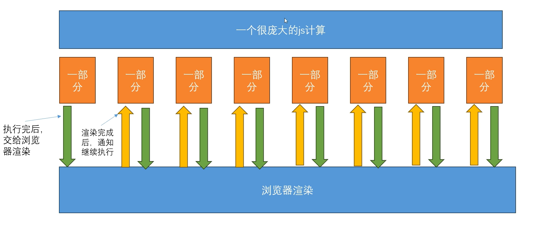
API : requestAnimationFrame
requestAnimationFrame定义的任务,会在浏览器渲染完成后去执行。所以我们只需要把每个切片放到requestAnimationFrame。他在执行完一个后,会等着浏览器渲染完成后再执行下一个
1 | function sliceRender(){ |
常见面试题:并发多个请求并失败重发,所有请求发送完毕,返回结果
需求:
- 可以一次发送任意多个请求,如果有失败,则重发失败请求,直到所有的都成功,或超出最大重试范围才返回最终结果
- 封装成可复用的并发请求工具
思路:
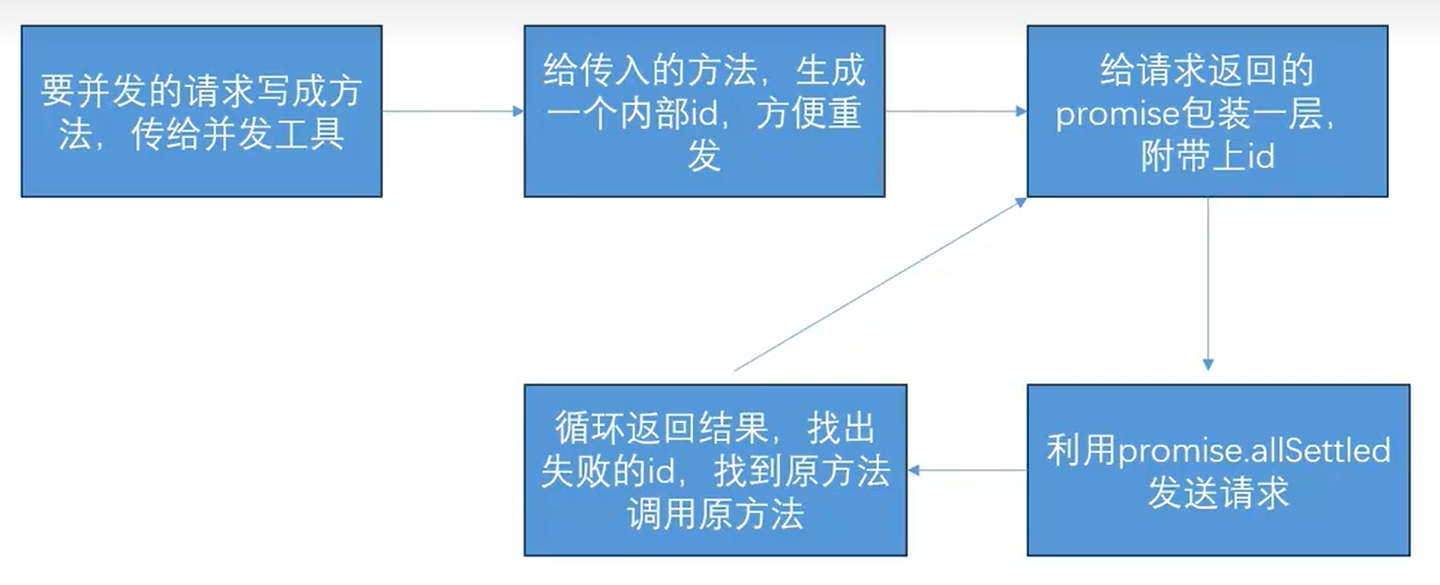
项目亮点案例: luckeysheet+nodejs+vue3,开发多人协同的在线表格
核心技术点:
前端: 用luckysheet做在线编辑表格
后端:nodejs编写接口和webscoket服务
load接口:
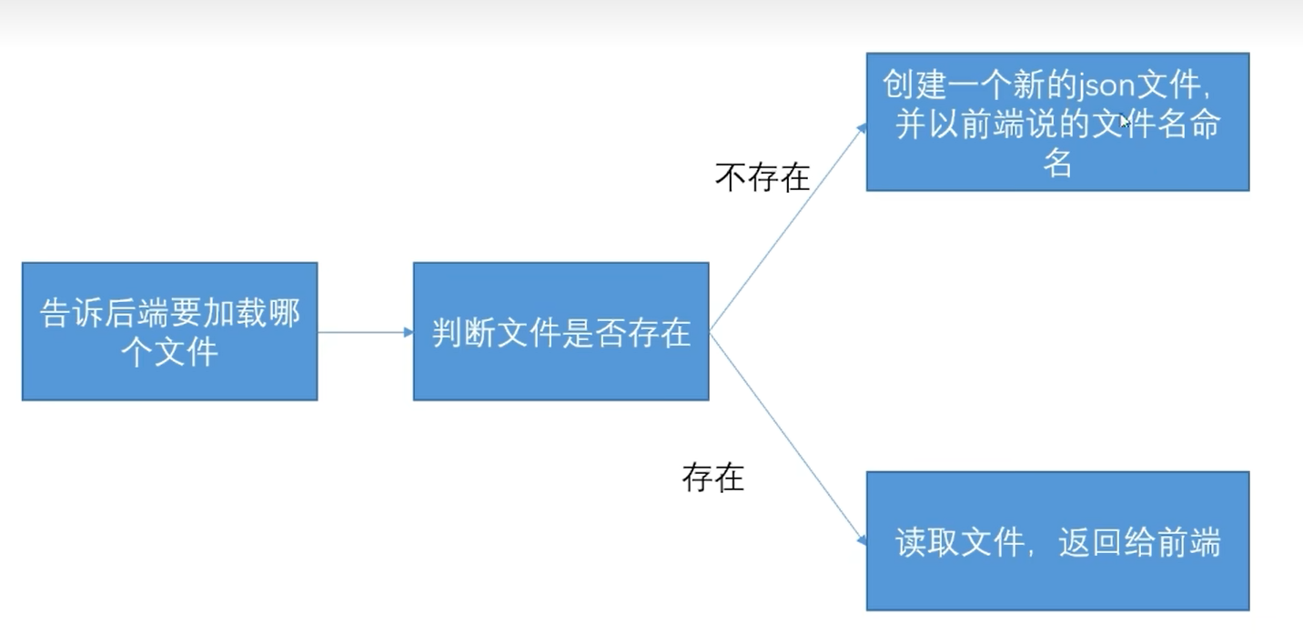
save接口:
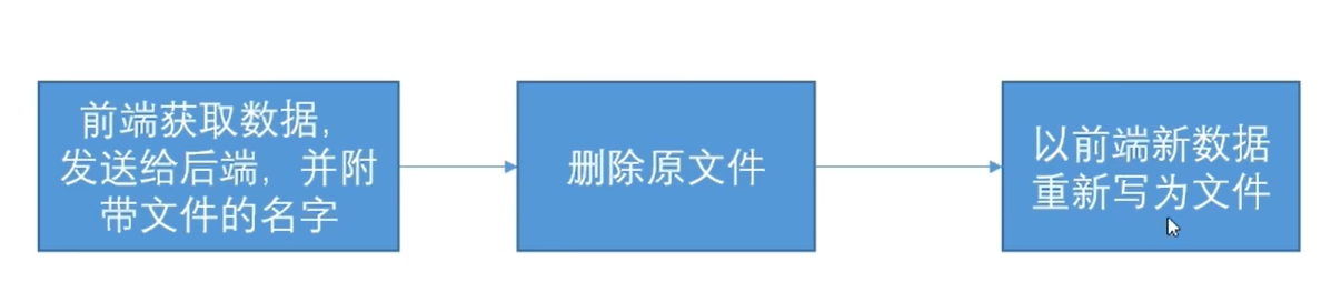
多人协作:
使用hock ,sheetActivate() 检测当前那张sheet ; cellUpdate() 给websocket服务发送我们的row、col等数据
websocket服务:
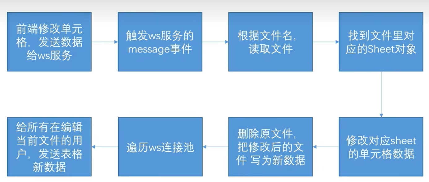
通过cellUpdate钩子函数向ws服务发送数据,ws向所有连接池的连接发送更新通知。利用ws.onmessage() 更新某个单元格。
项目案例亮点: 利用sass加css变量来实现,前端动态换肤
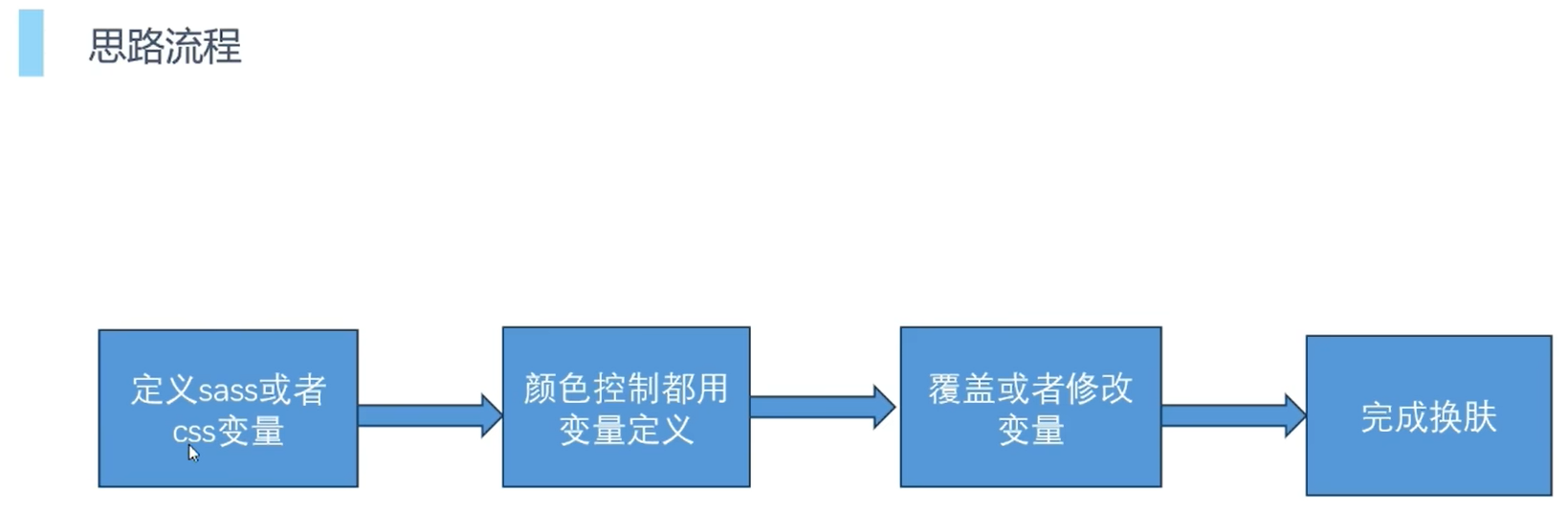
在一些特定的class样式中使用多个css样式名,将结构跟背景区分开
!!! 需要加!default
scss:
- 创建集合
1 | // 对象 |
- 通过方法来生成
1 | // 定义mixin方法 |
- scss调用
1 | .background-theme{ |
- 在js中设置data-skin属性
1 | <script> |
项目案例亮点: 实现可动态添加表单
- 支持原生,也支持组件库,也支持复杂自定义表单
- 可以让组件使用者定义可以添加那些组件
1 | // App.vue 父组件 |
1 | // testForm.vue 子组件 |
项目案例亮点: table数据 + 页码列表组件封装
1 | // 组件封装 |
1 | // 调用组件 |
项目案例亮点: 可复用拖拽逻辑
复用逻辑方案
- 提取组件或hoc 把逻辑封装在一个组件里,留出插槽在使用的时候插入 ( 缺点: 不方便使用)
- mixin混入 把要复用的逻辑设计的数据和方法通过mixin混入到个个组件
- 组定义指令 把逻辑卸载自定义指令中
- vue3组合api 配合vue3的组合式api, 把逻辑写为一个方法
其他细节
- 限制区域选取 限制边缘区如何限制
- x, y 坐标设置方案 x和y坐标不能只是单纯的区clientX 和clientY
- 输出设计 输出那些内容,一个好的输出内容可以让扩展性提高
- 监听 监听在哪挂载
组件封装 : 二次封装axios
- 几乎所有项目统一的axios基本封装方案
- 扩展开的一些大厂的特殊操作
- 配置中心的理念
- 基本封装部分
- 基本全局配置 如baseURL, 超时时间等
- token,密钥等 出于权限和安全考虑的密钥设置到请求头
- 响应的统一基本处理 主要针对于错误的情况做全局统一处理
- 封装请求方法 把对接口的请求封装为一个方法
1 | // axios.js |
1 | // user.js user api 模块 封装接口请求 |
- 我们业务中发现一些请求相关的处理事经常重复进行的,我们可以封装起来,让请求更加简便
- 防止频繁提交( 防止接口重复提交)
- 缓存数据
1 | // request.js 处理axios和封装接口请求的中间文件,统一处理接口请求的扩展或者额外工作 |
组件封装: vue 封装Echarts 组件
1 | // echart代码示例 |
1 | // EchartSub.vue |
项目案例亮点: input组件封装
- 如何给自己的组件封装v-model ( v-model 本质)
- 感受组件封装的思考
- 模糊搜索 ( 防抖和节流的区别)
- 验证
项目案例亮点: Vue项目权限控制方案
后端返回用户路由规则
- 用户登录通过后端接口返回菜单列表
- 前端通过VueRouter addRouter动态添加路由
按钮权限
- 可以通过自定义指令,控制显示隐藏
1
2
3
4
5
6
7
8
9
10
11
12
13
14// vue main.js
// 自定义指令 判断权限 v-has
const app = createApp(App)
app.directive('has', {
mounted: (el, binding, vnode) => {
let userInfo = JSON.parse(sessionStorage.getItem("userinfo"))
let permissionCodeList = userInfo.PermissionCodeList
permissionCodeList = permissionCodeList == undefined ? [] : permissionCodeList;
if(!permissionCodeList.includes(binding.value)){
el.parentNode.removeChild(el)
}
}
})路由权限